Page 1 of 2
Keyboard Color Symmetry
Posted: 10 Jan 2016, 16:00
by Hypersphere
Posted: 10 Jan 2016, 16:14
by Engicoder
Nitpick: With the standard layout and key sizes, you can't have true symmetry. Ignoring that, for the classic white/gray color scheme, My preference is to have keys that generate a printable character be white and all others be gray. That rule doesn't completely cover Tab, however. Therefore, Standard scheme is what I would choose.
Posted: 10 Jan 2016, 16:16
by Chyros
I don't associate keyboards with symmetry at all xD .
Posted: 10 Jan 2016, 16:20
by seebart
Chyros wrote: ↑I don't associate keyboards with symmetry at all xD .
You'll have to prove that in your next video review.

Posted: 10 Jan 2016, 16:26
by Hypersphere
Yes, I realize that the pattern of keys on a "standard" keyboard form at best a quasi-symmetry. Even so, I seem to need mod-color on the spacebar and all the way up on both sides. However, I am always undecided about accent colors, such as a Red Esc. I am also influenced by my preference for the HHKB layout -- the Backslash key serves as my Backspace key.
Posted: 10 Jan 2016, 16:28
by scottc
On a 60%, I always put escape on the upper-left key which makes the board reasonably symmetrical if using a classic two-tone keyset. Unfortunately the |\ key is often the brighter of the two tones which throws symmetry off somewhat. At the same time, I often use a brightly-coloured escape key which isn't symmetrical at all, so I suppose it doesn't bother me too much.
Posted: 10 Jan 2016, 16:36
by fohat
I like the symmetry and have toyed with replacing not only Tilde but also the "1" to balance the Backspace.
Although it would be "weird" up close it would be nice from across the room.
Posted: 10 Jan 2016, 16:38
by scottc
That sounds like it would throw me off! Interesting, though. I don't mind the slight imbalance between the left/right -- it's not perfectly symmetrical because of the key sizes, so it doesn't bother me too much.
Interesting point about printable characters, Enigcoder. That makes a lot of sense.
Posted: 10 Jan 2016, 16:39
by mars
I got my blank hhkb just this week,
previously I owned a poker2.
The hhkb keycaps colors are almost perfectly symmetric except for the grey esc, thanks to backspace being over return and so it balances tab on the left side.

Given that the symmetry is already "ruined" by esc, I'm kinda tempted to put a red accent on it.
I kinda like the lightblue esc + red control set they sell, but I feel it's unbalanced (which is what we discuss in this thread after all).
I think I will eventually put two matching keycaps on the esc and fn keys, so to have some kind of balance.
Otherwise, the grey is so unobtrusive so far that my OCD can't really complain.

Posted: 10 Jan 2016, 17:45
by Hypersphere
mars wrote: ↑I got my blank hhkb just this week,
previously I owned a poker2.
The hhkb keycaps colors are almost perfectly symmetric except for the grey esc, thanks to backspace being over return and so it balances tab on the left side.
Given that the symmetry is already "ruined" by esc, I'm kinda tempted to put a red accent on it.
I kinda like the lightblue esc + red control set they sell, but I feel it's unbalanced (which is what we discuss in this thread after all).
I think I will eventually put two matching keycaps on the esc and fn keys, so to have some kind of balance.
Otherwise, the grey is so unobtrusive so far that my OCD can't really complain.

Likewise, I often do something like this with my HHKB:

- hhkb-red-esc2.jpg (45.77 KiB) Viewed 5700 times
Posted: 10 Jan 2016, 17:53
by zslane
Standard + colored Esc and Return.
Posted: 10 Jan 2016, 19:04
by Parjánya
Funny you mentioning symmetry exactly now. I've been thinking about a layout like this:

- keyboard-layout(3).jpg (76.82 KiB) Viewed 5695 times
The asymmetry of the navigation cluster bothers me, but I haven't thought about how to solve it just yet... perhaps another 3 columns of keys on the left? It would make the keyboard too wide, I'm afraid.
Posted: 10 Jan 2016, 19:21
by Muirium
My taste is readily apparent…

Accent the Esc and Return keys. And ruthlessly purge the idiotic inconsistencies like backtick and backslash! There's no perfection on fundamentally asymmetric keyboards (hello staggering) but the chase is asymptotic.
Posted: 10 Jan 2016, 19:39
by Parjánya
Both are gorgeous, still not the platonic Idea of a keyboard... I dislike specially the backspace being 2u long, ruining the "stepped" column of mods.
Posted: 10 Jan 2016, 19:41
by Muirium
Yeah, 2u backspace is so dumb. The HHKB handles that so much better. Why stretch over backspace all the time? Simply make it the already oversized key immediately above Return. Done!
Posted: 10 Jan 2016, 20:09
by zslane
Well, we might as well bitch about QWERTY in general if we're going to complain about the positioning of keys (like Backspace).
I'm with Engicoder. I don't care about symmetry because there is none to be found on an ANSI keyboard to begin with. So I go with the principle that keys that produce stored/printed characters are the "alpha" color, and everything else is the "mod" color. Engicoder calls out the tab key, and I'd be okay with that being the alpha color too. It's just that you don't usually find that as an option in most base kits. I'd also be okay with the *, /, -, and + keys on the numpad being the alpha color, but again, that isn't usually an option except in 7bit's kits. Oh, and this business of alternating colors for the Fn keys is for the birds.
Posted: 10 Jan 2016, 22:10
by ReleaseCandidate
Depends on whether you want to actually use your keyboard or just look at it (that also holds for highlights).
A tab isn't a printable character, it's replaced by a number of spaces.
Posted: 10 Jan 2016, 22:45
by Madhias
Mostly I only like simple color themes, and when there is a color (added to great beige or white or grey caps), it should be only one cap. Could be ESC, RETURN, or CONTROL. Like Muiriums pictures above! Space bar should be the color of the alphas, always.
Posted: 10 Jan 2016, 22:46
by Muirium
I usually agree on the alpha colour spacebar. But mod black on my Graphite NovaTouch worked quite well, for a change.
Posted: 10 Jan 2016, 22:56
by scottc
ReleaseCandidate wrote: ↑Depends on whether you want to actually use your keyboard or just look at it (that also holds for highlights).
Oh, I didn't realise these two were mutually exclusive!
Posted: 10 Jan 2016, 23:05
by Chyros
seebart wrote: ↑Chyros wrote: ↑I don't associate keyboards with symmetry at all xD .
You'll have to prove that in your next video review.

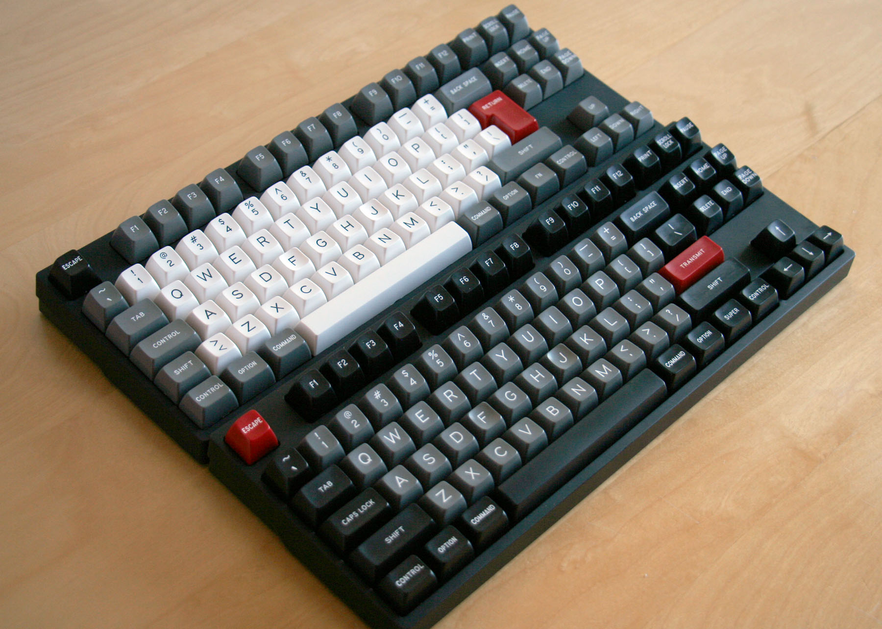
Well, what's so symmetrical about this? :p

Posted: 10 Jan 2016, 23:19
by Hypersphere
@Chyros: Good point. On a TKL or full-size, the most symmetrical part of the board is the navigation island taken in isolation from the rest of the keys.
Posted: 11 Jan 2016, 01:58
by zslane
ReleaseCandidate wrote: ↑A tab isn't a printable character, it's replaced by a number of spaces.
A tab is ASCII 9. While the "printed" representation looks like a number of horizontal spaces, it is stored/processed as a single character with ASCII code 9. I included the word "stored" for a reason.
Posted: 11 Jan 2016, 02:16
by Parjánya
I would think the focal point of symmetry to be the alphabetic block; the navigation cluster only happens to be there : o ). Also I don't think staggering ruins everything by itself, it has more to do with the areas: if the shape of all mod keys together in either side is equal, or almost, to the other side, I would count it as symmetrical enough.
Posted: 11 Jan 2016, 19:09
by Matt_
I actually like a bit of asymmetry. From this point of view the standard layout is fine, but since I prefer a full 1u top row I find the HHKB scheme even better, especially with a color accent on Esc.
In any case, I don't like when mods on both sides are all the same color from bottom to top (Symmetrical Mods+).
Posted: 11 Jan 2016, 20:14
by matt3o
I'm strongly against symmetry, it bothers me, it makes me itch. I would pick standard scheme + red accent

Specifically in a keyboard color symmetry would be just vanity. And if there's a think that I hate more than symmetry is vanity

Posted: 11 Jan 2016, 20:16
by Muirium
So I have discovered!
Posted: 11 Jan 2016, 20:37
by bazh
talking about symmetry, if you guys are so obsessed with it why nobody creates a perfect symmetry layout yet, I mean you can move the 2nd and 3rd rows (from the bottom) to the right by 0.25x space, no?
Posted: 11 Jan 2016, 20:39
by Muirium
No.
Not unless you can live without all the great caps…
Posted: 11 Jan 2016, 21:08
by bazh
well if it's just for the look then you don't use it so often anyway

)


