Page 1 of 2
Vortex PBT Doubleshots
Posted: 17 May 2013, 15:11
by Grond
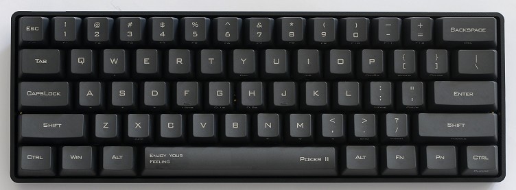
Vortex just posted on facebook pics of their PBT doubleshots with "cherry font".

To me it looks like a ugly imitation of Cherry fonts, and why did they go for horizontal centered letters!? Still: since it's possible to doubleshot pbt, maybe better set will be coming!
Posted: 17 May 2013, 15:24
by Dgsbllx
Hopefully a better set will be coming indeed. Win + Alt randomly at the top as well, and shift/caps don't look right. I don't recall seeing a caps with a downwards arrow?
Posted: 17 May 2013, 15:29
by matt3o
I hope this is just a prototype... anyway good news regarding pbt doubleshot
Posted: 17 May 2013, 15:30
by BimboBB
yep, there is much room for improvement. different thickness of the legends and weird centering makes it looking quite odd. seems that doubleshooting PBT process is still far away from perfection. but nice that they go for cherry legends instead of the italic font style.
Posted: 17 May 2013, 15:32
by Grond
Do you think they own the doubleshot machine on their own, or do they order keycaps from another facility?
Posted: 17 May 2013, 16:00
by Kurk
The "Z" looks like a "N" turned 90 degrees.
Dgsbllx wrote:.....I don't recall seeing a caps with a downwards arrow?
Ze Germans do it like that.
Posted: 17 May 2013, 16:01
by Muirium
The font they're looking for is Helvetica. The most widespread in the world, but still a classic.

Their G really blows it.
I doubt difficulties in process were to blame for such sloppy typography. It's just inexperience. Vortex's legends have noob written all over them, whether on ABS or PBT.
Re: AW: Vortex PBT Doubleshots
Posted: 17 May 2013, 16:18
by mintberryminuscrunch
Good news, bad news situation
Posted: 17 May 2013, 16:28
by Muirium
Well, it's no worse than Vortex's current keys:

Those alone were enough to put me right off ordering a Poker 2.
Hopefully their work will improve once the design department moves out of the local high school. Fingers crossed for you, Vortex!
Re: Vortex PBT Doubleshots
Posted: 17 May 2013, 17:25
by Trev
Muirium wrote:Well, it's no worse than Vortex's current keys:

Those alone were enough to put me right off ordering a Poker 2.
Hopefully their work will improve once the design department moves out of the local high school. Fingers crossed for you, Vortex!
Sort of like a kid who's pirated Photoshop and got excited downloading some awesome free fonts.

I'd like to see some key legends set in Gotham Rounded. A clean geo sans that might be well suited to plastic (less sharp details to mess up).
Posted: 17 May 2013, 18:20
by Muirium
Gotham's a fine font family, all right. And for the retro-junkies (likely myself) Eurostile has true Modernist cred.


And if they need free: there's authentically good stuff at
The League of Moveable Type. I'm sure Orbitron would get their design chief's thumbs up, even if its not my cup of tea.

Posted: 17 May 2013, 19:11
by Grond
Maybe we could try and contact them for a costum order? We could send them svgs so they don't legends up...
Re: AW: Vortex PBT Doubleshots
Posted: 18 May 2013, 11:08
by mintberryminuscrunch
Grond wrote:Maybe we could try and contact them for a costum order? We could send them svgs so they don't legends up...
They already wasted so much money on these. Can't image they want to spend money on proper legends (if all the other manufacturers are an indication)
The entire industry is just a gigantic joke
Posted: 18 May 2013, 12:55
by Muirium
Design details are just the sort of thing upstarts often get completely wrong. That doesn't mean they'll stay as bad forever. Companies I hope to get on the clue train someday include Das (or whatever the Das Keyboard guys are called) and the likes of Noppoo and KeyCool.
Examples of manufacturers already getting it right (for the most part) include Filco, Leopold and Topre, and to a certain extent Ducky when they can contain themselves.
The neat thing about design is that we're all completely surrounded by it, whether we realise it or not. Or even whether the manufacturers do either! In the long run, good design tends to win out. All else being equal, people go for the product that isn't ugly.
It can just sure take a while.
Posted: 19 May 2013, 01:50
by webwit

This font is worse than Comic Sans. Consider its origin. Take a font from outdated sci-fi, when they thought that advanced computers could do nothing more than produce square angled fonts, and that this looked hip and advanced. They took that and then added the rounded corners back. The infancy and kitsch factor are mind-boggling. Considering their new PBT doubleshots, it's clear that they will never get it right, they don't have a clue.
Posted: 19 May 2013, 12:25
by Trev
webwit wrote:
This font is worse than Comic Sans. Consider its origin. Take a font from outdated sci-fi, when they thought that advanced computers could do nothing more than produce square angled fonts, and that this looked hip and advanced. They took that and then added the rounded corners back. The infancy and kitsch factor are mind-boggling. Considering their new PBT doubleshots, it's clear that they will never get it right, they don't have a clue.
Can't you just be happy and "enjoy your feeling"?

Posted: 19 May 2013, 13:02
by mintberryminuscrunch
Trev wrote:
Can't you just be happy and "enjoy your feeling"?

that's what blanks are for
Posted: 19 May 2013, 13:09
by matt3o
I'm a bit confused... is mintberry = 7bit?
Posted: 19 May 2013, 13:28
by Muirium
I'd blank those buggers
if I could…
Posted: 19 May 2013, 13:28
by mintberryminuscrunch
matt3o wrote:I'm a bit confused... is mintberry = 7bit?
7bit = mintberry!
Posted: 20 May 2013, 10:50
by Elrick
webwit wrote:Considering their new PBT doubleshots, it's clear that they will never get it right, they don't have a clue.
Please remember that this is produced in the heartland of China. Hence typographic accuracy is not paramount with their objectives, anymore than it would be for you in producing their language font on a key-set within your non-chinese country.
They are still trying which is better than ignoring our fast disappearing language across this planet.
Posted: 20 May 2013, 12:47
by Halvar
So what are their objectives with this keyset in your opinion?
I'm pretty sure they will make better molds because these keys won't sell.
Posted: 20 May 2013, 12:56
by Trev
Elrick wrote:webwit wrote:Considering their new PBT doubleshots, it's clear that they will never get it right, they don't have a clue.
Please remember that this is produced in the heartland of China. Hence typographic accuracy is not paramount with their objectives, anymore than it would be for you in producing their language font on a key-set within your non-chinese country.
They are still trying which is better than ignoring our fast disappearing language across this planet.
They're not producing these as charity work for some dying language. It's a for-profit product, catering to a massive English-speaking market.
If they're manufacturing key legends that look like garbage, we have every right to be critical and not buy them.
Posted: 20 May 2013, 13:01
by Grond
They claim they're working on a ISO version, so probably they intend to support more "dying languages".
Posted: 20 May 2013, 13:19
by Muirium
Whoah. Cognitive dissonance! Is this forum actually in Gaelic, Faroese or Welsh and I never noticed?
Does anyone smell burnt toast?
Ahem. Anyway China is a good part of the reason. Not because of unfamiliarity with the Roman alphabet, but with shoddy quality control in general. It's not just the little things like typefaces that Vortex and its thousands of manufacturing peers get wrong. It's everything they can. Caveat emptor! They'll only make better product when that is all that will sell.
Pity absolutely no one the world over speaks English as a second language. How will we tell them?
Posted: 13 Jun 2013, 12:21
by Grond
Now they have posted pictures of a new, left handed keyboard:

Keycaps are pad printed PBT, apparently. I think they really took a step upward with this new typeface. I kind of like it, actually.
Posted: 13 Jun 2013, 12:25
by Muirium
It's not as bad. I'll give them that.
Posted: 13 Jun 2013, 12:35
by Grond
The terrible thing is the "Kbtalking" legend instead of "enter". BTW, is Vortex = KBTalking? I thought they were two different companies.
Posted: 13 Jun 2013, 12:50
by 7bit
These caps are just protectors for the switches to be used until you mount real key caps on them.
Pre-installed key caps are like pre-installed operating systems.
Posted: 13 Jun 2013, 13:12
by Muirium
KBTalking is a Korean or Chinese forum, so I've heard, which is several years ahead of the GH60; in that Vortex is selling whole assembled keyboards of KBT's design to consumers. Presumably with a split, for using the design and logo.
Vortex is a Chinese contract manufacturer, like Foxconn only several orders of magnitude smaller. You design it, they can make it. Not necessarily well, of course, and you'd better be constantly vigilant about materials and other cost savings creeping in as production continues!
And now Vortex is getting business from Ducky (metal cases) and others, so watch out. The chance that you'll be using some of their stuff, whether you know it or not, only goes upward over time. Just like Foxconn. Just like China!


