Page 1 of 1
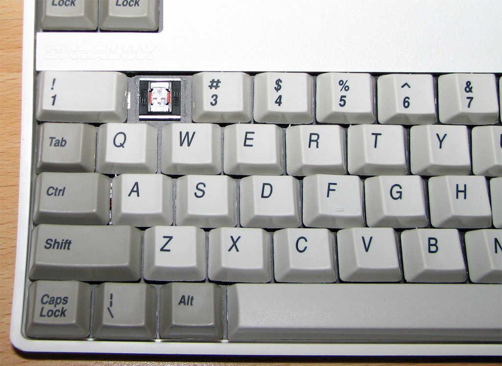
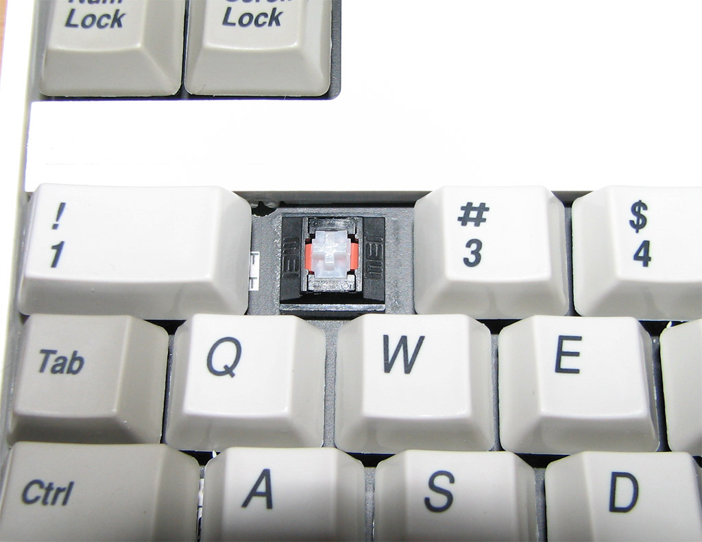
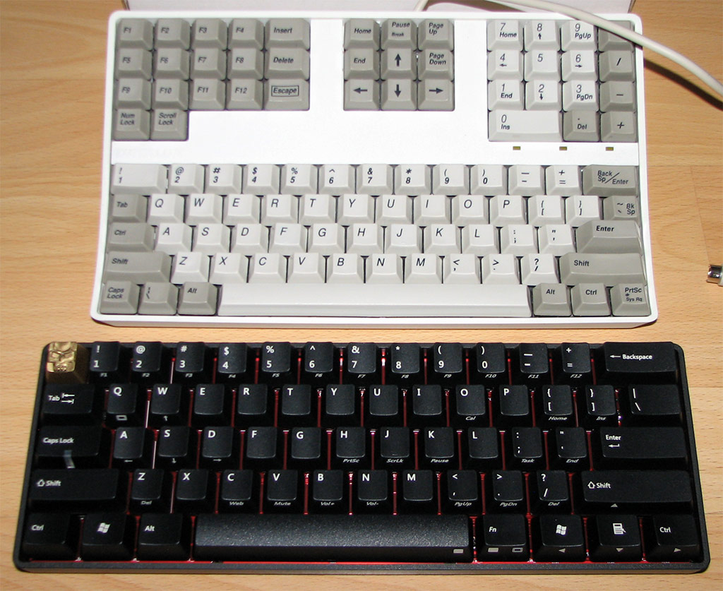
Datalux mini keyboard
Posted: 17 Sep 2011, 02:15
by webwit
Posted: 17 Sep 2011, 09:10
by kaiserreich
I recall the POKER having larger fonts.
Who did kill to have the smaller font keycaps?
Posted: 17 Sep 2011, 10:02
by sixty
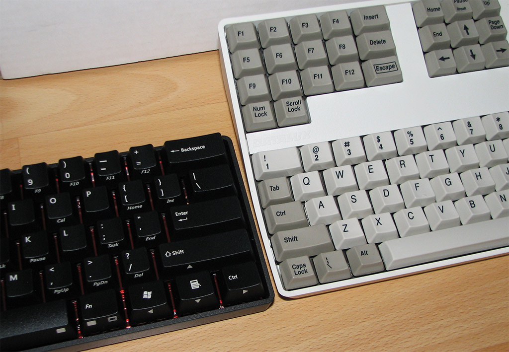
The pokers from the deskthority group buy had this print by default, the one from geekhack had an obnoxiously big font.
To be honest I have no idea why and how this happened (and I'm the one who organized this thing!), but I'm glad it did. The big font is fucking ugly.
Posted: 17 Sep 2011, 12:22
by lal
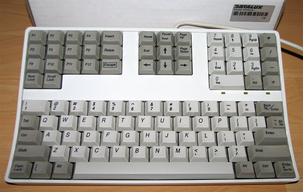
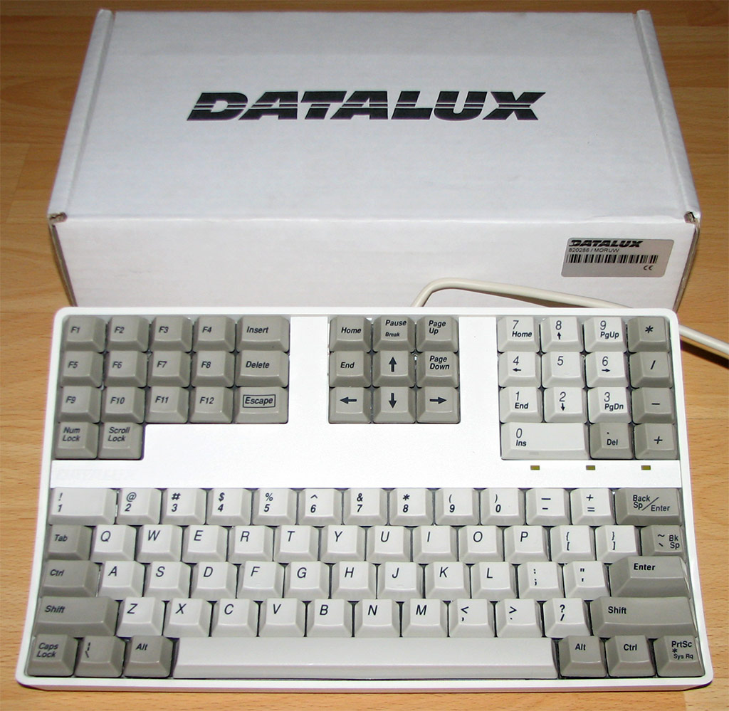
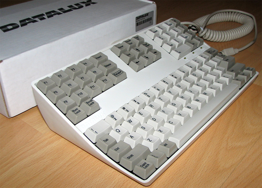
I like the 70s style case.

Posted: 17 Sep 2011, 12:50
by Matuka
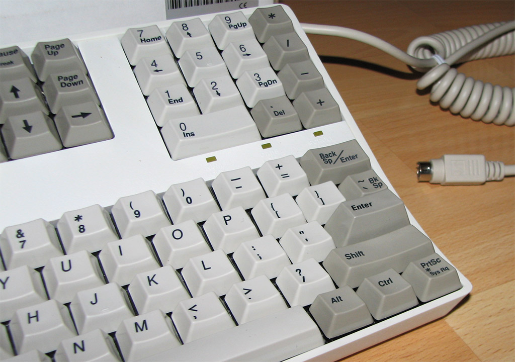
I wonder who's bright idea it was to design that think. It looks so obscure compared to other SSKs.
Posted: 17 Sep 2011, 13:58
by webwit
I was wondering before what the differences are between the deskthority groupbuy and the geekhack one. Our keycaps look much better.


I wonder who's bright idea it was to design that think. It looks so obscure compared to other SSKs.
The execution leaves to be desired, but I don't think the idea is weird. It saves lots of horizontal space on the desk or counter, while there's usually "dead space" between the keyboard and the monitor. It has all the keys, yet is smaller in width than a Poker or HHKB.
Posted: 17 Sep 2011, 17:26
by daedalus
I wonder what possessed them to make that really high enter key. It seems like the sort of thing designed to make typing as needlessly difficult as possible.
Posted: 18 Sep 2011, 12:52
by kaiserreich
The bigger font is the standard one.
I also noted something. the deskthorithy Poker has smaller fonts but a larger windows logo.
It's the other way around for the standard poker.
