Page 1 of 1
Noppoo Choc Mini Backlight - Impressions
Posted: 31 Mar 2012, 22:13
by CeeSA
here are some shots from my new Noppoo Choc Mini Backlight.
I have the feeling that i have a prototype. The keycaps are "sprayed" in different quality and looks.
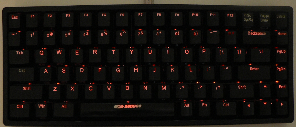
- full w max led.jpg (430.51 KiB) Viewed 7506 times
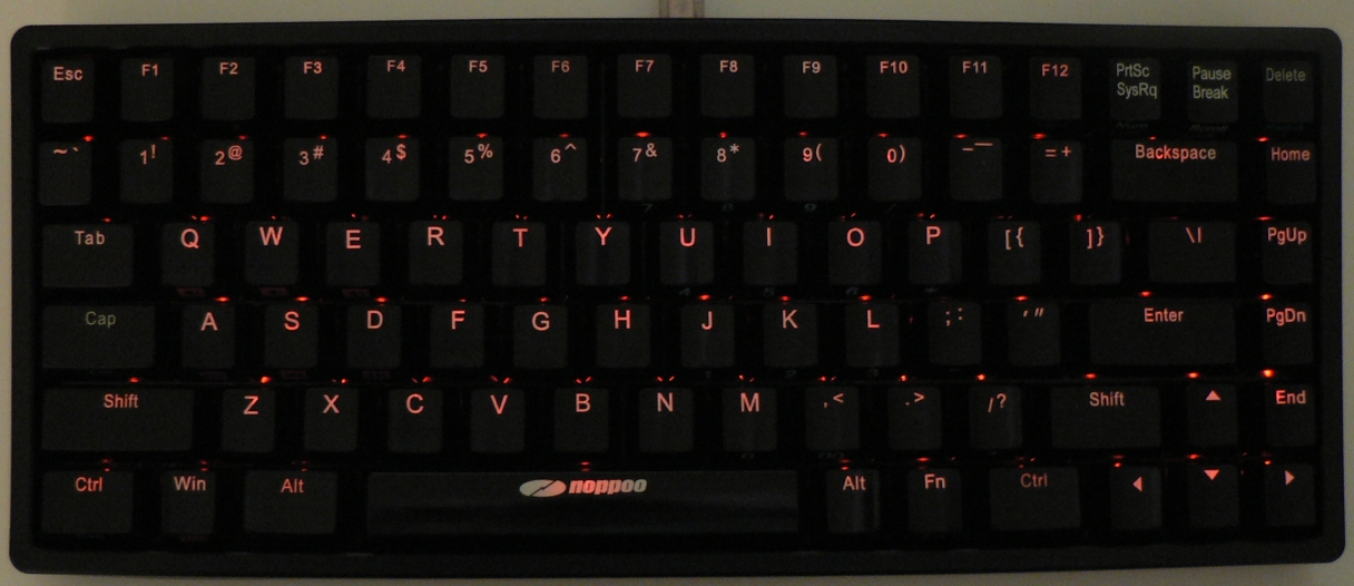
- full w lowest led.jpg (399.57 KiB) Viewed 7506 times
some stickers left and right:
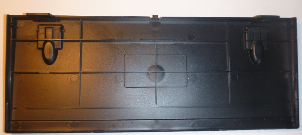
- frame lower part.JPG (306.36 KiB) Viewed 7506 times
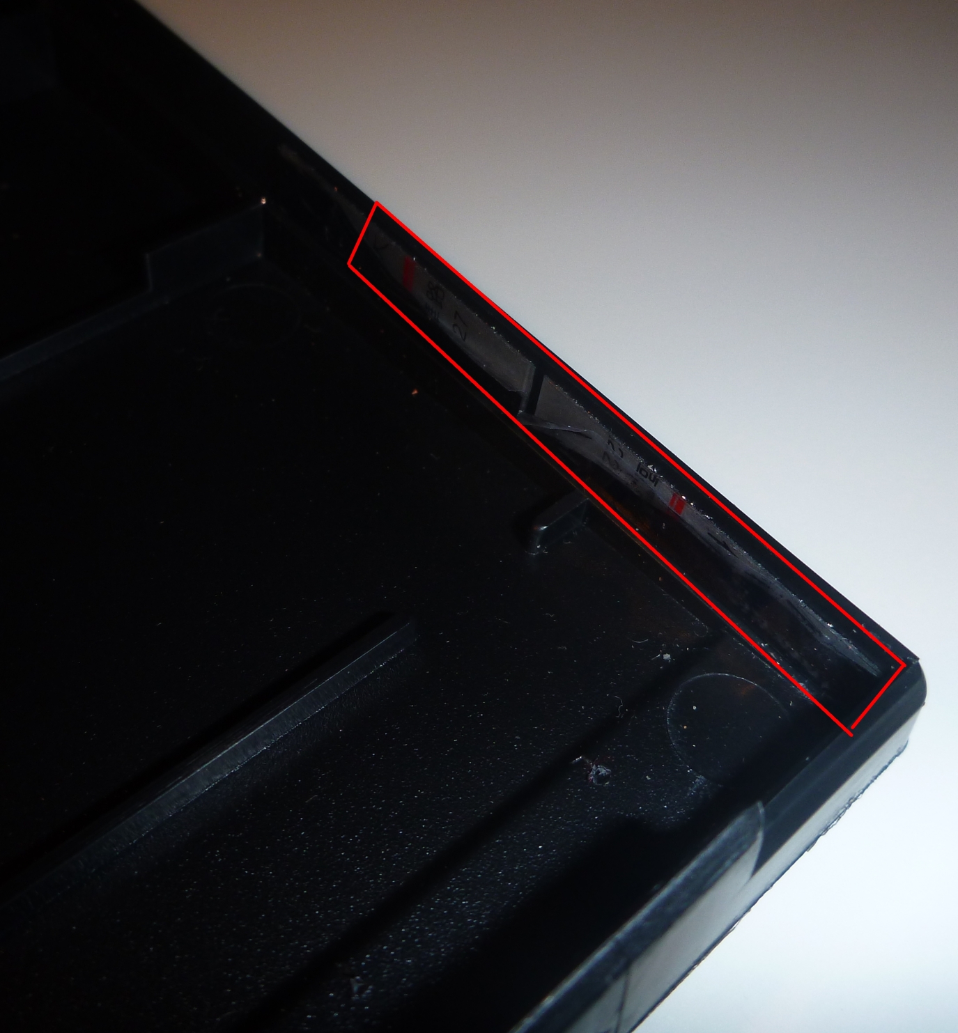
- bottom right taped.jpg (880.13 KiB) Viewed 7506 times
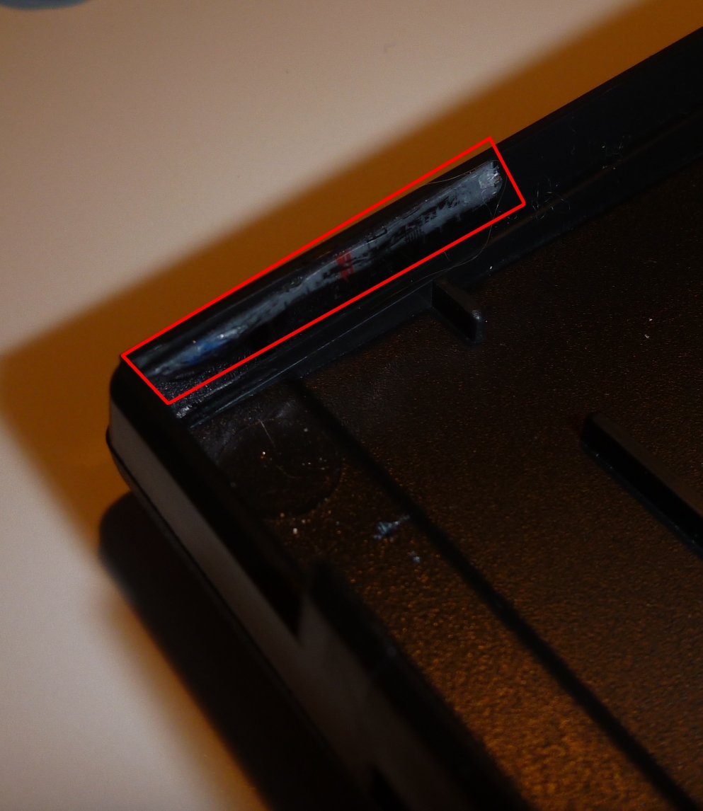
- bottom left taped.jpg (620.43 KiB) Viewed 7506 times
new frame is lower than the old one at all:

- frame old and new lower part cmp.JPG (335.53 KiB) Viewed 7506 times

- frame old and new upper part cmp.JPG (345.27 KiB) Viewed 7506 times
PCB
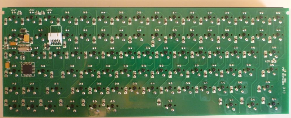
- pcb.jpg (370.76 KiB) Viewed 7506 times
do you like to see your stabilizers (only w the new lower frame)?

- space stb 2.jpg (772.6 KiB) Viewed 7506 times
different print qly (not a question of the bad pic qly or the light)
tab and cap looks same, shift looks like my self sprayed housings....
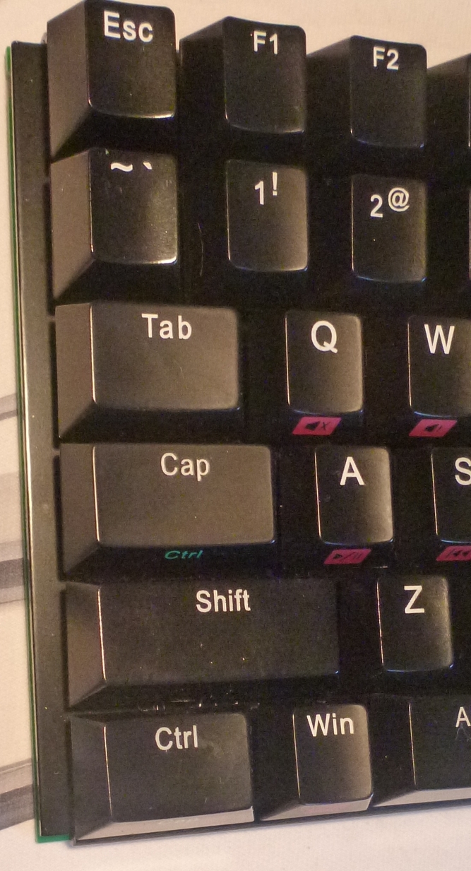
- keycaps cmp left side.jpg (566.42 KiB) Viewed 7506 times
Posted: 31 Mar 2012, 22:19
by CeeSA
some bubbles
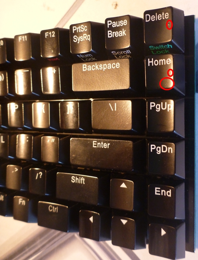
- keycaps cmp right side.jpg (425.96 KiB) Viewed 7504 times
dust magnet keycaps
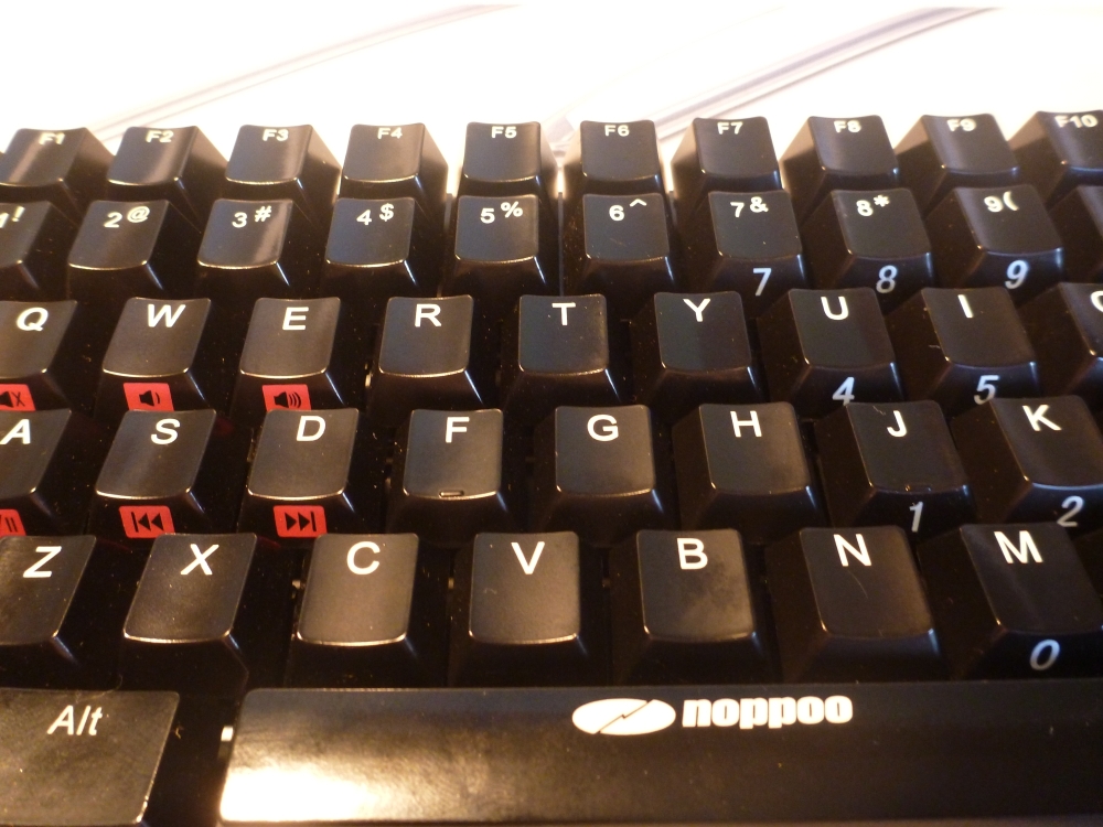
- keycaps middle part.jpg (470.81 KiB) Viewed 7504 times
so good the white, so bad is the backlight noppoo.
the keycaps feels very glassy, hate that.
hrmpf, this could be my last noppoo.
and there is a very new(strange) feeling w/ my lovely cherry mx blue.
(i have to tryout the switches more time)
Posted: 31 Mar 2012, 22:43
by tsangan
Sad about the glossy keys

Seems like you're must be a sucker for backlit mini keyboards

Posted: 31 Mar 2012, 23:25
by Lustique
That really looks pretty bad.

Some of the keys look like Noppoo got some shiny key caps from an old keyboard and just reprinted the legends. Are the "\|" and the backspace key the only keys that have a "normal" (at least that's what I would expect from key caps) surface?
Given that, I have a question to ask all the backlight lovers: Why?
I really don't understand why some people like backlighting so much. Frankly, I can't see any advantage, really, not even a single one. I think if a keyboard was backlit, for me that would be a reason not to buy it. Could anyone of you try to explain the need for backlighting? Is it just for the looks (would not be a reason for me, because I don't even like the look of it), or are there other reasons?
Posted: 01 Apr 2012, 15:23
by Poo
Yep, it looks like bad :s
Although I love my Noppoos I wouldn't buy a backlight one there is no point in it IMO.
Posted: 01 Apr 2012, 15:51
by CeeSA
this thread isn't about backlight or not, this is about quality.
this noppoo is my 4th noppoo. I prefer the white one bcause of the very good PBT keycaps. The backlight one has the worst keycaps. And the new lower shell is not good (for me) at all.
Posted: 02 Apr 2012, 05:52
by huttala
That sure doesn't look good...
Posted: 02 Apr 2012, 09:50
by rodtang
huttala wrote:That sure doesn't look good...
It looks like crap and the shiny caps are a nightmare to look at.
Posted: 06 Apr 2012, 00:04
by RC-1140
oww, now this is a cheap looking keyboard. Even compared to the ordinary Choc Mini. And I definitely agree to Lustique, I would prefer any lasered PBT caps over the feel of these strange coatings on backlit keyboards.
Posted: 06 Apr 2012, 08:36
by kaiserreich
How does this compare to the RACE?
Posted: 03 Feb 2013, 15:15
by reqq
new pictures of this keyboard in noppoo site
http://www.thenoppoo.com/china/content.asp?id=155
looks like better keycaps ??
Posted: 03 Feb 2013, 15:39
by vivalarevolución
Those look like ABS keycaps with all that shine.
Posted: 03 Feb 2013, 17:43
by Cafeine
The arrow keys looks oversized like on the Race and I hate that.

Well, I hate red backlight anyway. I tried the Noppoo choc mini of a friend this week-end and I'm really glad I went for the Filco.

Posted: 03 Feb 2013, 18:42
by vivalarevolución
Also that taping to hold the case together is really disappointing. Really disappointing.