Page 1 of 1
[collectionthread] diy-tenkeyless boards
Posted: 03 May 2012, 21:05
by off
TKL TENKLESS TENKEYLES TENKEY-LESS TEN-KEYLESS TEN-KEY-LESS 10KEYLESS SPACESAVER MOD DO-IT-YOURSELF SSK SPACE SAVING KEYBOARD
A spot to collect links to (photos of) tenkeyless boards that were born as fullsizes; both hackjobs and nib-like-mods.
Please help grow this into hackyourown-TKL-walhalla by dropping what you come across in here, thanks in advance!
Kickin' off:
mass':
Cherry3000Saver,
Cherry2100Saver
Intealls':
g80-1000TKL
CeesA's:
g80-1851TKL skeleton,
g80-1501 SSK
eunjea's + :
Dell AT-101 space saver <-- comments are
filled with other examples, like elbowglue's mx11800-84u, another Dell AT-101wTKL and a SGI AT-101TKL
mwandel's:
wooden tkl rubberdome logitech
wcass':
terminal ssk&
here
Lanx':
ergo4k reborn
Posted: 03 May 2012, 22:14
by Acanthophis
Also this
IBM SSK. Kinda modded.
//Also kinda irrelevant :/
Posted: 03 May 2012, 22:26
by Findecanor
off wrote:eunjea's + :
Dell AT-101 space saver <-- comments are
filled with other examples, like elbowglue's mx11800-84u, another Dell AT-101wTKL and a SGI AT-101TKL
Lots of us owe quite a bit to elbowglue to be the fore-runner and show us how to cut up our MX11800s.
Here's the post for mine, and I've been that keyboard at work since I made that post.
Edit: How it looks now. The alphanum keys are "white" Cherry PBT, the others are original key caps. The differences are more subtle in person. (I had dunked the F4 key in a dye bath by mistake when I had used other key caps

)

Posted: 03 May 2012, 22:46
by woody
Cherry2100Saver ... nice.
Posted: 03 May 2012, 23:38
by CeeSA
lazy mod, not satisfied with it. to many errors
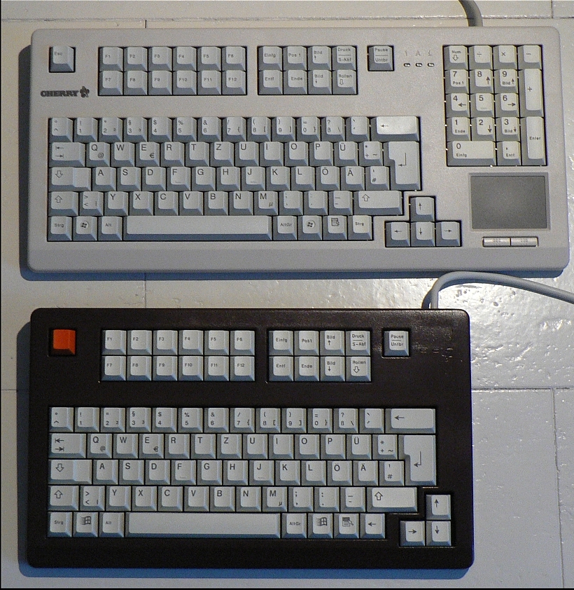
- choco_mod_compare.jpg (626.57 KiB) Viewed 7503 times
one of my best mods until now
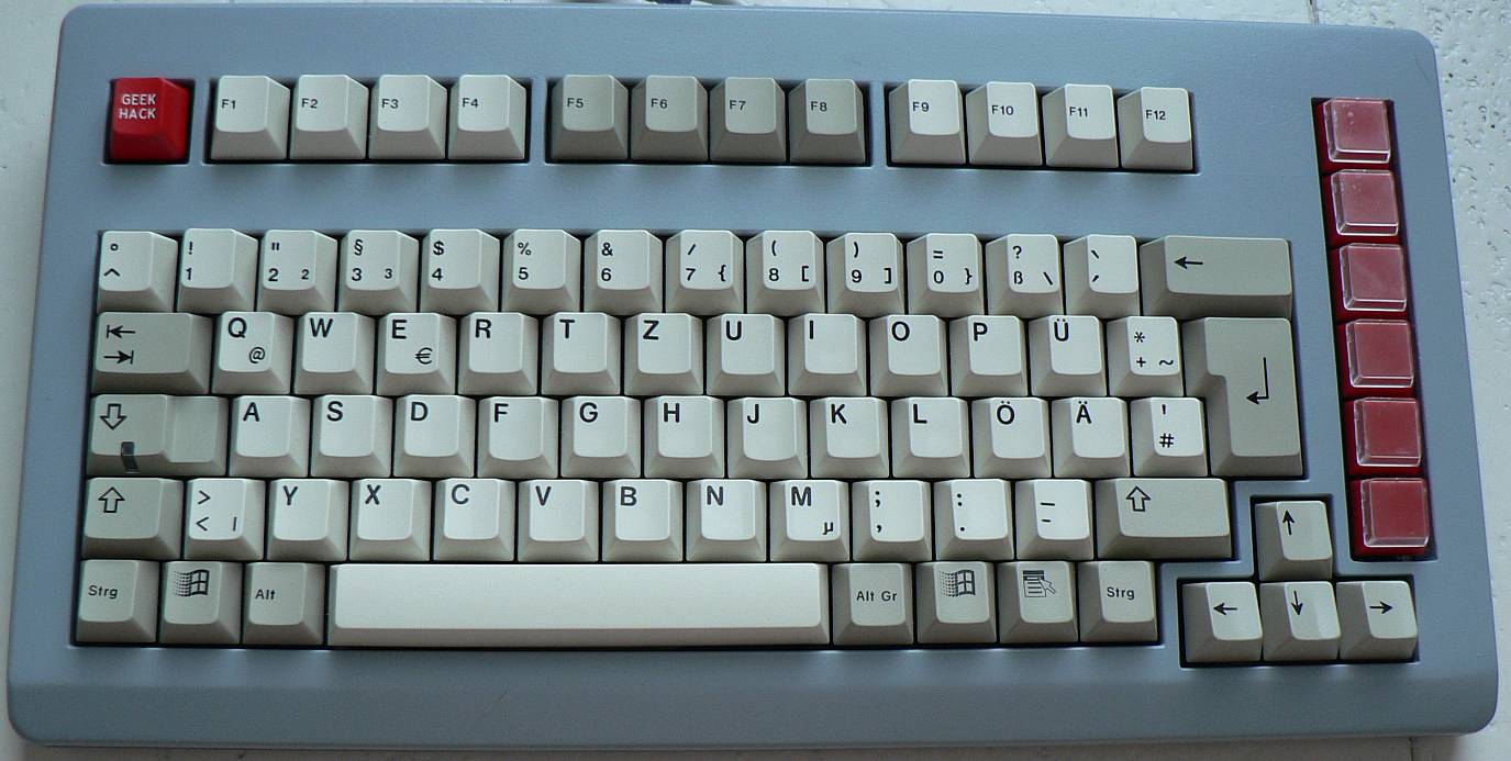
- Cherry 1800 tekeyless mod grey.jpg (135.36 KiB) Viewed 7503 times
and of course sixtys board (i have done only the housing, painting and everything else has done by himself)
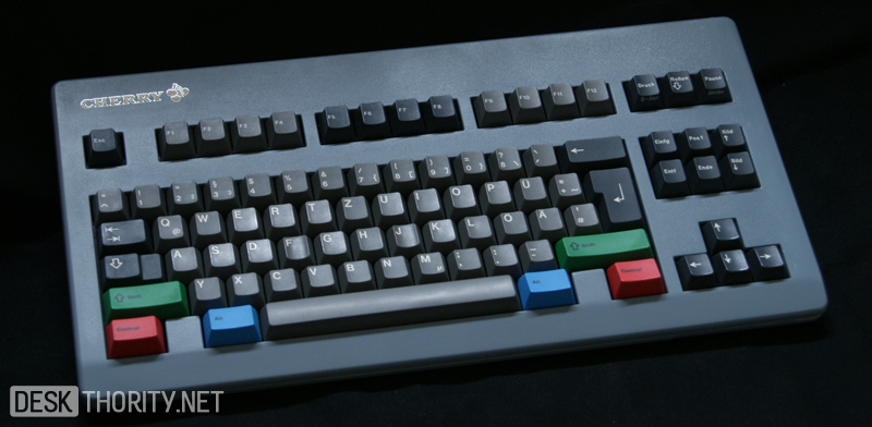
- sixtys board.jpg (133.07 KiB) Viewed 7503 times
i like the idea of the terminal ssk very much!
Posted: 04 May 2012, 14:14
by off
Still looks awesome, the case you made sixty. Which was the lazy one? because second pic (with the row of buttons on the right) looks real good too.. Even the first one looks nice, just that I wouldn't have my arrows like that these days

Posted: 04 May 2012, 14:28
by rodtang
off wrote:Which was the lazy one?
The black one, it isn't too bad.
Posted: 04 May 2012, 14:28
by Tarkoon
I started building a board like the one on CeeSAs last picture.
It will be a Cherry TKL with full NKRO and detachable PS/2 cable based on a G80-1501HAD.
PCB is cut and I know where I have to add some wires, but I am in the USA for the next three weeks for a holiday trip, so I will go on with it afterwards. Off course I will post pictures here when I am ready!
Preview:

Posted: 04 May 2012, 14:37
by CeeSA
the (black) brown one is the awful one. You couldn't see only from the pics.
(i should put the text above the pics, not under)
@Tarkoon - i could not wait until you return. I do the mod this weekend. After your return we could compare the outcome.

Posted: 04 May 2012, 14:43
by Tarkoon
I think we can exchange our experience with this mod afterwards... (less than 30km between our homes)
Do you plan to build it incl. a casemod to TKL or just as skeleton board?
Posted: 04 May 2012, 14:49
by CeeSA
i prepared the housing yesterday (first step). It seems easier to other housings, because there are screws to put upper and downside together. But the first question was, where to cut the right upperside.
Posted: 04 May 2012, 15:51
by off
I can't really say why, but that pcb is beautiful; I'd leave it as a skeleton board!
Posted: 04 May 2012, 16:33
by Maarten
Does mine count as a tenkeyless?

Ill shoot some more pics soon, its has a proper left shift now and i also swapped the guts for a chameleon yesterday so now she sits flat on the table as intended.
Posted: 05 May 2012, 00:56
by off
@maarten; dang, yeah it should.. was gonna bash her as a scratchbuilt, but you did use the pcb, at least for stability

Still an awesome board; judging off of pics only, verry purrdy.
Posted: 08 May 2012, 11:28
by SBI
That looks really well made, but the layout would drive me beyond insane :/
Posted: 08 May 2012, 16:47
by Maarten
Small boards like this will always stay a compromise, i built it to suit my preference best but i still swap back to a full-size every now and then when i have to do some programming or coding. For simply posting on fora or just playing games its pretty darn perfect for me.
Posted: 08 May 2012, 16:50
by off
honestly, to me it seems you have the *perfect* layout on that board, provided you have some smart fn-hotkeys programmed in for the F-keys, Page-block and numpad; can't really imagine why you'd even switch away from it for anything?
Posted: 08 May 2012, 17:12
by Maarten
off wrote:honestly, to me it seems you have the *perfect* layout on that board, provided you have some smart fn-hotkeys programmed in for the F-keys, Page-block and numpad; can't really imagine why you'd even switch away from it for anything?
Mainly when working with function keys and numbers (esp. !@#$%^&*()) at the same time sucks, also ofc the lack of numpad and the obvious (*grabs 6gv2*) [] {} kinda stuff.. Cuz even if you put that in some smart layer (which it ofc all is btw) it just takes too much time switching back and forth between layers when you need to use that kind of stuff often.
BTW, 4 layers is fun and all but tbh its also a bit much

I have all kinds of fancy key-combo's and media stuff crammed in the lower layers but its just so darn hard to remember it all that im faster off just pressing my good ol shortcuts 'by hand'.
Like i said, as a compromise when i want space on my desk whilst still being able to do something albeit at a lower pace its pretty darn brilliant.
Posted: 08 May 2012, 17:42
by off
Well that's why I said 'smart'

Nah really, can't it be perfect by just using an fn-key as a layershift instead of toggle?
I mean,
all those }{)(*)^ are just regular shift-chars, function keys on fn-numrow, numpad FN in place of
rightalt (for thumb)CAPS-lock should be quite nice I think?
Now I notice you actually shortened the board by ONE collumn! :/
Well that ruins the idea of an integrated numpad nicely.
GLWLayers!
I used to use ctrl+alt for one layer, for music functions- then I got a g15 and put those on dedicated buttons; more comfortable. Way too big and mushy though.
Posted: 08 May 2012, 17:53
by Maarten
Yes i indeed have the functions layered under the numerals, but the point is that when i have to use function keys alot then the numerals are not numerals anymore so those regular shift-chars also dissapear (so instead of $ youd get shift+F4).... long story short there's no way you can get single press function access AND single press numerals (or shifted) at the same time so when i kinda need that a lot i swap boards. And ofc i can can access the layers with both toggle and/or shift functionality... but some shortcuts are just so darn hard-wired in my brain for some odd reason that its easier to press ctrl+alt+something than to hit layershift+something. and yes, Mr unbreakeyble is actually a whole column smaller (and also lacks the border they have) than HHKB/poker and the likes, i wanted it as narrow as possible whilst still being useable

Maarten wrote:Ill shoot some more pics soon, its has a proper left shift now and i also swapped the guts for a chameleon yesterday so now she sits flat on the table as intended.
As promised, in a nice and simple all black suit (yes, i had to cheat to make that pic the board is non-funcitonal as in this shot LOL)
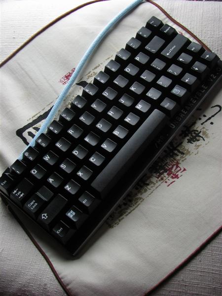
- IMG_8518 (Medium).JPG (50.5 KiB) Viewed 7206 times
Can you notice how i cheated there?

Posted: 08 May 2012, 18:05
by off
Can't see it xD Looks legit!
Your brightness/contrast gets me; could be my new monitor as well :/
Well ofcourse no single press function keys, but meh, how often do you need those? I mean once in a while an fn-2 or fn-5 seems perfectly fine..
I do notice for the first time that your delete is higher than the rest of the row, pretty effective I'd think.
AAAANYHOW, back on topic- how are you liking that chameleon?

Posted: 08 May 2012, 18:16
by Maarten
I actually use function keys and numerals mixed quite a bit (mainly when working with Autodesks junk).. and that delete is a row 4 profile key so its indeed higher (which i dislike btw) but oh well, usually i just throw any random other proper profiled key on there cuz i type blind most of the time and then profile is more important to me than the actual marking on the key (thats also why i prefer the grey SP DS keycaps, they have those funny notches on the F and J and i prefer those over cherries deep-cut F/J profiles)
And erm.. talking bout the chameleon is NOT back on topic

But look closer at that all black board... theres something really odd going on if you compare it to the one i posted earlier. Hint; count the total number of keys

Posted: 08 May 2012, 18:30
by off
I only counted 13 keys to be sure

But that's very functional, space is way too big anyhow
 Honestly, I'd say that higher profile for that key is good, hence my remark. Seeing how it's not part of the alpha block afaik and has an extra function (like print/page/del/..)
 Pff, it is part of alpha.
and indeeed I confused my own threads xD
tsk tsk tsk... blaming it on watching Natural Selection 2 games and stressing over round4 again.
To make up at least one functional remark in this post: I like f/j deep. Not sure which I ultimately prefer, but I've definitely come to like the dips over the nips/strips so far. Especially paired with the smoothness the cherry doubleshots bring to the table.
Posted: 25 Jun 2012, 14:41
by off
Bump!
Adding this as a pic here, since it just deserves it (mentioned in OP, but just came across another pic; don't worry, cleaned it):
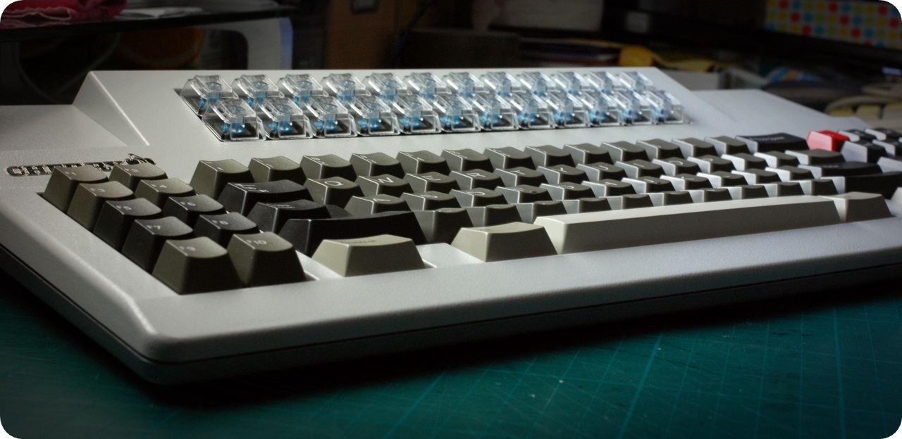
Mass' beautiful 2100 saver.
Posted: 25 Jun 2012, 19:25
by Maarten
Ooooooh that looks like a great board! Nice picture as well!
Posted: 25 Jun 2012, 19:28
by Half-Saint
CeeSA wrote:sixtys board.jpg
Da ultimate Cherry keyboard!!!


 Mass' beautiful 2100 saver.