Page 1 of 1
[IC] Hackdura 70%
Posted: 01 Jun 2016, 19:51
by MrBishop
The Hackdura originated as project Ultrahack an idea to give more function to a compact style keyboard. I have teamed up with Van Keyboards to bring a new van to the the world. In a tribute to the A-Team TV show this keyboard is themed around the 1983 GMC Vandura that BA drives in the show. custom cap set has come under some controversy but its an interest check and not everyone will like the keyboard cap color theme. hence the other options. PURPLE! tell us what you think.
Features
Open Source
PCB with built on controller (TMK Firmware compatible)
Custom key cap set with extras
*case to be determined in this IC
(sandwich acrylic, acrylic/aluminum sandwich, all aluminum custom machined and anodized)
minimum GB entry level will be 50 orders.
cost is always a factor. we are working hard to ensure affordability as well as tools to ensure everyone can enjoy this board to its full potential.
future revisions of this board will be determined by its initial success. (Rev2 Bluetooth?)
Posted: 01 Jun 2016, 19:52
by MrBishop
reserved
Posted: 01 Jun 2016, 20:42
by Stabilized
Looks really interesting, I will keep an eye on this one. For keycap choice, I really liked the teal/grey you posted on the GH thread:

Posted: 01 Jun 2016, 20:46
by chuckdee
I like the A-Team theme. I usually don't like the untraditional color layout keysets, but this one looks good, and is very reminiscent of the A-Team.
Posted: 01 Jun 2016, 21:07
by MrBishop
Stabilized wrote: ↑Looks really interesting, I will keep an eye on this one. For keycap choice, I really liked the teal/grey you posted on the GH thread:

yeah i kind liked it too. it was based on some old keycap colors. but the purple really came out nice. cap color is still all up in the air. finding out if people just really hate the layout is first thing.
also this will likely be a DSA profile key cap set making it easier for people to swap keys out with other boards.
Posted: 01 Jun 2016, 21:46
by KRKS
Even if you get 2,5u keys somehow, I think that the right one is too far right to be able to comfortably press it while keeping fingers on the JKL: keys, as touch-typists do.
Also, you have a 6u spacebar, or this 2,5u-1u-2,5u mess. One of the reasons I promote 5,5u specifically is sane splitting.
Posted: 01 Jun 2016, 22:38
by evangs
KRKS wrote: ↑Even if you get 2,5u keys somehow, I think that the right one is too far right to be able to comfortably press it while keeping fingers on the JKL: keys, as touch-typists do.
Also, you have a 6u spacebar, or this 2,5u-1u-2,5u mess. One of the reasons I promote 5,5u specifically is sane splitting.
good points
Posted: 02 Jun 2016, 20:25
by MrBishop
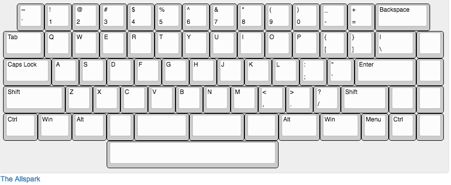
UPDATED LAYOUT PER YOUR COMMENTS
this will give support for more commonly available key caps.

- Screen Shot 2016-06-02 at 11.19.09 AM.png (34.23 KiB) Viewed 2530 times
Posted: 02 Jun 2016, 20:26
by evangs
MrBishop wrote: ↑UPDATED LAYOUT PER YOUR COMMENTS
this will give support for more commonly available key caps.
Screen Shot 2016-06-02 at 11.19.09 AM.png
also, not shown, iso support is planned
Posted: 02 Jun 2016, 20:28
by MrBishop
evangs wrote: ↑MrBishop wrote: ↑UPDATED LAYOUT PER YOUR COMMENTS
this will give support for more commonly available key caps.
Screen Shot 2016-06-02 at 11.19.09 AM.png
also, not shown, iso support is planned
because we know how much you LOVE ISO

Posted: 03 Jun 2016, 20:46
by chuckdee
MrBishop wrote: ↑UPDATED LAYOUT PER YOUR COMMENTS
this will give support for more commonly available key caps.
Screen Shot 2016-06-02 at 11.19.09 AM.png
Not sure about that top row. Of course, it could be because it's so different. What required the odd offset on the top row? And could it just be repositioned to normal offset, and adding a 5th macro key?
This is my fave color scheme.

Posted: 03 Jun 2016, 20:55
by MrBishop
chuckdee wrote: ↑MrBishop wrote: ↑UPDATED LAYOUT PER YOUR COMMENTS
this will give support for more commonly available key caps.
Screen Shot 2016-06-02 at 11.19.09 AM.png
Not sure about that top row. Of course, it could be because it's so different. What required the odd offset on the top row? And could it just be repositioned to normal offset, and adding a 5th macro key?
This is my fave color scheme.

we were trying to support more layouts AND more standard keys. the top row offset was more of a symmetrical thing but to your point we could just add another switch and shove it all over.
thanks for your feedback!
