Page 1 of 2
Why IBM Model M's Number Row Is Not Helvetica But Alphas Are
Posted: 27 Mar 2012, 15:41
by ripster
I finally figure this puzzle out that has been bugging me for YEARS!
But before I do:
1. Will everyone yell at me like you do at GlossyWhite?
2. Who already knows the answer? For if you do I don't want to hear about it later.
3. Who doesn't care. That's OK, feel free to post. It just bumps the thread.
Posted: 27 Mar 2012, 15:49
by huttala
Why not just tell us instead of being like "haha I know, I know, but I won't tell you"?
Posted: 27 Mar 2012, 16:18
by kps
The normal consist of a metal or film font in the days before computer vector typefaces does not include all the characters that appear on a computer (or Wheelwriter) keyboard, so they had to roll their own.
Posted: 27 Mar 2012, 16:19
by ripster
Because I have to take pics.
Lot of work doing Haha OR AHA! posts.
Posted: 27 Mar 2012, 16:24
by ripster
kps wrote:The normal consist of a metal or film font in the days before computer vector typefaces does not include all the characters that appear on a computer (or Wheelwriter) keyboard, so they had to roll their own.
OOooh!
I LIKE this answer! But not quite. Dollar sign and the at sign (monkey tail - lol) have been around a LONG time.
Helvetica Neue

IBM Model M
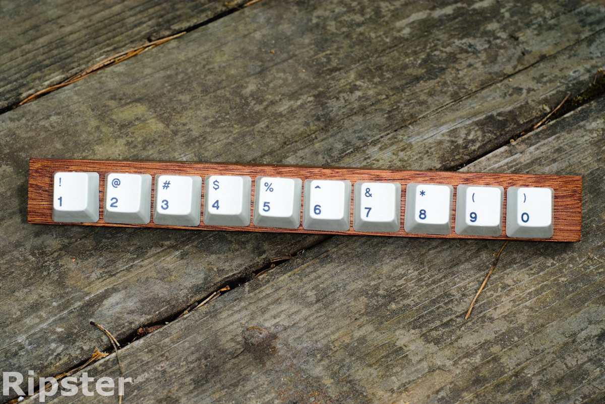
- FLA_9551.jpg (928.67 KiB) Viewed 6647 times
I'll take pics when I get a chance.
Posted: 27 Mar 2012, 16:27
by itlnstln
Not sure what forum you're hanging out on, but here's my attempt (from GH):
ripster wrote:(Dyesub is a bit of a fuzzy process)
Is this a clue? Some of the symbols, in Helvetica, would look terrible in dye sub... especially "$" and maybe "@."
Posted: 27 Mar 2012, 16:50
by ripster
Nope.
- FLA_4520-2.jpg (396.88 KiB) Viewed 6637 times
And we have to stop meeting like this.
I'll take more pics of the Monkey Tail when I get a chance today. Busy AM.
Posted: 27 Mar 2012, 16:55
by kps
ripster wrote:Dollar sign and the at sign (monkey tail - lol) have been around a LONG time.
They were around, but not generally part of a normal font (a 'font' being a set of metal sorts of some typeface). The dollar sign is an exception, for American foundries, though I don't know whether one was originally cut for Helvetica. Printers would use 'handy sets' of special characters — at signs, percent signs, fractions, and so on — that didn't necessarily match any particular typeface exactly. (You can still
buy them; at signs are particularly popular now that business cards typically display email addresses.)
Posted: 27 Mar 2012, 19:23
by ripster
Isn't America Great!
Archibald Binny was an Edinburgh punchcutter who emigrated to Philadelphia in 1795. Here he met James Ronaldson, a businessman also from Edinburgh. The two Scots combined their business and technical skills to open Binny & Ronaldson, the first successful American typefoundry, in 1896. This company’s success marked the beginning of the end of America’s reliance on Europe for type. According to Updike, in 1797 the company cast the first ever dollar signs. They also produced the first American type specimen books, in 1809 and 1812.
But anyhoo, any guesses why IBM didn't just stick with the Model F XT linethrough Dollar fonts? That is one I don't know. And back in the old days I would have thought at LEAST the @ was cut for Helvetica.
Ooh, nice
@ here.
Posted: 27 Mar 2012, 19:40
by webwit
The Model F XT was before Sonoran Sans Serif, the others after.
Posted: 27 Mar 2012, 19:44
by ripster
Uh. Snooooren. Nice try.
Hey, ItlnStln the HTML wiz says you fooled me about default Deskthority.net fonts!
Posted: 27 Mar 2012, 20:29
by webwit
It was an elaborate effort to sell books about fonts to gullible people decades later.
Posted: 27 Mar 2012, 20:44
by ripster
I think IBM knew that Model M's would be Hipster some day and wanted us to have something to talk about.
And run through this HTML stuff again....I just want to learn enough about fonts to impress female Art Majors.
Code: Select all
.content {
	font-size: 11pt;
	line-height: 14pt;
	margin-bottom: 1em;
	font-family: "Lucida Grande", "Trebuchet MS", Verdana, Arial, Helvetica, sans-serif;
	overflow: hidden;
}
Trebuchet. Definitely says Trebuchet.
Posted: 27 Mar 2012, 21:08
by webwit
It uses the first font in the list your system supports.
Posted: 27 Mar 2012, 21:18
by itlnstln
webwit wrote:It uses the first font in the list your system supports.
Unless he doesn't have Lucida Grande. He uses Windows, so he's probably getting Trebuchet; I had to install Lucida Grande on my Windows install. Lucida Grande is a better font, IMO.
Posted: 27 Mar 2012, 21:22
by webwit
Like, the first font your system supports.
Posted: 27 Mar 2012, 21:37
by Charlie_Brown_MX
itlnstln wrote:Lucida Grande is a better font, IMO.
*Much* better. It’s optimised for use on the screen for one, and it doesn’t have the slightly eccentric character of Trebuchet. It’s just a shame Apple seem hellbent on abandoning it as their UI font of choice…
Posted: 27 Mar 2012, 21:39
by itlnstln
webwit wrote:Like, the first font your system supports.
Word. I can't read, apparently.
Posted: 27 Mar 2012, 22:25
by ripster
I have to say Deskthority.net looks grand on both my Windows PC in Trebuchet and my iPad in Trebuchet and am always willing to learn
despite being called a "insensitive clod". In fact I thought "Insensitive Clog" was what they danced at the Dutch Tulip Festivals.
But this is not the quest at hand.
Now THIS was VERY close.
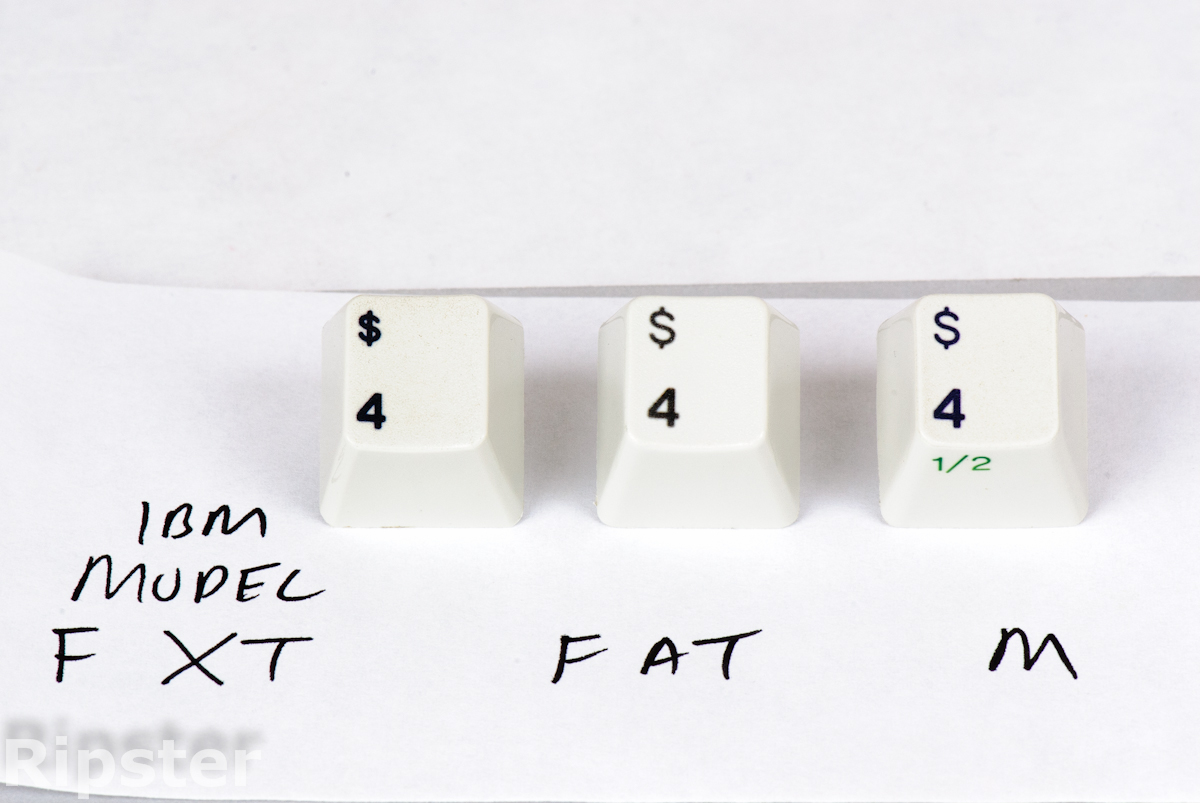
=kps IBM used 'open' dollar signs on everything from the 029 through the Displaywriter. The shapes are not identical to the M/F keyboards, though.
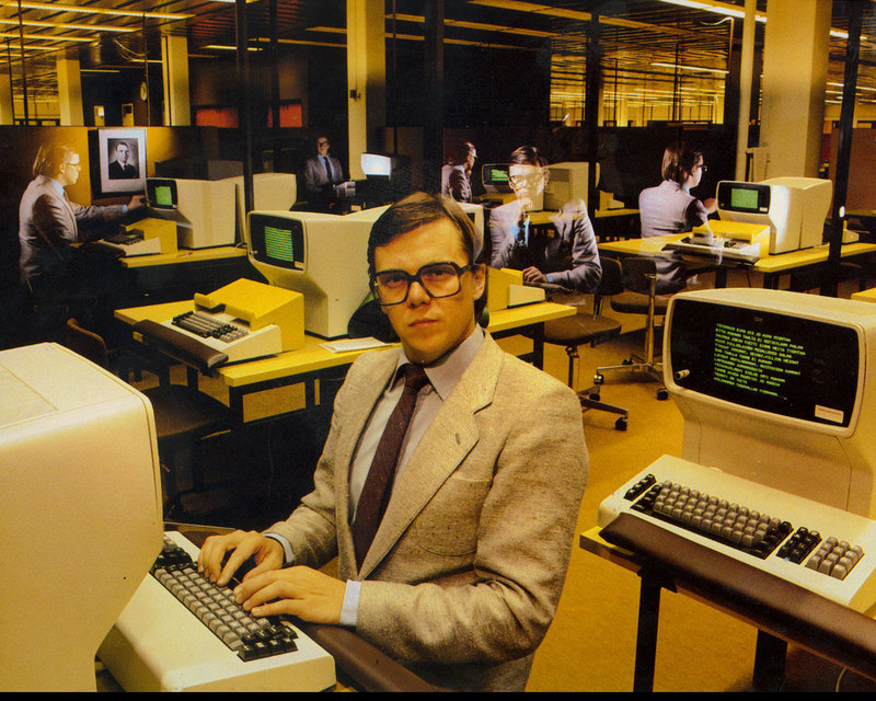
- man-at-old-computer.jpg (185.6 KiB) Viewed 6536 times
http://www.columbia.edu/cu/computinghistory/029.html
The IBM 29 Card Punch (also called the 029 or Type 029 Key Punch or Keypunch), introduced about 1964 to coincide with the introduction of the IBM 360. Available in nine models with various combinations of keyboard (12-key numeric or 64-key alphanumeric), zero insertion, printing, and interpreting, and also as the IBM 59 Card Verifier (for verifying that cards punched on the 29 were correct).
Posted: 27 Mar 2012, 23:43
by daedalus
Ooh, 3277 terminals ^^^
The size of of the numbers has definitely changed - when I compare the number row from my 122-key Model F to the number row from my SSK, the latter have consistently bigger print than the former.
Posted: 28 Mar 2012, 00:43
by Findecanor
I think that the big deal is that you want O and 0 to look different.
Posted: 28 Mar 2012, 01:35
by webwit
Vintage IBM promotional photo and no IBM babes? I object.


Posted: 28 Mar 2012, 03:15
by ripster
Edited my previous post. iOS does not support Lucida Grande so indeed I am looking at Trebuchet YET again. I thought the g looked odd.
I will now take pics of the non-Helvetica "at" symbol.
Germans call it the Affenschwanz - the Monkey's Tail.
I'd post a screenshot but I'm on my iPad.
Posted: 28 Mar 2012, 03:37
by webwit
I thought you knew all the memes and
jargon.
Re: Why IBM Model M's Number Row Is Not Helvetica But Alphas
Posted: 28 Mar 2012, 10:52
by itlnstln
ripster wrote:I have to say Deskthority.net looks grand on both my Windows PC in Trebuchet and my iPad in Trebuchet and am always willing to learn
despite being called a "insensitive clod". In fact I thought "Insensitive Clog" was what they danced at the Dutch Tulip Festivals.
But this is not the quest at hand.
Now THIS was VERY close.
=kps IBM used 'open' dollar signs on everything from the 029 through the Displaywriter. The shapes are not identical to the M/F keyboards, though.
man-at-old-computer.jpg
http://www.columbia.edu/cu/computinghistory/029.html
The IBM 29 Card Punch (also called the 029 or Type 029 Key Punch or Keypunch), introduced about 1964 to coincide with the introduction of the IBM 360. Available in nine models with various combinations of keyboard (12-key numeric or 64-key alphanumeric), zero insertion, printing, and interpreting, and also as the IBM 59 Card Verifier (for verifying that cards punched on the 29 were correct).
Damn, look at those wrist rests.
Posted: 28 Mar 2012, 10:59
by woody
itlnstln wrote:ripster wrote:man-at-old-computer.jpg
Damn, look at those wrist rests.
I was focused on the photo-play and totally missed the wrist rests.
These chaps knew their stuff.
Posted: 28 Mar 2012, 11:35
by Lustique
I propose substituting Lucida Grande/Lucida Sans Unicode with Frutiger (or something along the line). Lucida doesn't even come with a real oblique type, let alone italics.
Posted: 28 Mar 2012, 15:40
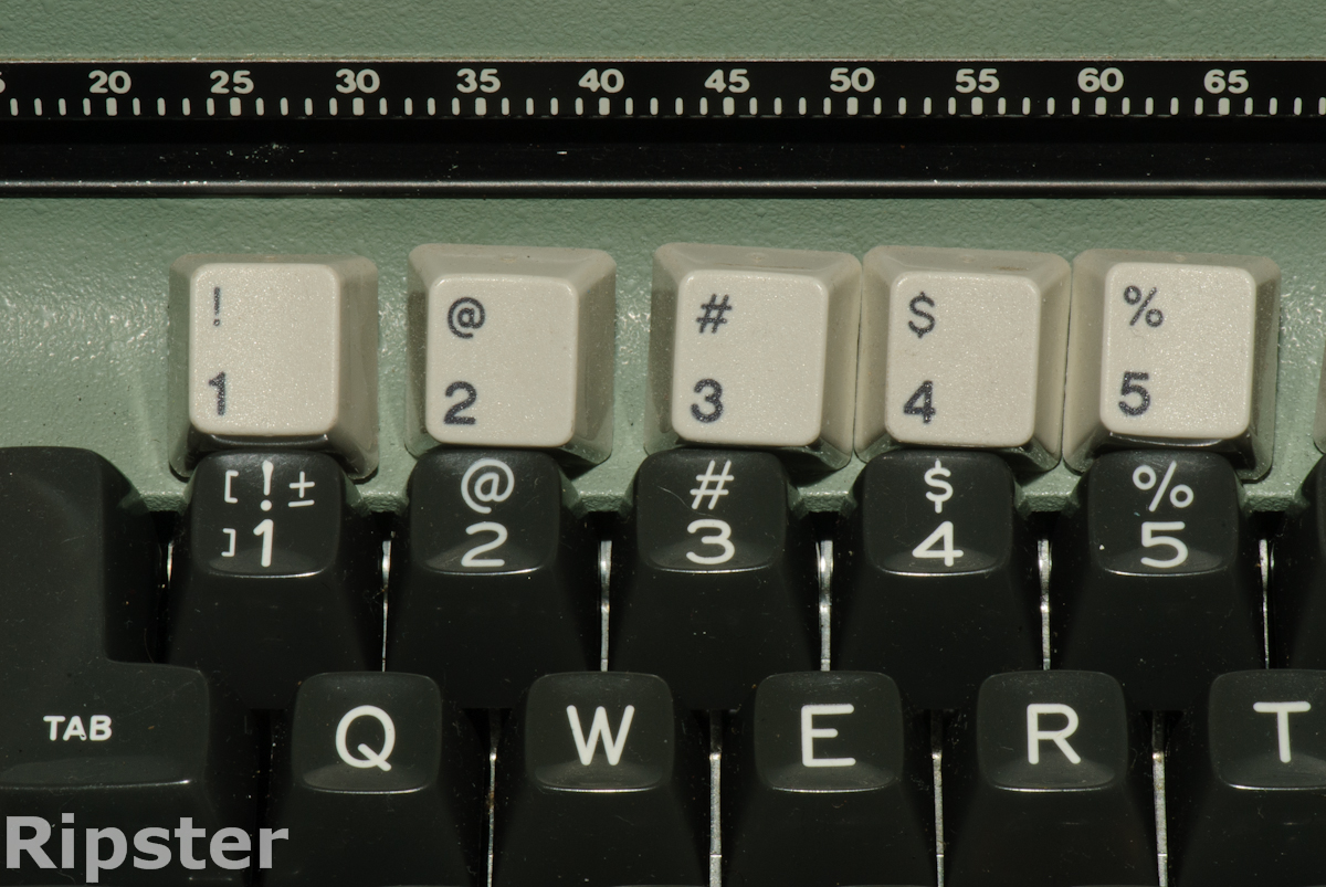
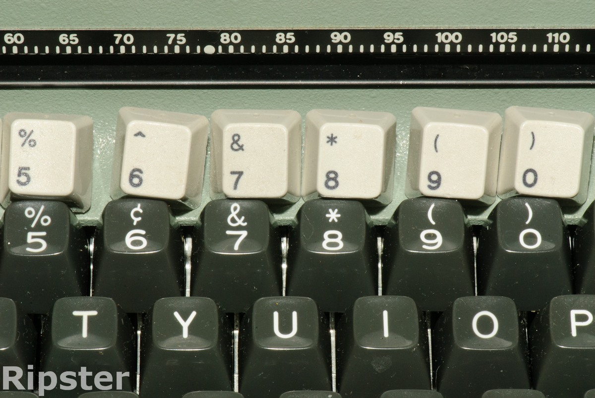
by ripster
So ANYHOO nobody can guess the origins of the Number Row Font? The Trick is to walk in the shoes of a IBM engineer working for this guy.
Note to iMav. Deskthority is more iPad friendly than Geekhack.
Sent From Brother Ripster's iPad
Posted: 28 Mar 2012, 16:16
by kps
ripster wrote:So ANYHOO nobody can guess the origins of the Number Row Font? The Trick is to walk in the shoes of a IBM engineer working for this guy.
That's easy! You copy the new Selectric III keyboard.
Posted: 28 Mar 2012, 16:30
by ripster
kps wrote:ripster wrote:So ANYHOO nobody can guess the origins of the Number Row Font? The Trick is to walk in the shoes of a IBM engineer working for this guy.
That's easy! You copy the new Selectric III keyboard.
AND WE HAVE A WINNAH!!!!
- D20_4530.jpg (630.27 KiB) Viewed 6380 times
- D20_4531.jpg (698.88 KiB) Viewed 6380 times
I will conveniently ignore the Ampersand has a shorter tail for randomness must have been common during the chaotic birth of the IBM PC.
Kps - you want a genuine Keyboard Company Beer Coaster? PM me your address and I can send you one with the oblig lego.
- FLA_4482-2-Edit.jpg (832.57 KiB) Viewed 6380 times