Ursa
Posted: 10 Dec 2025, 00:03
I've been waiting a while for this.
Proper, no-shit, authentically good caps for Topre that aren't Topre's own creation. Caps with solid colours and a superb shape. At last: Andreas and FKcaps delivered!
Needless to say, I placed quite an order when I heard about Ursa. Then much time passed and I very almost forgot about it. An email showed up telling me that pre-orders had started shipping, and mine just showed up in stormy Scotland today. Without any UK customs fees on top, I might add, to my sincere relief! What was past me thinking ordering all this? Well, it turns out he done pretty good.
Sphericals on Topre? Do I like them? Is the Pope Catholic?
These boys are incredible! The shape is magnificent, especially the convex front row which I just love. That looks so classy on an old school Realforce 87u. And the colours, dayum son, they'll take your eyes out…
I pulled out my Canon and flash just to make the best of these. They absolutely deserve it. They're fantastic!
Back when I was getting into fancy caps, back in the days of Round 5—ask your grandparents, kids—how I wished there were caps that good for the keyboards I really loved the most. I had no idea it would take so long, but now we're here on Topre I am bloody loving it!
The texture on these comes across very nicely. The feeling of the caps—they're doubleshot PBT, a thing which did not exist when I was first into this—is different to Topre's classic dyesubs but still definitely PBT. They're just the kind of classy I expect on my HHKB and Realforce.
Yes, I threw a silver "artisan" into the mix. It's certainly shiny. Rides a little high for my liking, though. But how am I to trim that stem a bit to make it flush with its brothers?
Did I mention the convex mods yet? They're brilliant! I’m sure I was asking for these here 12 years ago!
My 55g Realforce 87U has never looked better! Ya beaut!
The black HHKB Pro 2 doesn't look half bad either…
Compared to the black-on-black ninja look this keyboard has rocked since its inception, the colours on these are just outrageous, in the best possible way!
Now, anyone old and crotchety enough to remember what I’m like will tell you that I’m a fussy bugger when it comes to caps. It's not just looks, it's function. How are the homing bumps on these, for instance?
Very nice. They feel much more pronounced than you might think, stuck at the side of a dish like that. Not that they're over-done, either, just that I like them. I can feel where they are when I go to home-row, and they don't annoy me while I’m typing in earnest. I like them a lot better than Round 5's deep dishes, actually. These are the best homing markers I've encountered on spherical caps.
The legends are downright scrumptious.
Spot the one OG Topre dyesub hiding in plain sight. The mounts on these—unlike certain other attempts—are a perfect match for Topre keyboards. Even the metal one fits quite nicely, if a bit too proud for his own good.
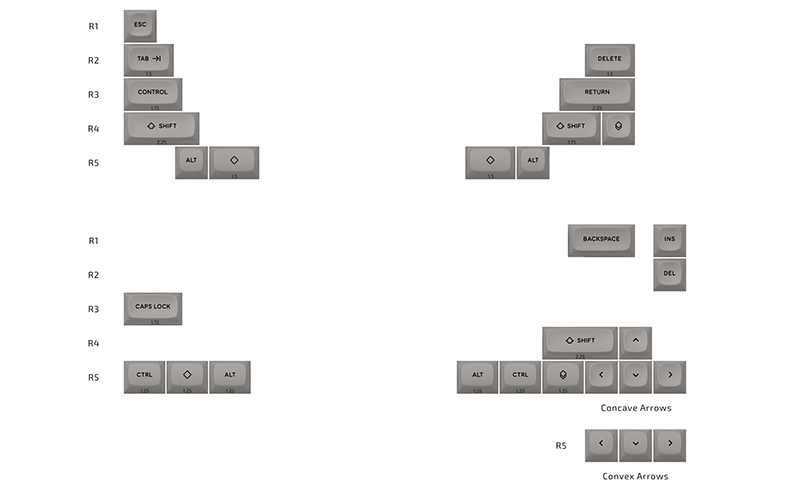
Oh yeah, and this one key is such a relief to see: a 90º rotated mount 1.5 unit Control key, just for the oldschool "R1" Realforces out there, like mine. Phew! If it weren't for that, I'd be buggered.
Past me did a fair job in kit selection for this order. I figured I could make do with the classic colour way, for the Realforce, and the black colour way for the ninja HHKB. Chuck in some red mods and blue mods for variety, that silver artisan, some domes…
The downside being I've now two rather nice numpads worth of keys and nary a Topre numpad to put them on. Don't tell me I’m on the hunt for one of them after all?
I have like six of these…
I’m sure I'll put them on my beloved workhorse HHKB Type-S soon, too. It'll pop in its own way with these.
So aye, that was my "review" of Ursa. This was not paid content, I’m the one who did the paying! But damn these are lovely caps! They're the stuff that dreams are made of. Topre dreams…
- Busy.jpg (1.45 MiB) Viewed 2267 times
- Frontal.jpg (1.43 MiB) Viewed 2267 times
- Classic.jpg (1.18 MiB) Viewed 2267 times
- Topshot.jpg (1.75 MiB) Viewed 2267 times
Needless to say, I placed quite an order when I heard about Ursa. Then much time passed and I very almost forgot about it. An email showed up telling me that pre-orders had started shipping, and mine just showed up in stormy Scotland today. Without any UK customs fees on top, I might add, to my sincere relief! What was past me thinking ordering all this? Well, it turns out he done pretty good.
- Panelled.jpg (1.22 MiB) Viewed 2267 times
- Dayum.jpg (1.22 MiB) Viewed 2267 times
- Popping.jpg (1.29 MiB) Viewed 2267 times
- Popfilter.jpg (1.16 MiB) Viewed 2267 times
- Dishes.jpg (1.26 MiB) Viewed 2267 times
- Dishesoblique.jpg (1.3 MiB) Viewed 2267 times
- Bam!.jpg (1.15 MiB) Viewed 2267 times
- Texture.jpg (1.21 MiB) Viewed 2267 times
- Steely.jpg (886.93 KiB) Viewed 2267 times
- Shine.jpg (647.55 KiB) Viewed 2267 times
- DoubleSteel.jpg (1.04 MiB) Viewed 2267 times
- Steely2.jpg (970.79 KiB) Viewed 2267 times
- Knurled.jpg (1.13 MiB) Viewed 2267 times
- Curves.jpg (865.81 KiB) Viewed 2267 times
- Curvy.jpg (1.76 MiB) Viewed 2267 times
- Black vs. White.jpg (1.27 MiB) Viewed 2267 times
- Oldschool.jpg (1.48 MiB) Viewed 2267 times
The black HHKB Pro 2 doesn't look half bad either…
- Redred.jpg (807.32 KiB) Viewed 2267 times
- Blackness.jpg (763.16 KiB) Viewed 2267 times
- Reverse.jpg (1.41 MiB) Viewed 2267 times
- J.jpg (1.01 MiB) Viewed 2267 times
The legends are downright scrumptious.
- Legends.jpg (1.19 MiB) Viewed 2267 times
- Dyesub and Doubleshots.jpg (794.66 KiB) Viewed 2267 times
- Side eye.jpg (1.45 MiB) Viewed 2267 times
- Blueboys.jpg (1.25 MiB) Viewed 2267 times
- Reinforcements.jpg (1.42 MiB) Viewed 2267 times
- Box.jpg (852.94 KiB) Viewed 2267 times
So aye, that was my "review" of Ursa. This was not paid content, I’m the one who did the paying! But damn these are lovely caps! They're the stuff that dreams are made of. Topre dreams…
- Dutch.jpg (1.24 MiB) Viewed 2267 times
- Dreams.jpg (684.51 KiB) Viewed 2267 times