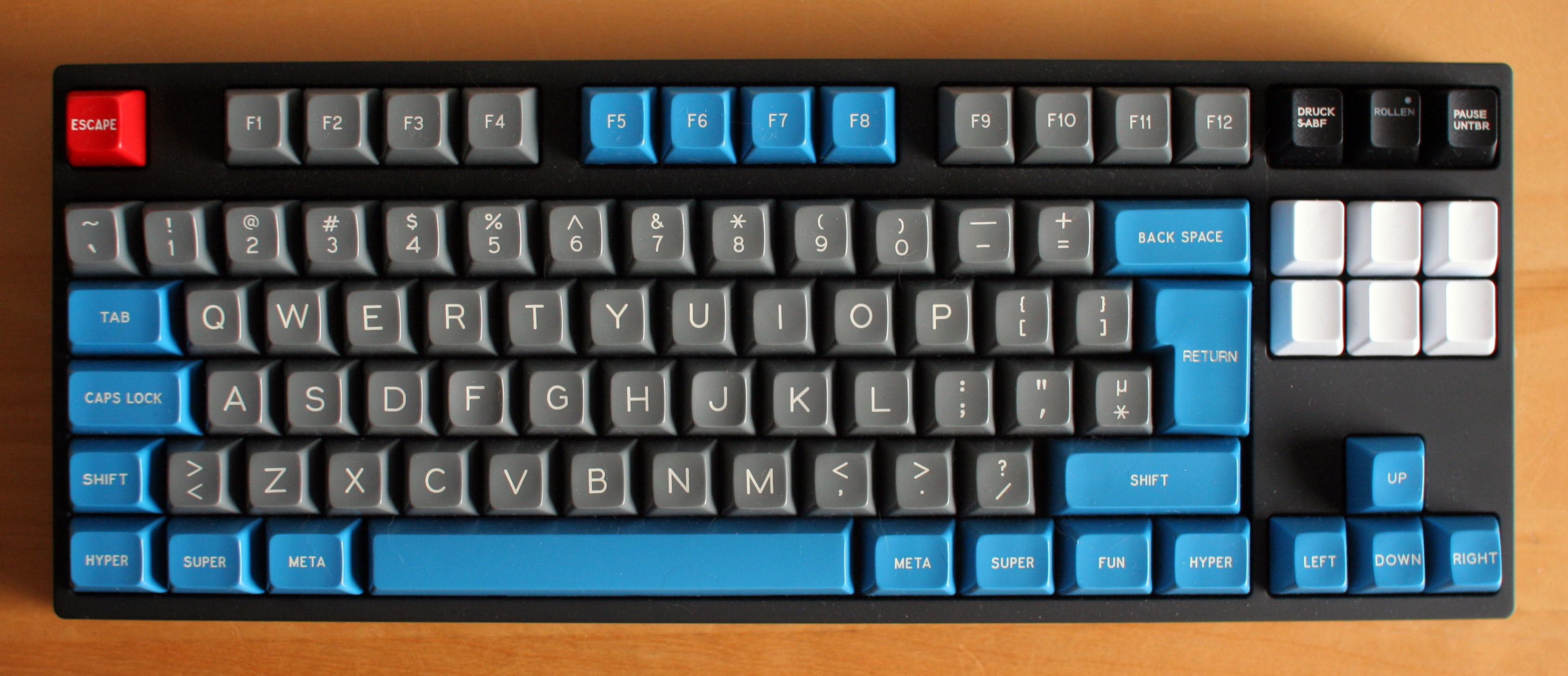
Hi! Sorry if this is in the wrong place but I was wondering what the name of the font is that was used on the keycaps found in Honeywell keyboards and what seems to be most keyboards from around that era.
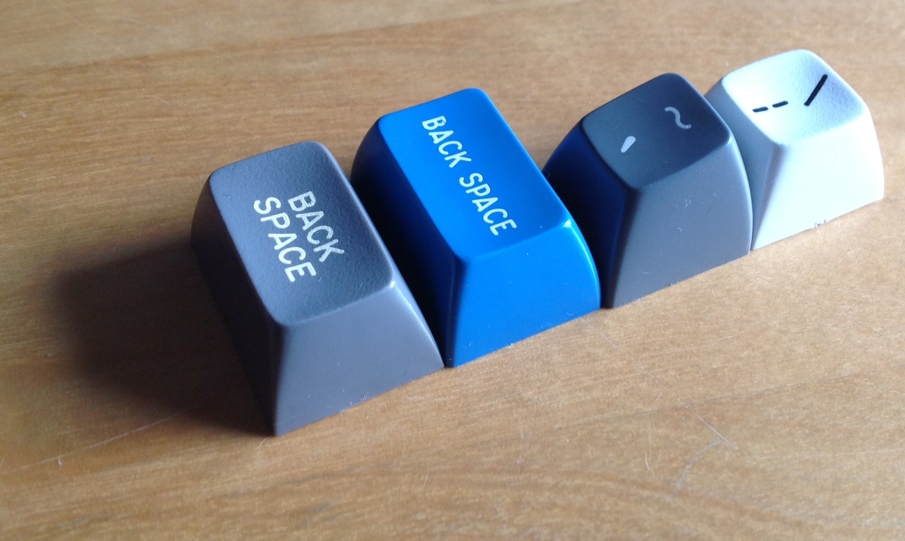
These:
Thanks!
Honeywell Keycap Font?
-
- Location: Europe
- DT Pro Member: -
It looks a lot like the font used by Signature plastics for their DSA keys.koalapear wrote: ↑Hi! Sorry if this is in the wrong place but I was wondering what the name of the font is that was used on the keycaps found in Honeywell keyboards and what seems to be most keyboards from around that era.
Have you got a more detailed picture?
- Muirium
- µ
- Location: Edinburgh, Scotland
- Main keyboard: HHKB Type-S with Bluetooth by Hasu
- Main mouse: Apple Magic Mouse
- Favorite switch: Gotta Try 'Em All
- DT Pro Member: µ
Here:
http://deskthority.net/photos-f62/a-hon ... t6296.html
I have that keyboard. The font is similar, but not identical, to "Gorton Modified" as used in SP's doubleshots (of all profiles):
The real difference is with symbols like brackets, where the Honeywell has more emphasis than SP.
http://deskthority.net/photos-f62/a-hon ... t6296.html
I have that keyboard. The font is similar, but not identical, to "Gorton Modified" as used in SP's doubleshots (of all profiles):
The real difference is with symbols like brackets, where the Honeywell has more emphasis than SP.
-
- Location: Europe
- DT Pro Member: -
Slight detour: Desn't SP uses Gorton Modified for DCS and a different font for DSA?Muirium wrote: ↑I have that keyboard. The font is similar, but not identical, to "Gorton Modified" as used in SP's doubleshots (of all profiles)
I have been told that the font used for the Macross set (DSA) is not Gorton Modified but the standard SP DSA font.
- Muirium
- µ
- Location: Edinburgh, Scotland
- Main keyboard: HHKB Type-S with Bluetooth by Hasu
- Main mouse: Apple Magic Mouse
- Favorite switch: Gotta Try 'Em All
- DT Pro Member: µ
Nonsense, as far as I know.
Macross:
Round 4 SPH (definitely Gorton):
(Note the telltale SP rendition of "SHIF T". Looks the same to me.)
So long as the caps are doubleshot, the font is either Gorton Modified or (brace yourself) one of these:
Helvetica is about as close to Gorton as it is to Verdana, which is to say: NOT CLOSE! They are both sans, but so are about half of all fonts in existence.
Dyesub, meanwhile, can handle entirely bespoke legends across the whole keyboard. And so any font at all. Such as Matteo's gorgeous Gotham PBT Granite set.
Macross:
Round 4 SPH (definitely Gorton):
(Note the telltale SP rendition of "SHIF T". Looks the same to me.)
So long as the caps are doubleshot, the font is either Gorton Modified or (brace yourself) one of these:
http://keycapsdirect.com/processes.phpSP wrote:There have been numerous inquiries as to the actual "font" that Signature Plastics uses for their standard keycaps. Over 30 years ago a font was developed, based on a modified IBM standard, using a Gorton engraving machine. Thus our standard font, Gorton Modified was born.There is no electronic file of this particular font, however Arial or Helvetica come very close.
Today we can offer 3 additional line fonts - subject to a fee.
Check out the link to the left for specifics!
Helvetica is about as close to Gorton as it is to Verdana, which is to say: NOT CLOSE! They are both sans, but so are about half of all fonts in existence.
Dyesub, meanwhile, can handle entirely bespoke legends across the whole keyboard. And so any font at all. Such as Matteo's gorgeous Gotham PBT Granite set.
Spoiler:
- Hypersphere
- Location: USA
- Main keyboard: Silenced & Lubed HHKB (Black)
- Main mouse: Logitech G403
- Favorite switch: Topre 45/55g Silenced; Various Alps; IBM Model F
- DT Pro Member: 0038
@Muirium: How are fonts modified for printing on concave spherical surfaces? If the font is, say, true Helvetica as printed on a flat surface, when printed on a concave spherical surface such as a spherical keycap, is it Helvetica on the keycap, as perceived by the eye, or is it a spherical projection of Helvetica (or spherically modified Helvetica)? At some point, the original font must be modified in order to undergo the transformation from planar to spherical.
- Muirium
- µ
- Location: Edinburgh, Scotland
- Main keyboard: HHKB Type-S with Bluetooth by Hasu
- Main mouse: Apple Magic Mouse
- Favorite switch: Gotta Try 'Em All
- DT Pro Member: µ
That's true. And I think it's more of a live issue when considering dyesubs. The way those are made is with a flat piece of film (I don't know the material) which has the legend printed on it with ink, which is then pressed against a blank cap and baked in an oven for an extended period of time. From what I've gathered through Matt's work on Granite, the legends are considered entirely flat. The distortions when seen on a spherical surface are not accounted for. He would know more than me, though. As I don't even have my Granite caps yet. When I do, I can compare them with the vector legends Matteo submitted to SP.
As for doubleshots, I think the font is extruded vertically into the plastic. That way, regardless of the cap shape, the font should look right when viewed straight down by a distant observer. This also means they can use the same Gorton Modified font on all doubleshot cap families. There's no need to transform it digitally, it is all done in the material tools.