A little envelope arrived, containing a well wrapped little ANSI Return key. Thanks Stratokaster!

This is a recent Unicomp 2.25u Return. So let's see if we can spot it among its peers:

- Desk Plan.jpg (134.1 KiB) Viewed 8681 times
The cold blue winter light's not doing us any favours, but you can see the differences in legends plainly enough. Three different Return keys: three quite different weights of print!

- Desk Low.jpg (90.32 KiB) Viewed 8681 times
And oh yeah, the "Return" vs. "Enter" thing! That's the giveaway: Unicomp's evidently switched over to calling Return "Return" like IBM should have always done. I'm not against it. The legend is an ENORMOUS improvement over that miserable 2015-era Enter of theirs you see on top. Its kerning's a little tight: "Retum" anyone? It's still a bit thick and compressed, as if they're worried about running out of space to print it on, or rather skimping on the stencil! And the baseline is a little low beside the arrow, but overall it's a good bit closer to the IBM SSK original in the middle.
Now, what about the colour? My old Unicomp cap always looked much too pale and creamy brown to match the SSK's own set.

- Installed Plan.jpg (85.13 KiB) Viewed 8681 times
Apologies for the lighting, which is making everything too monochrome. My pics show hardly any difference, but in reality the old Unicomp cap always stood out. Let me find an older picture… here's a couple of that very cap on my AT.
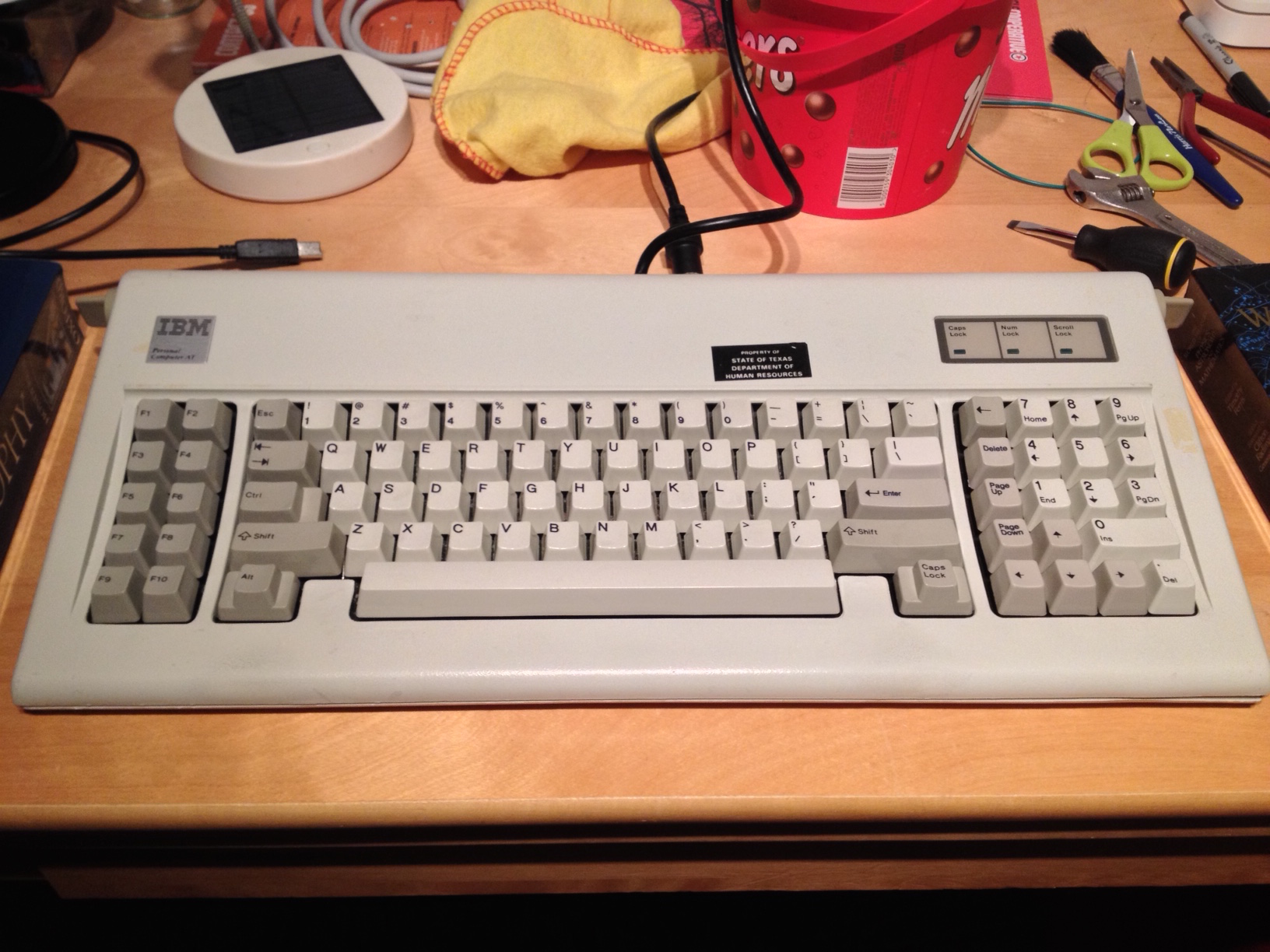
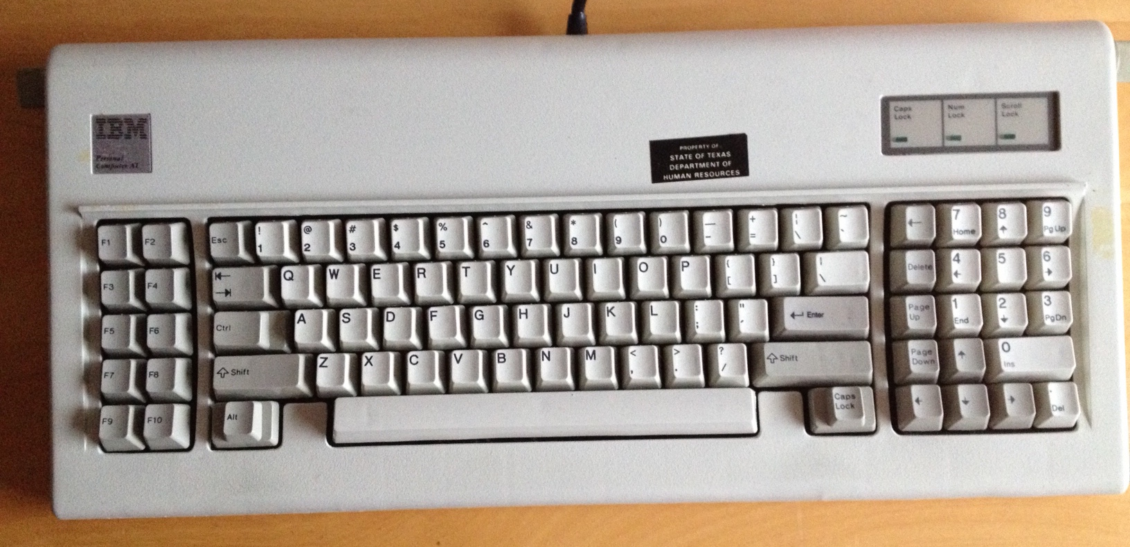
See what I mean? It always jumps out instantly in real life. I've put this new cap onto the SSK and will report when the light is right to tell. But it's at least most of the way there to matching the original. They upped their game a bit, thankfully.


