Long rambling stuff ahead warning. Read at your own peril!

The concept of making round characters slightly taller than flat ones is called overshoot. There is also another optical phenomena whereby horizontal strokes appear thicker than equally sized vertical ones. These articles have some nice visualizations.
https://frerejones.com/blog/typeface-mechanics-001
https://frerejones.com/blog/typeface-mechanics-002
http://typographica.org/on-typography/m ... type-work/
This latest round of revisions to the Beam Spring font came out of some template techniques I worked up while doing the F XT Quality repro legends for the Ellipse project. I now had a pretty accurate setup for getting all the stroke widths the same so I went about fixing things. I had just assumed that whatever kind of engraving machine IBM used to make the molds would result in consistent stroke widths but I started noticing stuff like this after fixing up the characters.
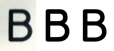
- Beam Spring B comparison.PNG (50.29 KiB) Viewed 10837 times
The left B is from the original scan from lot_lizard. The middle B is what things look like when you make all the strokes equal. Looks pretty good but the openings seem a bit small and the horizontal strokes now look too heavy when you compare it to the scan. When the horizontals are made a bit thinner, things start to look better as shown in the B on the right. Looking at the other characters with horizontal elements, I became convinced that I wasn't just seeing some distortion in the scan. This was how they were designed... like a real font.
The overshoot is something I am not as sure about since it is very difficult to get exact height measurements given the resolution of the scan I have to work with. The fuzziness around the edges of the letters is pretty much the same thickness as the amount the overshoot would be so it becomes a judgment call. Given the confirmation of the horizontal strokes being thinner, I decided to go with it. If they went to the trouble to use the horizontal stroke trick, there is no reason why they would not also incorporate overshoot. If I am wrong, it is pretty harmless and at least it makes the letters look like they are equal in height.

- Beam Spring overshoot 2.PNG (2.4 KiB) Viewed 10837 times
When we zoom in a bit, it looks like this.
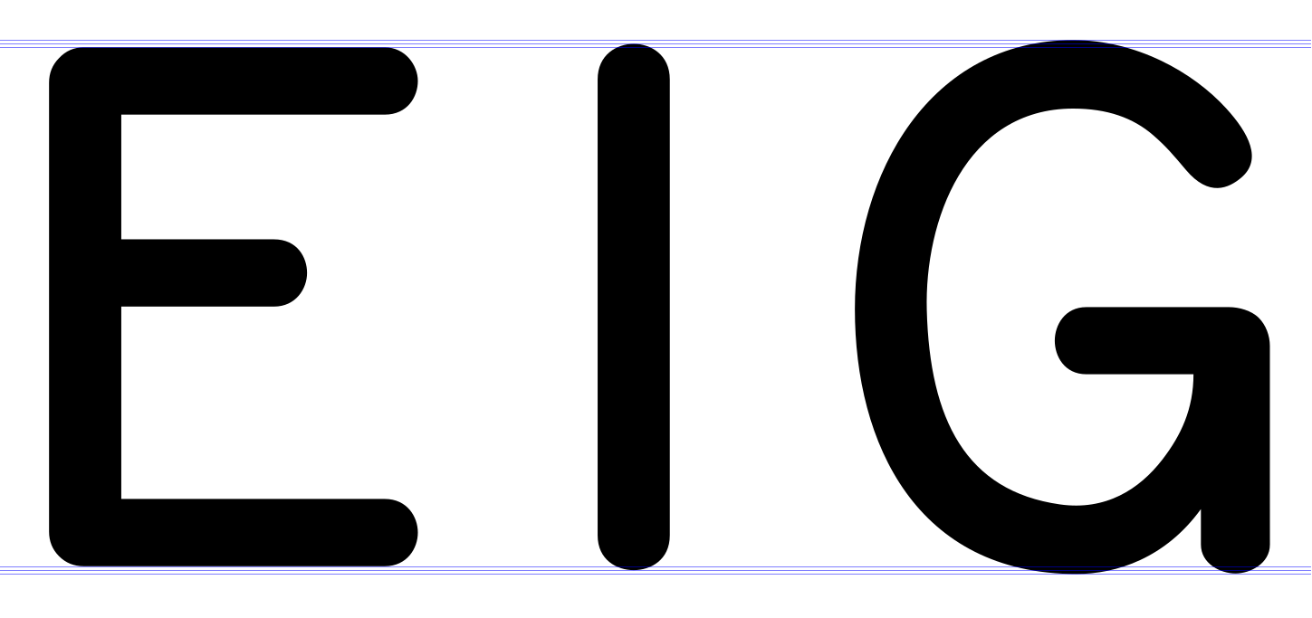
- Beam Spring overshoot 1.PNG (32.88 KiB) Viewed 10837 times
There are three different heights and three baselines to account for the flat stuff, the rounded ends and the big curves. Will any of this make a difference with letters that are less than 10mm high? I don't know, but I look forward to finding out.
BTW, IBM took all these tricks and pretty much threw them out the window when it came to the Model F font but that is a rambling diatribe for another time!


