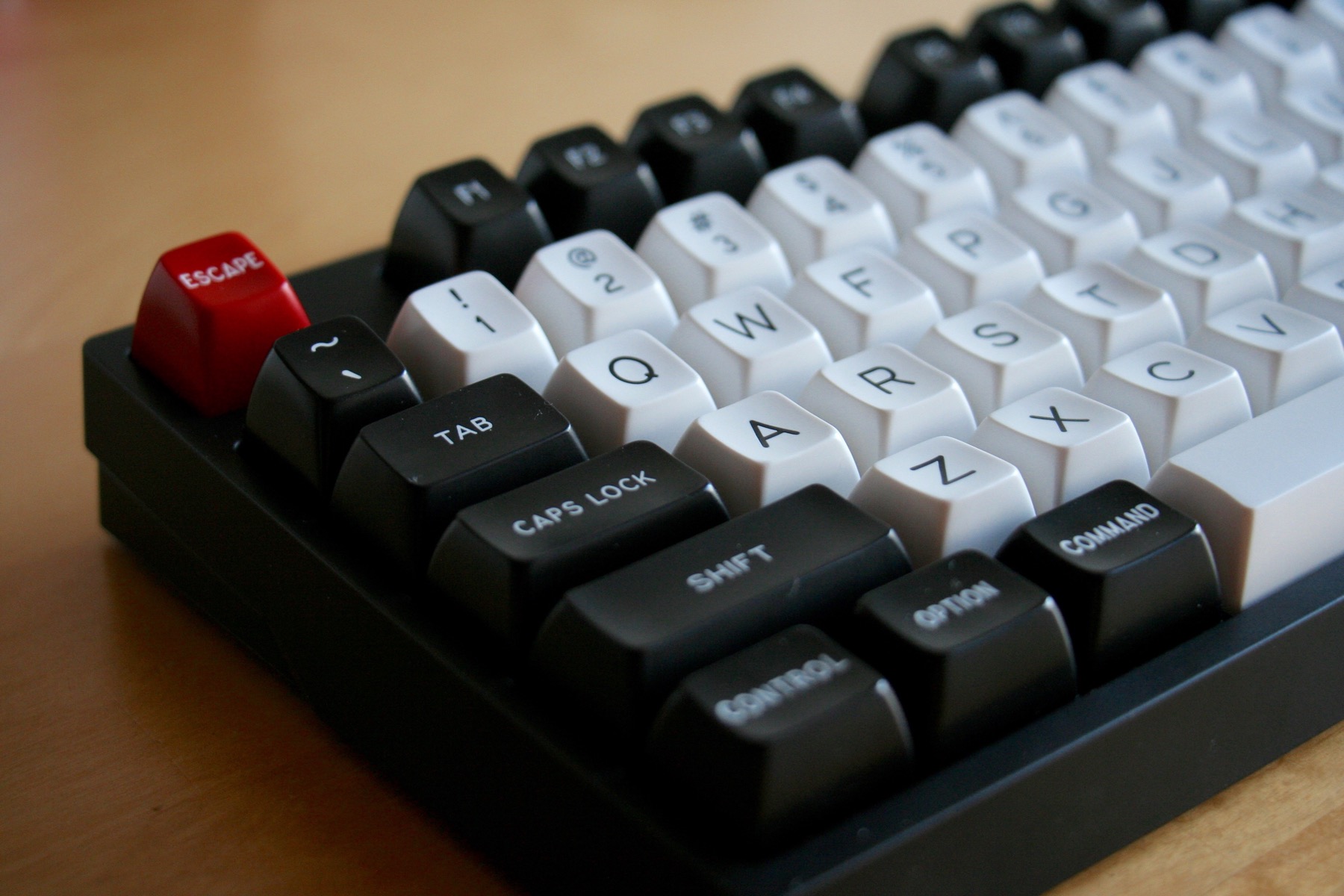
Designing the next Topre keycap set

User avatar
Muirium
µ

13 Aug 2015, 21:04

Khers wrote:
matt3o wrote: hi-pro unfortunately is not an option.
:(
As if!

Matteo, are you sill working on that other HiPro project? I know it's for MX mount at first. But one day, Beamspring profile on Topre mount, you shall be mine, oh yes!

Even if it's a 7bit kind of timescale…

User avatar
Hypersphere

13 Aug 2015, 23:18

Muirium wrote: Is the spacebar PBT or ABS?


@Hyper: My username's just a palinilap. Sorry, palindrome. It's there as a little unconscious reminder of how much I like symmetry. And yes there will be a muirium someday. How could we ignore the perfect name forever!
Yes, I like palindromes and other forms of symmetry. Even better when each letter has at least two-fold symmetry. One of my favorite courses was "Chemical Applications of Group Theory", which involved assigning chemical structures to point groups and carrying out symmetry operations on them.

Back to keyboards. Now I am typing on my RF 87UB 55g. I love the feel of this board, but I wish it were a 60% form factor. The navigation island seems an unnecessary appendage that is just in the way. Likewise, the top F-key row merely adds unwanted depth to the board's dimensions. The caps are wonderful, but I look forward to having more color choices. Actually, some of the former Topre standard issue would be fine (such as English Blue), especially if the prices were favorable.

User avatar
matt3o
-[°_°]-

14 Aug 2015, 08:18

Hypersphere wrote: Are blanks an option?
that should be easier. I'll try to push for that.
Muirium wrote: Matteo, are you sill working on that other HiPro project? I know it's for MX mount at first. But one day, Beamspring profile on Topre mount, you shall be mine, oh yes!
yes, still working on that. I was waiting for some more samples, but I actually got only a bunch. I had a punch from life few months ago and again last week. Hard times, but high profile PBT keycap is at the top of my priority list (as soon as the whitefox is ready).

User avatar
Madhias
BS TORPE

14 Aug 2015, 09:14

That's great news here! I always wanted to get a replacement Topre set for my Realforce, and now is the time to get one.

I like these colorways, the rather 'normal' ones:
matt3o wrote: This is clearly inspired by the special edition, but the blue is more cyan than deep blue.

Image

Image
Is it possible to make a different color on the alpha legends? Like red on beige? Or blue on beige?

User avatar
matt3o
-[°_°]-

14 Aug 2015, 09:50

yes, that would be possible.. but don't forget that the design has to be approved by Topre. we don't have complete freedom.

User avatar
sth
2 girls 1 cuprubber

14 Aug 2015, 11:24

just to reiterate: matt3o you are fantastic.

User avatar
Hypersphere

14 Aug 2015, 14:48

@matt3o: Thanks again for your leadership role in this endeavor. Everyone appreciates the great efforts you expend on behalf of the keyboard enthusiast community.

Regarding colors, I regret that I do not like the ones I have seen thus far. I prefer the former Topre "English Blue" to cyan or teal, and I prefer a lighter shade of grey. My preference is to have English Blue alphas and blank black mods, with an option to have blank black for the Backslash key to balance the color symmetry of the Tab key.

I don't think that Topre has offered blanks before, and this would be an easy option for them to implement.

Thanks again.

User avatar
Muirium
µ

14 Aug 2015, 14:55

Come on. Topre already makes black blanks. Those black on black Realforce keys look blank to me in anything but strong light!


@Matteo: How about a red, white and blue theme? Olivetti style blue on white alphas, but with black on blue mods, with a few red keys for spice. Or indeed the opposite: a red alert like theme, red on white alphas, black on red mods, with blue highlights. Those two colour ways would combine nicely for the kind of nutjob (hi!) who would buy both. Topre might appreciate that!

User avatar
matt3o
-[°_°]-

14 Aug 2015, 15:02

Hypersphere wrote: Regarding colors, I regret that I do not like the ones I have seen thus far.
guys, don't be afraid of hurting my feelings. I posted this here because I want suggestions and feedback. I just have passion, time and some skill with graphics software. Everything else comes from the community. The fact that people think that there are keycap gurus is pure bullshit.
Muirium wrote: @Matteo: How about a red, white and blue theme? Olivetti style blue on white alphas, but with black on blue mods, with a few red keys for spice. Or indeed the opposite: a red alert like theme, red on white alphas, black on red mods, with blue highlights. Those two colour ways would combine nicely for the kind of nutjob (hi!) who would buy both. Topre might appreciate that!
this, I like.

User avatar
Hypersphere

14 Aug 2015, 15:09

@Mu: Although the Black on very dark Grey caps look blank in dim light, they are not true blanks and the ghostly legends become distractions. It is also not possible to get a Black/dark Grey Topre keycap set except by purchasing a black keyboard. I recall that you have complained about Topre/HHKB black on dark grey caps before, insisting that they should be true blanks instead.

EDIT: It is possible to get keycap sets for the HHKB from EK, including black blanks.

I do like the Olivetti style, with a shade of blue similar to that of the original Olivetti. I am not fond of other blues, such as aqua, cyan, or teal.

Red could be good for accents. Red blanks would provide some flexibility, including 1x caps that could be used as Fn on a HHKB.
Last edited by Hypersphere on 14 Aug 2015, 15:27, edited 1 time in total.

User avatar
seebart
Offtopicthority Instigator

14 Aug 2015, 15:12

I'd like to see something like this with RGB mods:
Olivetti_ANK_25-101_--_Front.jpg
Olivetti_ANK_25-101_--_Front.jpg (639.35 KiB) Viewed 4422 times

User avatar
Muirium
µ

14 Aug 2015, 15:19

Damnit, those understated legends are tasty.

I'm not so big on RGB mods though, I'm more into Red White and Mu…
Hypersphere wrote: I recall that you have complained about Topre/HHKB black on dark grey caps before, insisting that they should be true blanks instead.
Aye, I'm just kidding about what I honestly consider woefully inadequate contrast on Topre's black on blacks. Keys that dark demand doubleshot. PBT keys that dark demand second thoughts!

I'm with you on the shade of blue. One I like, and think you might too, ought to be familiar to Matteo:

Image

Scotland and Italy are both azure nations. We usually cheer them on at the world cup (because we're far too shit to qualify, last time was 1998!) especially against our good pals the English.

User avatar
matt3o
-[°_°]-

14 Aug 2015, 19:28

talking to me about soccer is like talking about quantum physics to a bonobo.

User avatar
Muirium
µ

14 Aug 2015, 20:38

I'm less into sport than most people here too. But it's still a nice colour. I like the lack of green in it. Which I think was what Hypersphere's on about. Too green and you wind up with cyan shades of blue. Olivetti used those effectively in legends but I don't generally like aquamarine shades in solid colours, like the body of modifiers.

User avatar
tlt

14 Aug 2015, 22:17

I like that orange/yellow color, How about that color on the alphas?

User avatar
7bit

14 Aug 2015, 22:37

Please tell them to change their swiches to Cherry MX mounts and to sell their keyborads without key caps!
:evilgeek:

User avatar
Hypersphere

14 Aug 2015, 23:57

I just received a reply from the S. Korean seller on eBay called "widebasket" about Realforce keycap sets. He seems to be the only remaining source of Topre keycaps outside of Japan.

He said that there are no more blue or red sets available and there is no plan to get them back in stock.

I really like the blue Topre keycaps (black legends on English blue background). I hope that this color can be included. Thank you for considering it.
Topre_Blue.PNG
Topre_Blue.PNG (693.61 KiB) Viewed 4336 times

User avatar
Muirium
µ

15 Aug 2015, 00:07

English blue? I've never heard of it, certainly not from the land itself!

User avatar
Hypersphere

15 Aug 2015, 00:47

"English blue" is the moniker that Leopold/Topre put on it. The blue looks better when looking at the actual product. I am typing on a set now on my HHKB. The blue provides a more soothing look on the keyboard than white does. It is the only Topre color (other than their dark grey or black) that I have liked thus far. Their other colors have included lime green, orange, pink, red, and yellow.

See below for an image of my HHKB with the blue set and some red accents. Since taking this picture, I have replaced the black-on-dark-grey mods with black blanks from EK.
HHKB_Blue.jpg
HHKB_Blue.jpg (952.83 KiB) Viewed 4323 times

User avatar
002
Topre Enthusiast

15 Aug 2015, 01:01

English blue likely just refers to the fact that it's not the Japanese or non-printed set.

Also +1 for an Olivetti-inspired set :)
I think Topre had some problems with Red Alert. Years ago I collected close to 200 votes for a Red Alert set to try and get Topre or one of the distributors to do it. Apparently EK did try to make it happen and even had some prototypes done but Topre could never nail the shade of red -- it would come out too pinkish.

User avatar
Muirium
µ

15 Aug 2015, 01:35

I think you nailed the mystery of a paler shade of blue!

The main thing for me is that I much prefer white alphas over darker, dimmer options. Round 5's a great playset for experimenting with that (if you have the lot, especially…) and those white alphas just keep winning for me.

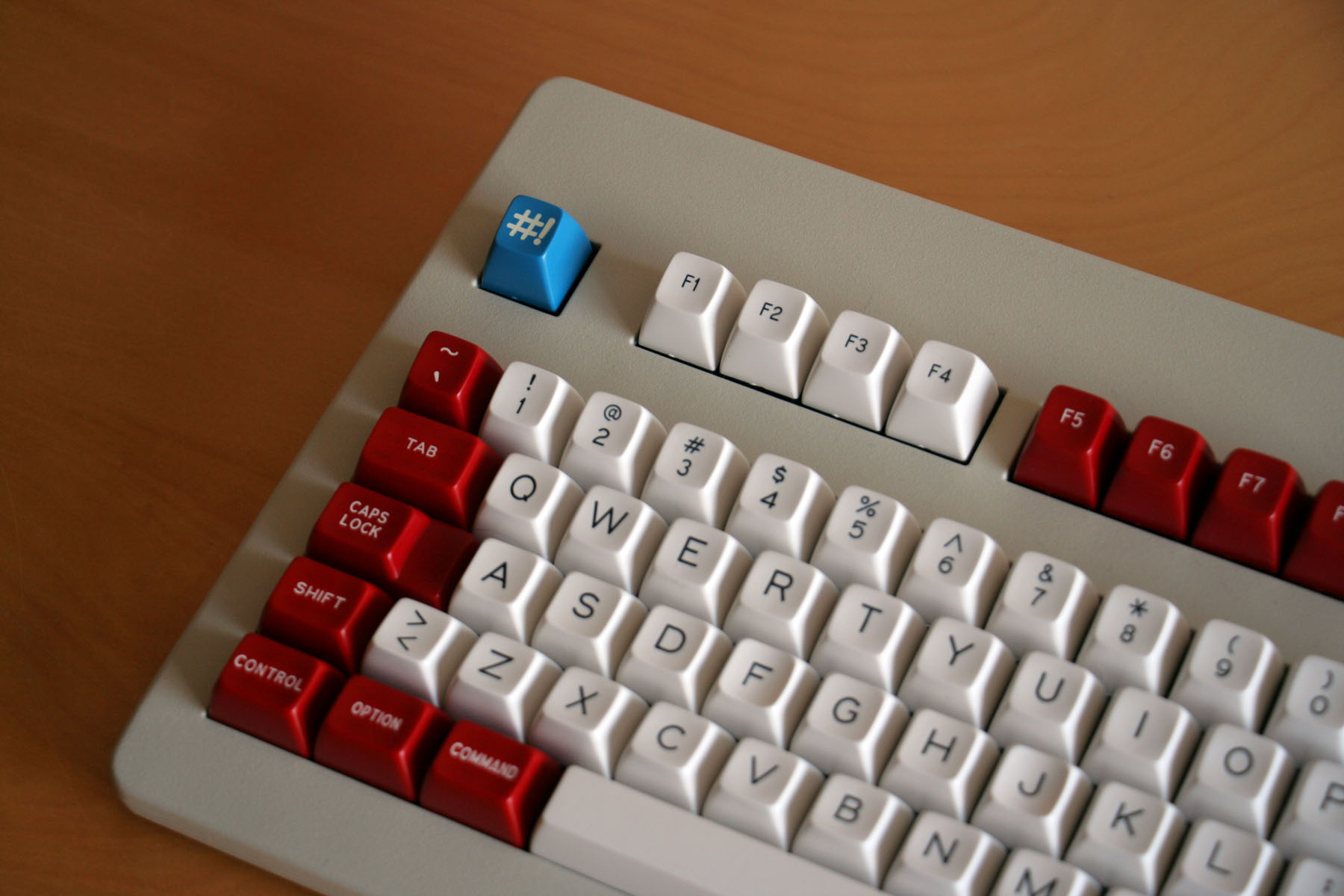
Doubleshots can pull off excellent contrast on any colour, of course. That's a luxury we don't have with PBT. The red, grey and especially black alphas I've got here wouldn't be half as good without white legends. And even then, I still reckon white alphas work the best of all. Whether they're with red, blue or black:

Image
Image
Image

Naturally, we're limited to dark legends with dyesub. It's really got to be black on any of those strong mods. Olivetti or Red Alert style matching blue or red legends would work a treat, if they do work technically at all! Boring Joes like me can even mix in their black legend Realforce originals.

A few questions come to mind:

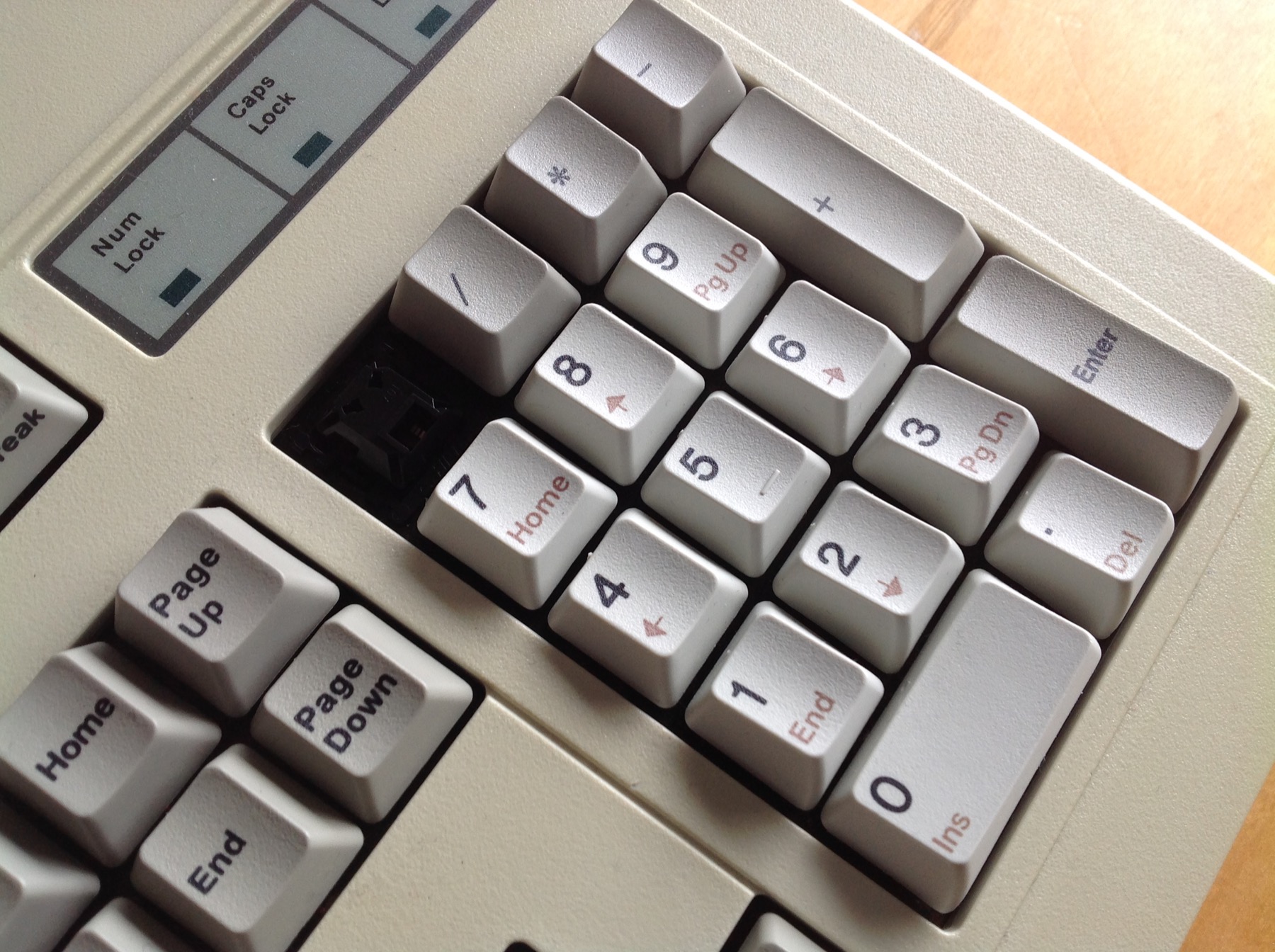
What about side printed legends like the embedded numpad on the 87U? Does Topre intend to make full size sets with them? I'm only in it for the TKL of course, so I'd much prefer to see them included. (Although I guess they'd be out of place if I try to put them on an HHKB! No chance of all those HHKB specific front legends of course.)

Can they print side legends in alternate colours? Are there different limitations we need to know?

Are multi coloured legends a possibility? I really like these on my NMB:

Image

I'd really appreciate second colours on the mods, so we can handle the non-swappable Alt and GUI keys situation vs. Command and Option on the Mac. I can excuse busier legends on those mods if they are pretty!

User avatar
002
Topre Enthusiast

15 Aug 2015, 01:47

Well they certainly *can* do multi-coloured legends :)

Image

Image

User avatar
Khers

15 Aug 2015, 09:48

I would also vote in favour of a olivetti-style set

User avatar
seebart
Offtopicthority Instigator

15 Aug 2015, 10:14

Not sure what keyboard this is but I love the color combination:
keyboard-mo5.png
keyboard-mo5.png (992.79 KiB) Viewed 4274 times

Findecanor

15 Aug 2015, 12:55

I really liked how matt3o designed the multi-coloured legends on the Granite. Support of symbols on Alt Gr-combos without compromising the look of centred symbols or making it cluttered.
With the key plastic in shades of grey or beige, I think that orange, brown or somewhere in between would look the best for the second legend colour.
If the colour scheme has light alphanumerics and coloured modifiers then I think that using the same hue as the modifiers should be the first thing to do a mock-up of.

Otherwise, I really like the look of when the legend is printed in a colour on plastic, and especially when on light shades of grey or beige. I don't think black legends look good on a background that is too dark, and dark coloured legends would be worse.
I think one of the most beautiful keyboards of all time is the Sun Type 5, but the legend colour could be more vibrant.
Raindrop and Red Alert with beige modifiers also nice... Just don't choose pink or baby blue. ;)

User avatar
Muirium
µ

15 Aug 2015, 15:19

Aye, Granite's a pure classic. The gold standard when it comes to community designed legends. But can we even dream of multilingual sets here? I assume we're doing ANSI US and hoping Topre likes it enough to want the rest.


@Seebart: Impossible to do light legends like those with dyesub on PBT. Theyre doubleshots. As were those Olivettis linked earlier, alas…
Spoiler:
Daniel wrote:
seebart wrote: they did produce some keyboards, the older ones are nice:
6qD48cc.jpg
probably Dyesub on PBT also, who knows.
Those are double shots:
Image
If we want any legend colours besides black, we need to do them on seriously light coloured keys. Dyesub's weakness is our job to work around. As are whatever Topre's policies about front printing and multiple colour legends. (Which may not be the same thing as their *abilities* of course.)


@Matteo. Any info on whether we can consider front legends and multiple coloured legends? We shouldn't even waste time talking about it if Topre says no. Design is about working within constraints, of course.

User avatar
seebart
Offtopicthority Instigator

15 Aug 2015, 16:16

I'm pretty sure the Olivetti ANK 25-101 has PBT Dyesubs. They are dark blue of course.

http://deskthority.net/wiki/Olivetti_ANK_25-101

User avatar
Muirium
µ

15 Aug 2015, 18:21

Indeed. So in dyesub terms:

Good.
Image

Bad.
Image

Print on light colours, or be put to shame by doubleshot ABS!

User avatar
matt3o
-[°_°]-

15 Aug 2015, 18:59

I'm pretty sure I can have them print colored legends.

User avatar
Muirium
µ

15 Aug 2015, 19:23

Multicoloured top legends? And single coloured front legends?

Post Reply

Return to “Workshop”