[IC] Two combos I'd actually buy
- matt3o
- -[°_°]-
- Location: Italy
- Main keyboard: WhiteFox
- Main mouse: Anywhere MX
- Favorite switch: Anything, really
- DT Pro Member: 0030
What do you think of the followings (standard ABS+DCS)
Midnight
Fog
Colors are not final, but just to give you an idea. I'd like midnight to be a little more "charcoal" for example.
Midnight
Fog
Colors are not final, but just to give you an idea. I'd like midnight to be a little more "charcoal" for example.
Last edited by matt3o on 27 Aug 2013, 16:25, edited 1 time in total.
- damorgue
- Location: Sweden
- Main mouse: MX500
- Favorite switch: BS, MX Green and MX Clear
- DT Pro Member: -
- Contact:
I like both of them. The first one looks like the korean set called Graphite which is fairly popular and quite rare. Then again, I tend to like all colour combos which are more subtle with at most one saturated colour.
Any particular reason why the alphas are darker? How would they look if the mods were darker? I like them, just wanted to see what they would be that way.
Edit: [rant] I am growing tired of all these recent attempts (not this) at making as many saturated colours as possible in one set. Nordic layouts aren't offered very often but it seems when they are, they are plagued by what I would consider unicorn vomit colours. [/rant]
- matt3o
- -[°_°]-
- Location: Italy
- Main keyboard: WhiteFox
- Main mouse: Anywhere MX
- Favorite switch: Anything, really
- DT Pro Member: 0030
I'd prefer to make something original and usually alphas are lighter, hence let's make alphas darkerdamorgue wrote:I like both of them. The first one looks like the korean set called Graphite which is fairly popular and quite rare. Then again, I tend to like all colour combos which are more subtle with at most one saturated colour.
Any particular reason why the alphas are darker? How would they look if the mods were darker?
- damorgue
- Location: Sweden
- Main mouse: MX500
- Favorite switch: BS, MX Green and MX Clear
- DT Pro Member: -
- Contact:
For the record, I like Midnight more. Fog might be better suited on a lighter case perhaps?
- frankbartoli
- Location: Italy
- Main keyboard: KBT Race white led brown cherry
- Main mouse: Performance MX
- Favorite switch: cherry brown/blue and buckling spring
- DT Pro Member: -
- Contact:
i like it
- Muirium
- µ
- Location: Edinburgh, Scotland
- Main keyboard: HHKB Type-S with Bluetooth by Hasu
- Main mouse: Apple Magic Mouse
- Favorite switch: Gotta Try 'Em All
- DT Pro Member: µ
I like fog, but not a fan of DCS.
Presumably the colour zones can be mixed up a bit. A single colour across all function keys for instance, and the arrow keys being the opposite colour to the home/end block.
Presumably the colour zones can be mixed up a bit. A single colour across all function keys for instance, and the arrow keys being the opposite colour to the home/end block.
- Ducky Nordic
- Kayvee
- Main keyboard: Ducky YotS & Mini
- Main mouse: Logitech G9x
- Favorite switch: MX red/white, topre 30, BS
- DT Pro Member: -
Ooh, i like the midnight color combo
- BimboBB
- Location: Germany
- Main keyboard: Filco Majestouch 2 (mx brown)
- Main mouse: Logitech G400
- Favorite switch: mx brown
- DT Pro Member: -
Why not dark legends on light caps? All (....really all?) recent sets came with light legends on dark ground. So if I would like to try something "original", I would consider dark legends for a change. 
- matt3o
- -[°_°]-
- Location: Italy
- Main keyboard: WhiteFox
- Main mouse: Anywhere MX
- Favorite switch: Anything, really
- DT Pro Member: 0030
fog has both. midnight is too dark for dark legendsBimboBB wrote:Why not dark legends on light caps? All (....really all?) recent sets came with light legends on dark ground. So if I would like to try something "original", I would consider dark legends for a change.
- Muirium
- µ
- Location: Edinburgh, Scotland
- Main keyboard: HHKB Type-S with Bluetooth by Hasu
- Main mouse: Apple Magic Mouse
- Favorite switch: Gotta Try 'Em All
- DT Pro Member: µ
One of the reasons I prefer fog. The dark on dark schemes that Topre likes are just the result of dyesub's inability to put bright ink on dark plastic. Not a problem for doubleshot.
Say: how about a doubleshot with clear legends for the tasteless buggers among us (like me) who'd like a good set for backlights?
Say: how about a doubleshot with clear legends for the tasteless buggers among us (like me) who'd like a good set for backlights?
- matt3o
- -[°_°]-
- Location: Italy
- Main keyboard: WhiteFox
- Main mouse: Anywhere MX
- Favorite switch: Anything, really
- DT Pro Member: 0030
YEAH!Muirium wrote:Say: how about a doubleshot with clear legends for the tasteless buggers among us (like me) who'd like a good set for backlights?

polycarbonate legends might be interesting though
- BimboBB
- Location: Germany
- Main keyboard: Filco Majestouch 2 (mx brown)
- Main mouse: Logitech G400
- Favorite switch: mx brown
- DT Pro Member: -
Was thinking about complete dark legends....maybe somethink like that....a reminiscence of the Commodore 5/10 keyboards:matt3o wrote:fog has both. midnight is too dark for dark legendsBimboBB wrote:Why not dark legends on light caps? All (....really all?) recent sets came with light legends on dark ground. So if I would like to try something "original", I would consider dark legends for a change.
- Attachments
-
- commodore5_remake.jpg (115.54 KiB) Viewed 8649 times
- Halvar
- Location: Baden, DE
- Main keyboard: IBM Model M SSK / Filco MT 2
- Favorite switch: Beam & buckling spring, Monterey, MX Brown
- DT Pro Member: 0051
I've given up on the idea of doubleshot for backlighted keyboards. I think you'd have to basically design and make completely new molds for that because the first shot on current molds is too irregular or otherwise not suited for a nice shinethrough effect. And it will be hard to do it well because of the different "islands" (middle parts of legends that have to show the second shot, like on letters like AOBDQPaobdpqe) on different legends.
- mashby
- Location: Nashville, TN USA
- Main keyboard: KBC Poker (MX-Black)
- Main mouse: Apple Magic Trackpad
- Favorite switch: Buckling Spring
- DT Pro Member: -
- Contact:
Like them both, would buy them both.
- ForestFunK
- Location: Germany
- Main keyboard: Realforce 88u
- Main mouse: Logitech MX518
- Favorite switch: Topre so far
- DT Pro Member: -
I like fog better but midnight is nice also.
- Muirium
- µ
- Location: Edinburgh, Scotland
- Main keyboard: HHKB Type-S with Bluetooth by Hasu
- Main mouse: Apple Magic Mouse
- Favorite switch: Gotta Try 'Em All
- DT Pro Member: µ
Yes, you are of course right. Quality backlit caps are the stuff of unicorns, for now. Though with the popularity of Ducky's boards, I can always dream they'll up the stakes and make great caps someday.Halvar wrote:I've given up on the idea of doubleshot for backlighted keyboards. I think you'd have to basically design and make completely new molds for that because the first shot on current molds is too irregular or otherwise not suited for a nice shinethrough effect. And it will be hard to do it well because of the different "islands" (middle parts of legends that have to show the second shot, like on letters like AOBDQPaobdpqe) on different legends.
- Dubsgalore
- Location: USA
- Main keyboard: ESA-3000-HASRO
- Main mouse: Deathadder 2013
- Favorite switch: MX Blacks
- DT Pro Member: -
Fog is pretty cool
I think i would rather the legends in the OP over Black/Dark legends for it
I think i would rather the legends in the OP over Black/Dark legends for it
- nathanscribe
- Location: Yorkshire, UK.
- Main keyboard: Filco tenkeyless w/blues
- Main mouse: Kensington Expert
- Favorite switch: MX Blue
- DT Pro Member: -
"Fog" looks a lot like R3 alphas and vintage Cherry DS modifiers etc. I've had those on my Filco TKL for a while but recently changed to a different combo. Might have a photo somewhere.
- nathanscribe
- Location: Yorkshire, UK.
- Main keyboard: Filco tenkeyless w/blues
- Main mouse: Kensington Expert
- Favorite switch: MX Blue
- DT Pro Member: -
Here's my Filco TKL Linear R with a mixture of caps:
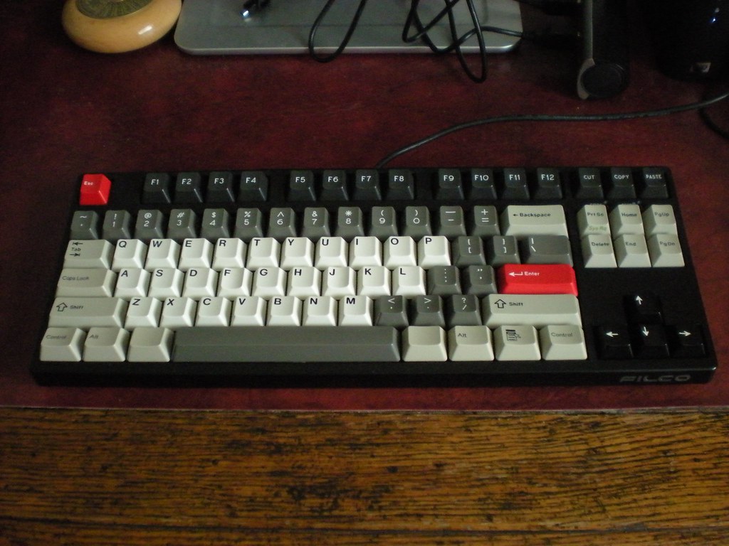
Untitled by nathanscribe, on Flickr
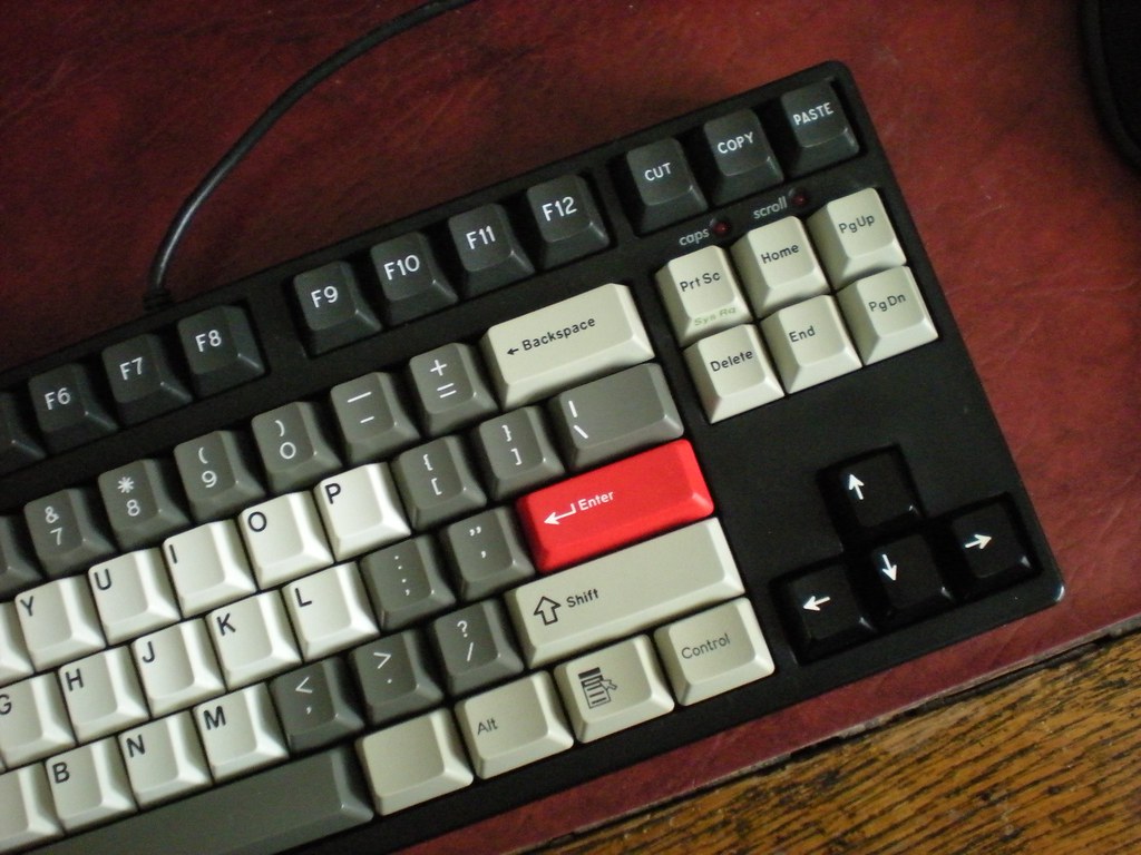
Untitled by nathanscribe, on Flickr
Hopefully it gives some idea of how some of these colours might look, though the camera's not great in low light and any yellowing you see in the photo is not present in real life - the Moogle keys are a slightly different shade to the old Cherry beige, but the picture emphasises it rather negatively.
The R3 grey and Cherry beige look very pleasantly muted together in real life. I reckon the Fog set would work really well.
- R3 SP very dark grey F row
R3 SP grey number row, symbols etc.
Cherry DS off-white alphas
Cherry DS beige and Moogle kit modifiers etc.
Cherry DS black arrow keys
SP DS red Esc & Enter

Untitled by nathanscribe, on Flickr

Untitled by nathanscribe, on Flickr
Hopefully it gives some idea of how some of these colours might look, though the camera's not great in low light and any yellowing you see in the photo is not present in real life - the Moogle keys are a slightly different shade to the old Cherry beige, but the picture emphasises it rather negatively.
The R3 grey and Cherry beige look very pleasantly muted together in real life. I reckon the Fog set would work really well.
- Hypersphere
- Location: USA
- Main keyboard: Silenced & Lubed HHKB (Black)
- Main mouse: Logitech G403
- Favorite switch: Topre 45/55g Silenced; Various Alps; IBM Model F
- DT Pro Member: 0038
I like the idea of setting off the arrow cluster in a contrasting color from that of adjacent keys.
-
segfaultless
- Main keyboard: Filco MJ2 TKL
- Main mouse: Logitech G700
- Favorite switch: Browns
- DT Pro Member: -
I really like the Midnight set, shame about ABS. 
