Dyesub Alphas for cheaper language packs and PBT 2-Shot modifiers?Muirium wrote:Say, would it be harder to get SP to make the white alphas dyesub PBT while everything else is doubleshot? I'd love a UV resistant set! (Not to mention a PBT space bar, which they do now have…)
[IC] Round 5 / color scheme
- rindorbrot
- Location: Bavaria, Germany
- DT Pro Member: 0029
- Muirium
- µ
- Location: Edinburgh, Scotland
- Main keyboard: HHKB Type-S with Bluetooth by Hasu
- Main mouse: Apple Magic Mouse
- Favorite switch: Gotta Try 'Em All
- DT Pro Member: µ
Doubleshot PBT is beyond SP's ability right now. But one day… Anyway, black on white alphas are just asking for Dyesub.
Halvar's got a fair point about what Honeywell would have done with row 0. A choice between grey mods and black mods down there would be optimal. I just love those cream on blacks, but haven't a numpad to put them on!
Halvar's got a fair point about what Honeywell would have done with row 0. A choice between grey mods and black mods down there would be optimal. I just love those cream on blacks, but haven't a numpad to put them on!
- 7bit
- Location: Berlin, DE
- Main keyboard: Tipro / IBM 3270 emulator
- Main mouse: Logitech granite for SGI
- Favorite switch: MX Lock
- DT Pro Member: 0001
I've prepared these language kits:snoopy wrote:If that happens, an additional red "transmit"-button would be nice
will there be addon kits and language kits like in r4?
DE
DK
ES
FR
IT
NO
PT
SE
UK
- Muirium
- µ
- Location: Edinburgh, Scotland
- Main keyboard: HHKB Type-S with Bluetooth by Hasu
- Main mouse: Apple Magic Mouse
- Favorite switch: Gotta Try 'Em All
- DT Pro Member: µ
Excellent. Looks like you've done this before…
Is black on white dyesub PBT out of the question for this set? I like to focus my nagging on the possible!
Is black on white dyesub PBT out of the question for this set? I like to focus my nagging on the possible!
-
Findecanor
- Location: Stockholm, Sweden
- DT Pro Member: 0011
I like Halvar's Honeywell rendition with a red Return, and only the nav or numpad keys black. I think the bottom row should be grey and that any black keys should be in a separate key group.
There are several images on Rune's PC-museum.
I got this set from WASD (engraved OEM-profile). If you choose white alphanumerics, I suggest an orange that is more a "sunshine orange" (more yellow) than red orange. Overall, I am a fan of white-on-primary modifiers and inverted alphanumerics. I really like the look of the coffee-on-cream, blue-on-white, red-on-cream and red-on-white sets that have been made in DCS profile, but none of these have been available in Swedish/ISO.
Inverse would also be great.
The Swedish vintage "ABC" computers had orange and white, but with black letters on all keys.7bit wrote:What about something like this:
There are several images on Rune's PC-museum.
I got this set from WASD (engraved OEM-profile). If you choose white alphanumerics, I suggest an orange that is more a "sunshine orange" (more yellow) than red orange. Overall, I am a fan of white-on-primary modifiers and inverted alphanumerics. I really like the look of the coffee-on-cream, blue-on-white, red-on-cream and red-on-white sets that have been made in DCS profile, but none of these have been available in Swedish/ISO.
Inverse would also be great.
Almost... the "chocolate" is probably really a yellowed grey. (Fluke 1720A).Halvar wrote:Tangerine chocolate looks great.
- 7bit
- Location: Berlin, DE
- Main keyboard: Tipro / IBM 3270 emulator
- Main mouse: Logitech granite for SGI
- Favorite switch: MX Lock
- DT Pro Member: 0001
This will come in Round 6.nourathar wrote:great !
I came to this after round 4 so I would still be very interested in a space cadet scheme, preferably one that included all those funky symbols... It is less spectacular color wise, but i like the symbolics scheme too....
I could add this to a gamer kit consiting of red keys.Broadmonkey wrote:F12 takes screenshot in steam games
- 7bit
- Location: Berlin, DE
- Main keyboard: Tipro / IBM 3270 emulator
- Main mouse: Logitech granite for SGI
- Favorite switch: MX Lock
- DT Pro Member: 0001
The black keys are a bit problematic for people who want to put other keys there. I think the only solution would be to offer these black keys as extras for both the cursor section and the complete numpad. In the 2nd graphic, I'd addHalvar wrote:As for Honeywell, I'd prefer the color distribution to be more PC/MF2 consistent, and less based on the Honeywell original. Kind of like matteo did it in Retro DSA.
For example: or Links:
http://www.keyboard-layout-editor.com/# ... 5cbec58db0
http://www.keyboard-layout-editor.com/# ... de85b8808e
PRINT, SCROLL LOCK and PAUSE to the black kit so it looks more consistent.
- 7bit
- Location: Berlin, DE
- Main keyboard: Tipro / IBM 3270 emulator
- Main mouse: Logitech granite for SGI
- Favorite switch: MX Lock
- DT Pro Member: 0001
in red, 2 or 1.5 units:Muirium wrote:I'd go for a grey backslash and red backspace to balance things out (on a 60%) but these are the kinds of details 7bit can work out with secondary colours, like the traditional selection of escape keys.
Say, would it be harder to get SP to make the white alphas dyesub PBT while everything else is doubleshot? I'd love a UV resistant set! (Not to mention a PBT space bar, which they do now have…)
BACK SPACE
TRANSMIT
CLEAR RESET
I prefer doubleshot keys!Muirium wrote:Is black on white dyesub PBT out of the question for this set? I like to focus my nagging on the possible!
I'm not sure SP is even able to do PBT keys in the spherical molds.
- 7bit
- Location: Berlin, DE
- Main keyboard: Tipro / IBM 3270 emulator
- Main mouse: Logitech granite for SGI
- Favorite switch: MX Lock
- DT Pro Member: 0001
At least less contrast as white on black, so not too bad.Incognito wrote:hmmm ... a bit hard on the eyes in sub optimal lighting conditions I would have thought ...matt3o wrote:oh my... to many options
I still like my midnight combo. So-so on screen, but it must be really nice in person
...]
Nevertheless, even without adding a poll, I can say that Honeywell is the winner. But I will post a poll anyway to see how many people are really interested.
If we do the modifiers in the same color as alnum keys in Round 4, then these could be combined to get an all white on gray layout.
We could do a BLACK kit with a selection of black keys and a RED kit with a selection of red keys.
-
forenleser0815
- Location: Dortmund, Germany
- Main keyboard: Filco Majestouch II
- Main mouse: Corsair M60
- DT Pro Member: -
- rindorbrot
- Location: Bavaria, Germany
- DT Pro Member: 0029
Will there be replacement keys for the wrong profile numpad + keys?
- 7bit
- Location: Berlin, DE
- Main keyboard: Tipro / IBM 3270 emulator
- Main mouse: Logitech granite for SGI
- Favorite switch: MX Lock
- DT Pro Member: 0001
What about this, split up into 2 kits:komar007 wrote:
I like this one a lot.
RED/ALPHA
BLACK/FUNMOD
your e-mail address
ADDRESS
your shipping ...
Wait!
Seriously: If these come both in only row 3, with just one legend per cap and I add some things like Å Ä Æ, this might be interesting for non-US-layout people as well.
Could be done.komar007 wrote:@7bit, since GH60 and Hyper are coming soon, what do you think about running dedicated 60% sets? Maybe they could be a bit cheaper than TKL and still provide many layout options.
We could call it SIXTY kit.
- nathanscribe
- Location: Yorkshire, UK.
- Main keyboard: Filco tenkeyless w/blues
- Main mouse: Kensington Expert
- Favorite switch: MX Blue
- DT Pro Member: -
I like grey/orange as an idea, I already have pale Cherry DS with R3 grey/dark-grey/Moogle, plus red Esc/Return, which is kind of similar to the Honeywell scheme... would be nice to have some dark, ie. near-black, alphas.
Also, I'll post this just because I can:
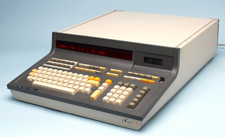
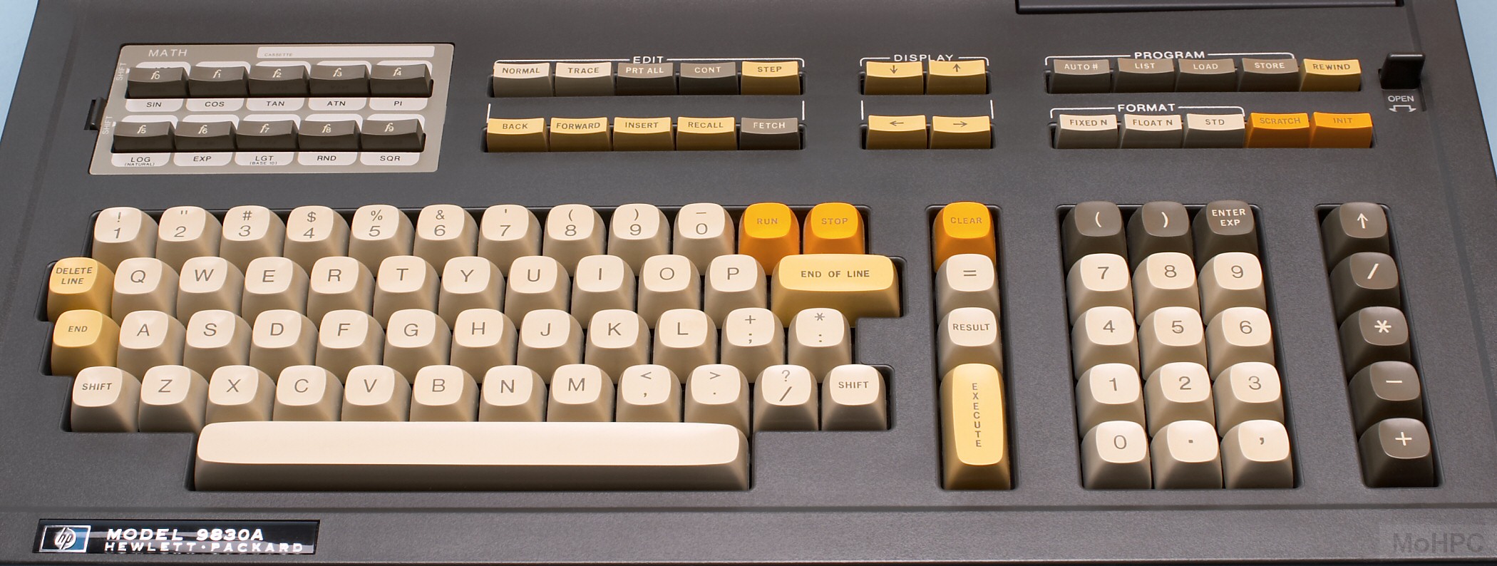
Also, I'll post this just because I can:


- Muirium
- µ
- Location: Edinburgh, Scotland
- Main keyboard: HHKB Type-S with Bluetooth by Hasu
- Main mouse: Apple Magic Mouse
- Favorite switch: Gotta Try 'Em All
- DT Pro Member: µ
Nice! I've played with the all-in-one version of that HP, and it remains the only time I've ever seen Helvetica on sphericals. Quite a nice keyboard, with so many earth tones going on, and all those tiny function keys.
Thoroughly autumnal.
Thoroughly autumnal.
- ===
- Location: New York
- Main keyboard: Poker II
- Main mouse: Apple Magic Mouse
- Favorite switch: Cherry MX Brown
- DT Pro Member: -
- Contact:
I'll throw in another vote for the Honeywell scheme, I need something to replace the ugly caps that came with my Poker.
-
John Fourth
- DT Pro Member: -
I like 7bit's TKL honeywell version. I also vote for the arrow key column in black.
- dirge
- Location: Newcastle Upon Tyne, United Kingdom.
- DT Pro Member: -
Also have the spherical profiles been discussed? What profiles in which rows?
I think number row in SA Row 2, to match the delete key. Function row in SA Row 1.
Shame there's not much in the SS profile, I'd have liked the spacebar row to have more of a positive angle like classic cherry. SS have a 19 degree!
I think number row in SA Row 2, to match the delete key. Function row in SA Row 1.
Shame there's not much in the SS profile, I'd have liked the spacebar row to have more of a positive angle like classic cherry. SS have a 19 degree!
- Muirium
- µ
- Location: Edinburgh, Scotland
- Main keyboard: HHKB Type-S with Bluetooth by Hasu
- Main mouse: Apple Magic Mouse
- Favorite switch: Gotta Try 'Em All
- DT Pro Member: µ
Oh man, red Beeb f-row! Once I get the colour wheel I'll size up a BBC Micro with it too. Knew I'd seen that bold black numpad somewhere…
Thanks for reminding me about row profiles too, Dirge. A full list of what size molds SP has in each row would be most useful! Are all our mods stuck in row 3?
I like row 1 profile for the number row, to give a 60% the full height sweep, but I can see your point on a bigger board with both.
Thanks for reminding me about row profiles too, Dirge. A full list of what size molds SP has in each row would be most useful! Are all our mods stuck in row 3?
I like row 1 profile for the number row, to give a 60% the full height sweep, but I can see your point on a bigger board with both.
- 7bit
- Location: Berlin, DE
- Main keyboard: Tipro / IBM 3270 emulator
- Main mouse: Logitech granite for SGI
- Favorite switch: MX Lock
- DT Pro Member: 0001
Not sure if the function row should be row 1 profile.
row 1 !1 @2 #3 $4....
row 2 Q W E R T Y
row 3 A S D F G
row 4 Z X C V B (1.25, 2.25 and 2.75 units keys are row 3 only)
row 3 ALT SUPER CONTROL SPACE ...
I might add an extra kit for row 2-bottom row with 1.5 and 1 unit keys. I use LEFT DOWN RIGHT from row 2 right now, which is much better than row 3 or row 4, because I tend to type these keys with my thumb. If they are row 4, I hit the edge, not the surface as I do with row 2 keys.
- dirge
- Location: Newcastle Upon Tyne, United Kingdom.
- DT Pro Member: -
As long as the key profiles match horizontally across the whole board then I'm fine, just having a different profile for row one single unit keys and the delete at the end isn't ideal.
And that Beeb colour is a strange one, also the beeb keys are not black just very very dark brown!
And that Beeb colour is a strange one, also the beeb keys are not black just very very dark brown!
- Muirium
- µ
- Location: Edinburgh, Scotland
- Main keyboard: HHKB Type-S with Bluetooth by Hasu
- Main mouse: Apple Magic Mouse
- Favorite switch: Gotta Try 'Em All
- DT Pro Member: µ
True. (I don't have my own Beeb but will scrutinise someone else's! It's in good shape so I should get good colour IDs.)
1.25u Command and Option (x2) are all I ask for Mac wise. I like my row 0 mods 1.25.
Are you doing POS again? (I'll forgive you if you retire those alongside DCS. But that row 3 red kit looks a good POS.)
Thanks for the list, 7bit. I have an arrow set like yours (the SPH set Matteo sold me has three different arrow clusters!) and it's a nice profile change.7bit wrote:Not sure if the function row should be row 1 profile.
row 1 !1 @2 #3 $4....
row 2 Q W E R T Y
row 3 A S D F G
row 4 Z X C V B (1.25, 2.25 and 2.75 units keys are row 3 only)
row 3 ALT SUPER CONTROL SPACE ...
I might add an extra kit for row 2-bottom row with 1.5 and 1 unit keys. I use LEFT DOWN RIGHT from row 2 right now, which is much better than row 3 or row 4, because I tend to type these keys with my thumb. If they are row 4, I hit the edge, not the surface as I do with row 2 keys.
1.25u Command and Option (x2) are all I ask for Mac wise. I like my row 0 mods 1.25.
Are you doing POS again? (I'll forgive you if you retire those alongside DCS. But that row 3 red kit looks a good POS.)

