Right lads,
Matty wants to see your work. So here's where I'm at with the shiny one:
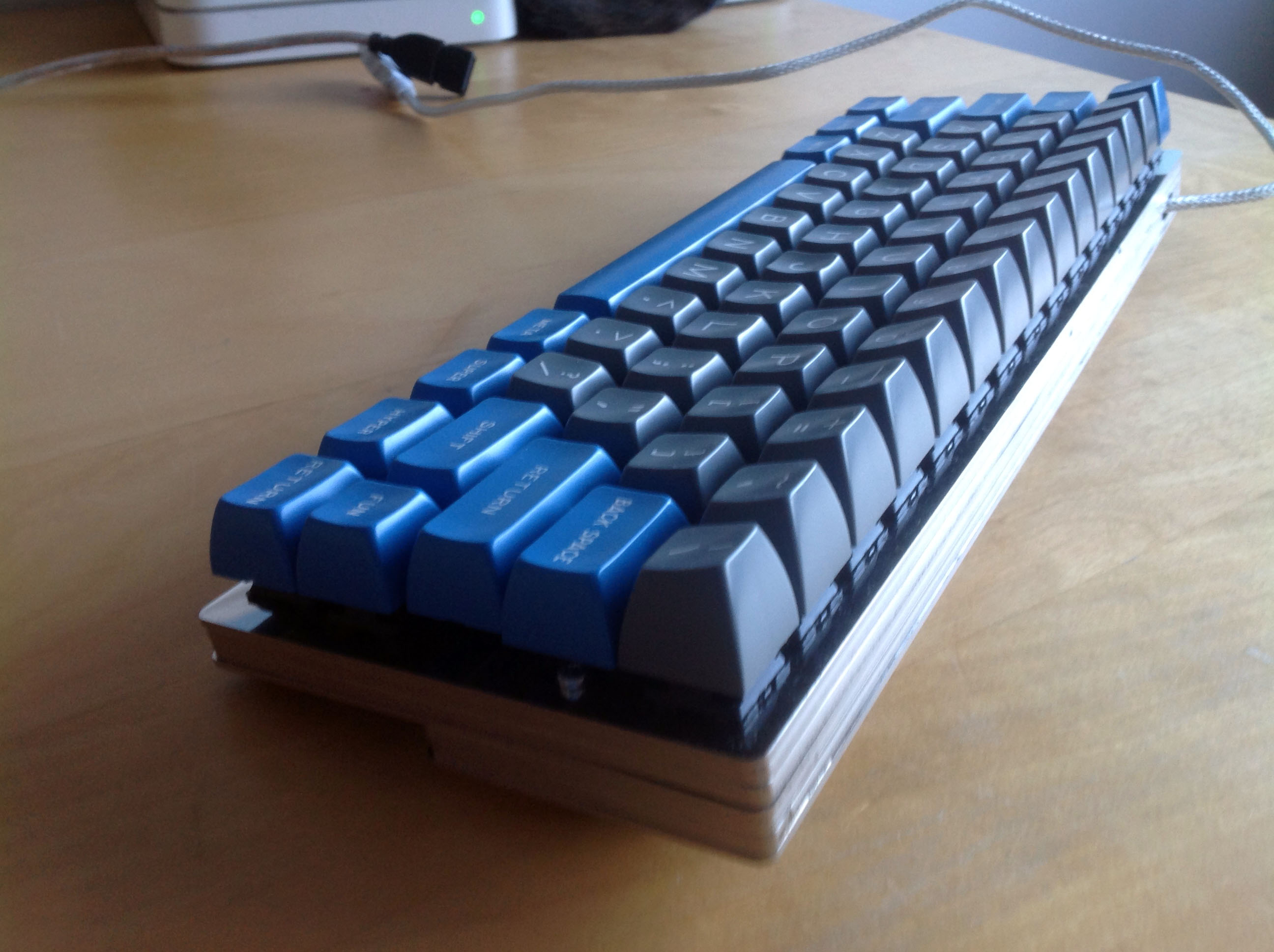
Sphericals, accept no substitute.
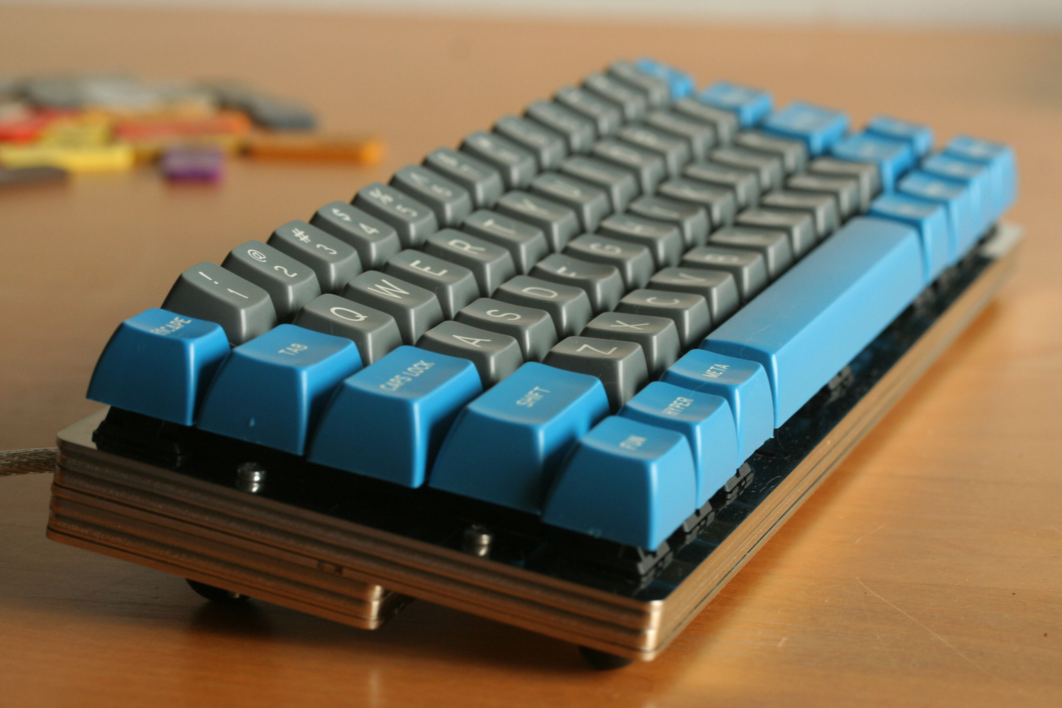
- IMG_8125.JPG (704.52 KiB) Viewed 24015 times
Matteo's 2nd generation design, with its hidden bolts, really brings caps right to the fore. The look when you're using the keyboard is a wall of caps. Pure minimalism. About a kilogram of it, underneath!
Still shiny:
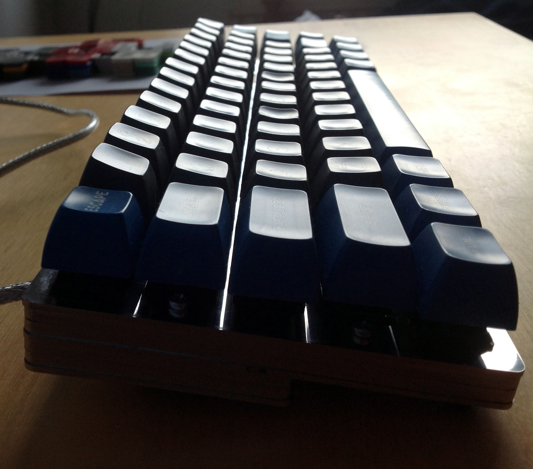
- IMG_2215.JPG (344.85 KiB) Viewed 24015 times
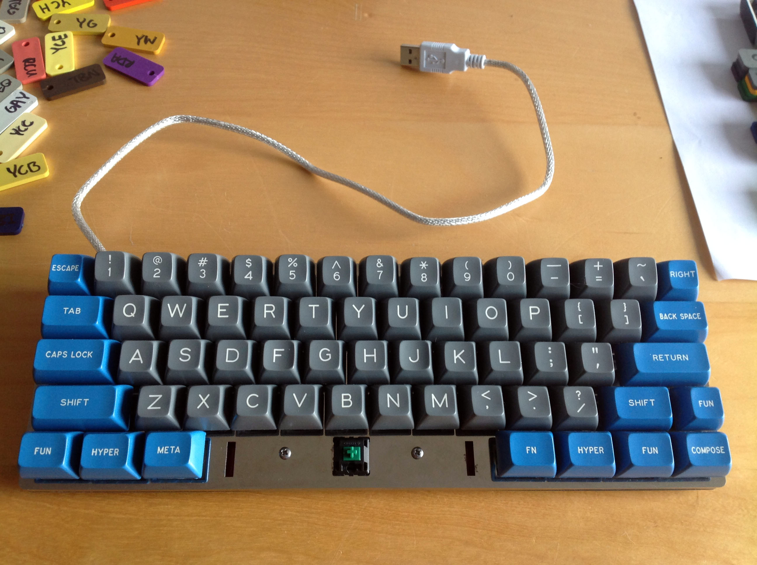
- IMG_2219.JPG (528.04 KiB) Viewed 24015 times
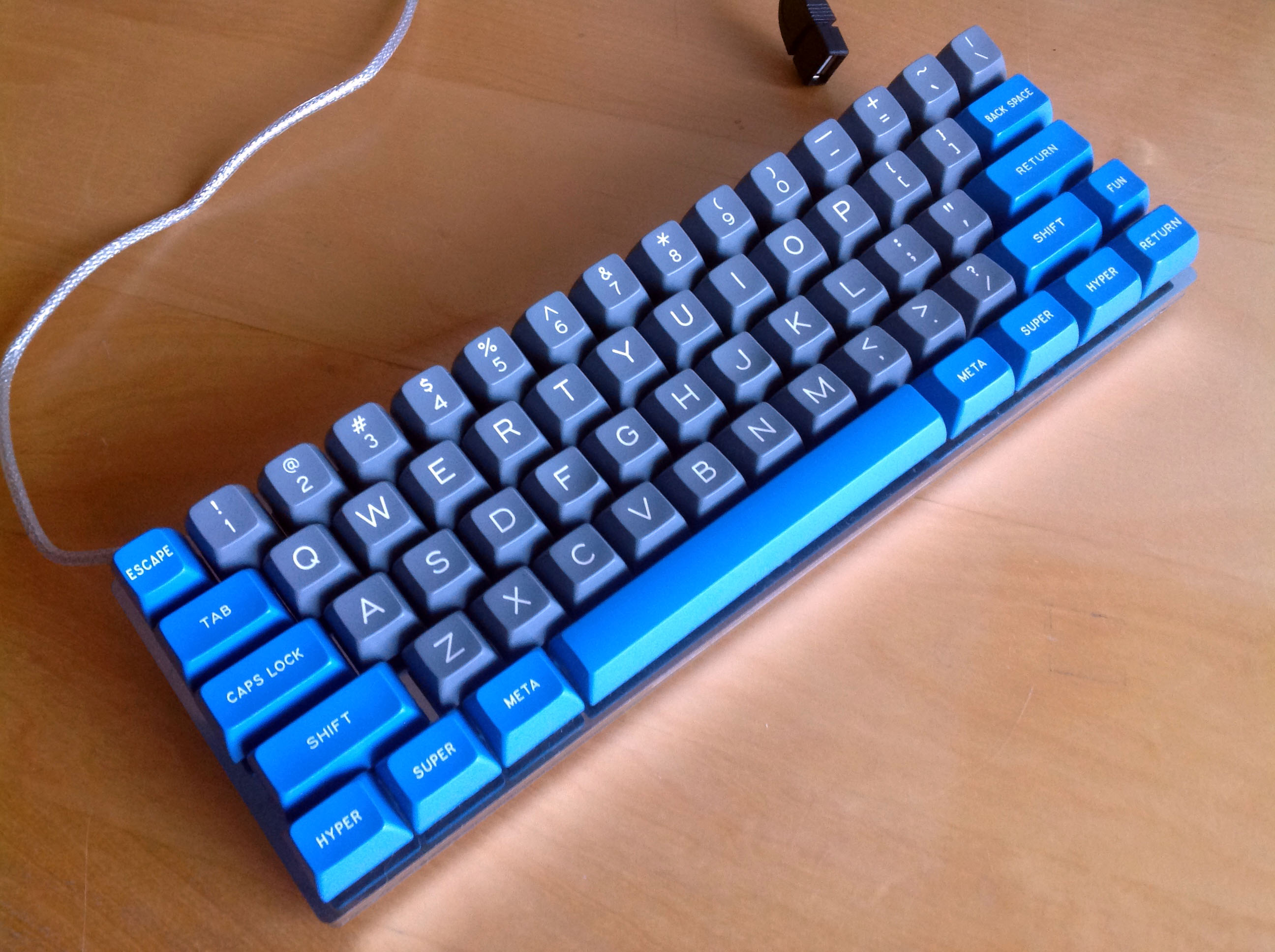
Of course, still no stabs yet either. And row 1 wasn't quite complete when I shot those. Here it is now:
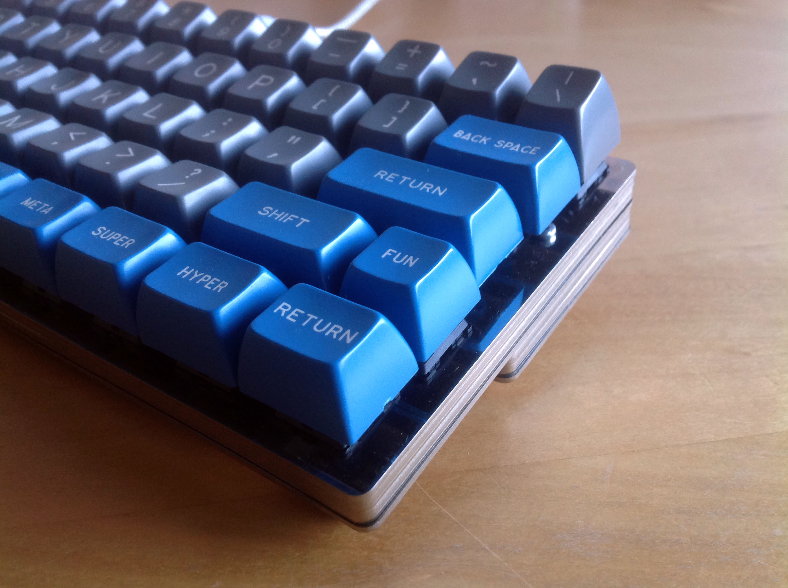
- IMG_3303.JPG (481.61 KiB) Viewed 24015 times
- IMG_3308.JPG (453.86 KiB) Viewed 24015 times
- IMG_3316.JPG (570.05 KiB) Viewed 24015 times
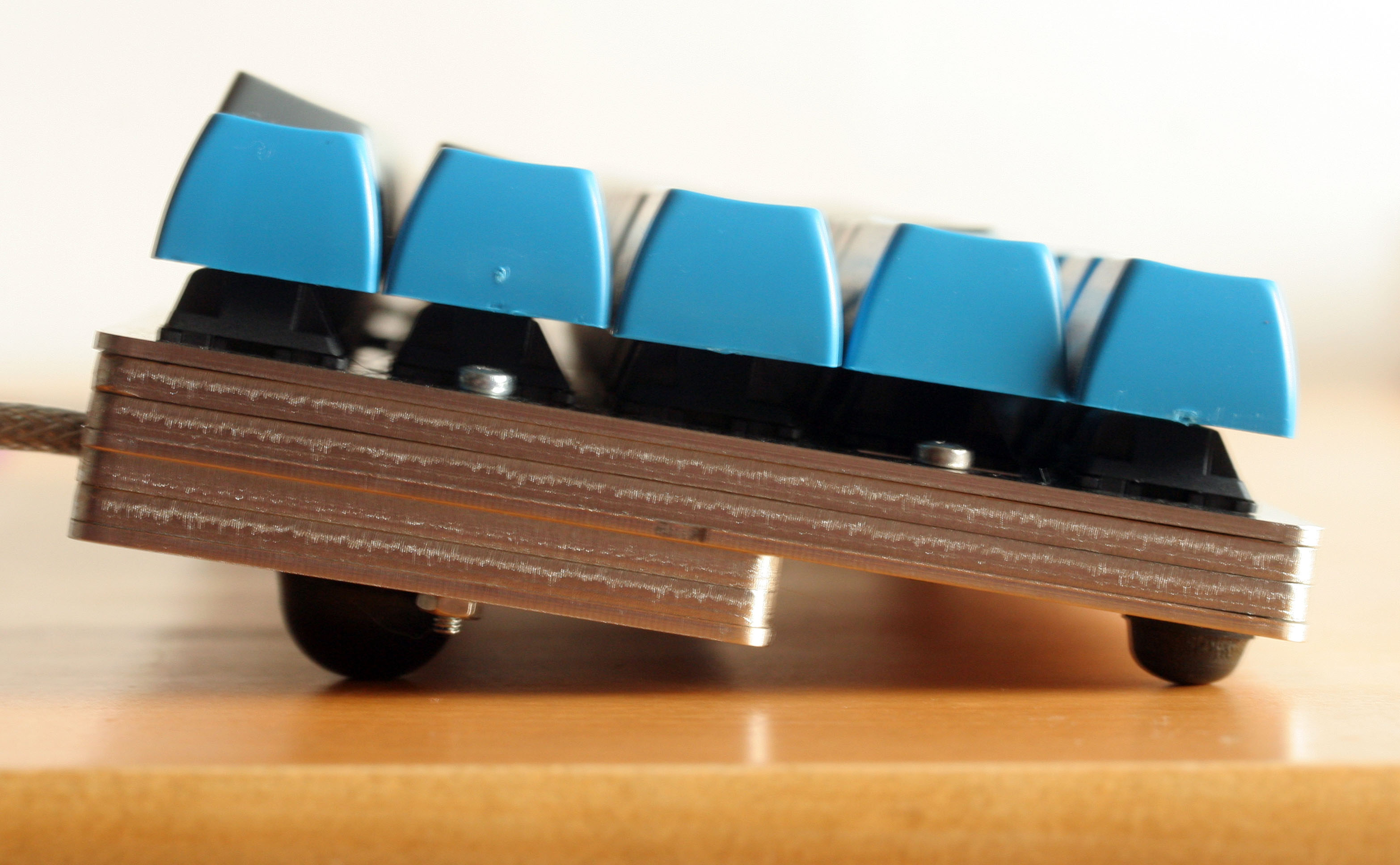
And the side view, of the compartment for Bluetooth ambitions to come:
- IMG_8126.JPG (548.68 KiB) Viewed 24015 times
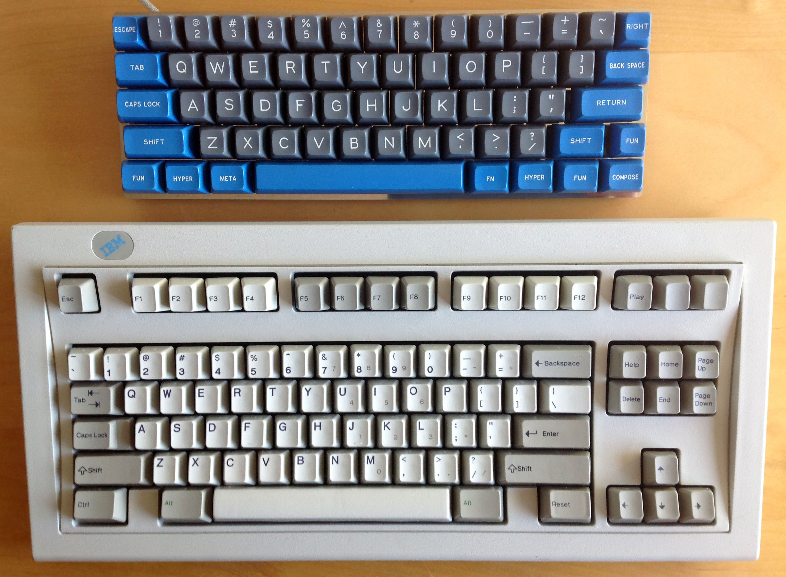
Space Saver, achieved!
- IMG_2276.JPG (608.37 KiB) Viewed 24015 times
Shinier on the underside than anyone sensible likes theirs on the top.
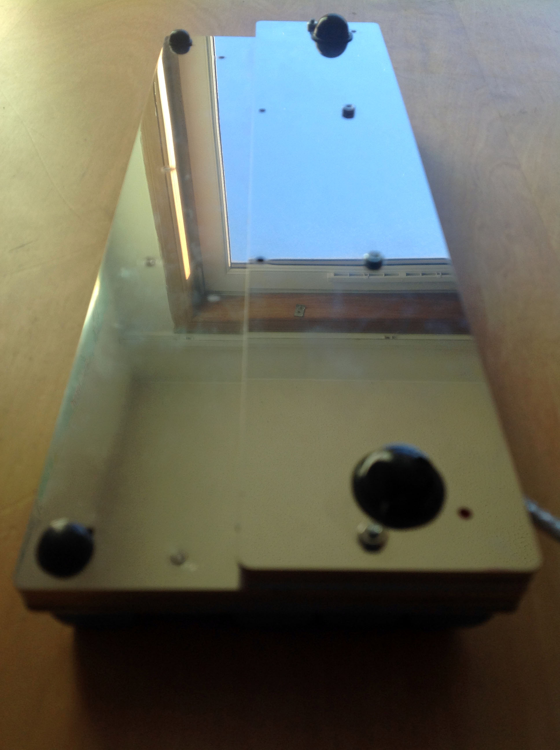
- IMG_2268.JPG (361.25 KiB) Viewed 24015 times
It's truly my kind of keyboard! It's currently my main one, in fact, thanks to a bit of Soarer Inside. I'm really thoroughly chuffed with how it's turned out, and owe a deep thanks to Matt3o once again. Magnifico!

