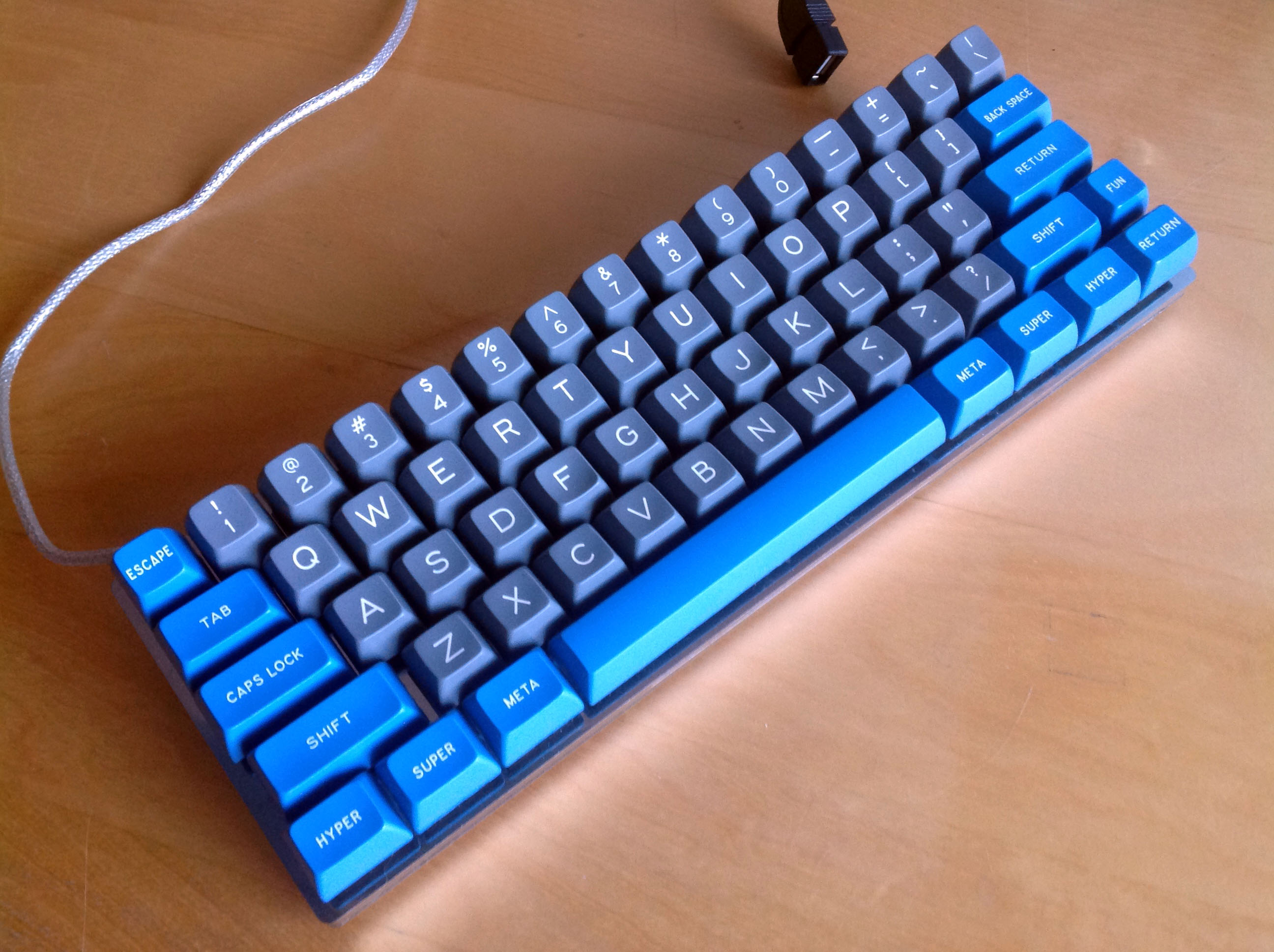
A proposal for a new SSK
- webwit
- Wild Duck
- Location: The Netherlands
- Main keyboard: Model F62
- Favorite switch: IBM beam spring
- DT Pro Member: 0000
- Contact:
You don't know Unicomp. 
This topic is fiction. It's fun, but it is a training exercise.
This topic is fiction. It's fun, but it is a training exercise.
[Account and posts deleted on request]
Last edited by M'er Forever on 30 Dec 2013, 19:59, edited 1 time in total.
- 7bit
- Location: Berlin, DE
- Main keyboard: Tipro / IBM 3270 emulator
- Main mouse: Logitech granite for SGI
- Favorite switch: MX Lock
- DT Pro Member: 0001
So, let's make it a community project!M'er Forever wrote:Actually I do know Unicomp. I've said many times in this thread that this high-end SSK design is not likely to be produced by them -- or anyone else for that matter. But I wanted to show my ideas anyway in the hope that some keyboard maker if not Unicomp would take an interest.webwit wrote:You don't know Unicomp.
This topic is fiction. It's fun, but it is a training exercise.
Hey Logitech, how about forming a Skunkworks division to develop "sky-blue/wishful-thinking" products like this?
Can't be undoable to let someone make tools for this:

[Account and posts deleted on request]
- Attachments
-
- SSK_new_2a.jpeg (370.02 KiB) Viewed 5301 times
- 7bit
- Location: Berlin, DE
- Main keyboard: Tipro / IBM 3270 emulator
- Main mouse: Logitech granite for SGI
- Favorite switch: MX Lock
- DT Pro Member: 0001
I didn't post that picture.
I don't believe it is too expensive to let somone make the tool.
Before you didn't ask some plastics manufacturers you can't know. SP produced at least some keyboard cases, so maybe we could ask them what the price range would be.
Another way would be to buy these from Unicomp and cut them down to SSK format. Might even be possible to roll up the numpad section of the contact sheets.
-
modology
- Location: Australia
- Main keyboard: Coolermaster's Novatouch
- Favorite switch: Beamspring
- DT Pro Member: -
Community project would be another way to go, or it would be prob the only way to make it possible. I lost faith in Unicomp after their "Brilliant white" keycap....best trolling attempt ever for black friday.
-
modology
- Location: Australia
- Main keyboard: Coolermaster's Novatouch
- Favorite switch: Beamspring
- DT Pro Member: -
Good idea, it seems to be more feasible this way than having produce everything from scratch.7bit wrote: Another way would be to buy these from Unicomp and cut them down to SSK format. Might even be possible to roll up the numpad section of the contact sheets.
[Account and posts deleted on request]
- Attachments
-
- WinSSK60_nested-numpad_tri-color_media-keys2.jpeg (357.2 KiB) Viewed 5266 times
-
- WinSSK60_nested-numpad_tri-color_media-keys.jpeg (354.76 KiB) Viewed 5266 times
- vivalarevolución
- formerly prdlm2009
- Location: USA
- Main keyboard: IBM Beam spring
- Main mouse: Kangaroo
- Favorite switch: beam spring
- DT Pro Member: 0097
Interesting take on the bottom row for those 60% renders. Although I favor booting the menu key altogether.
- Spearman
- Location: United States
- DT Pro Member: -
What is the menu key for anyway?
I really could never use the alternate 10-key shown. Something about having the keys being staggered like they are throws my fingers off. If I went for anything less than a full-size I would probably just jump straight to a HHKB.
What do you think about the 1800 layout? http://deskthority.net/wiki/G80-1800
- Dubsgalore
- Location: USA
- Main keyboard: ESA-3000-HASRO
- Main mouse: Deathadder 2013
- Favorite switch: MX Blacks
- DT Pro Member: -
really interesting layouts. especially the bottom row. Do you supposed the smaller spacebar would work well?M'er Forever wrote:A couple of 60%'ers, each with a different location for Fn.
One has Win and Menu keys left and right of the spacebar for convenience.
Scroll Lock and Num Lock are assigned to S and N keys as alternate or Fn-activated functions.
If Print Screen/SysRq and Pause/Break are needed, these could similarly be added to other keys as alternate functions.
Also, for that function row, would it be necessary to keep for the additional function (fn) purposes? or do you just prefer having a physical function row? the media controls on the function row look nice, but not super necessary.
I have to say, really great work with all of this. Looking back through this thread shows a ton of work and effort here. nice!
- Muirium
- µ
- Location: Edinburgh, Scotland
- Main keyboard: HHKB Type-S with Bluetooth by Hasu
- Main mouse: Apple Magic Mouse
- Favorite switch: Gotta Try 'Em All
- DT Pro Member: µ
Dubs is quite right. Thanks for the pretty renders!
By the way, 60% means no function row: just like the Kishsaver.

You're going in a good direction, but I'd lose f-keys over cursor keys any day.
By the way, 60% means no function row: just like the Kishsaver.

You're going in a good direction, but I'd lose f-keys over cursor keys any day.
- Dubsgalore
- Location: USA
- Main keyboard: ESA-3000-HASRO
- Main mouse: Deathadder 2013
- Favorite switch: MX Blacks
- DT Pro Member: -
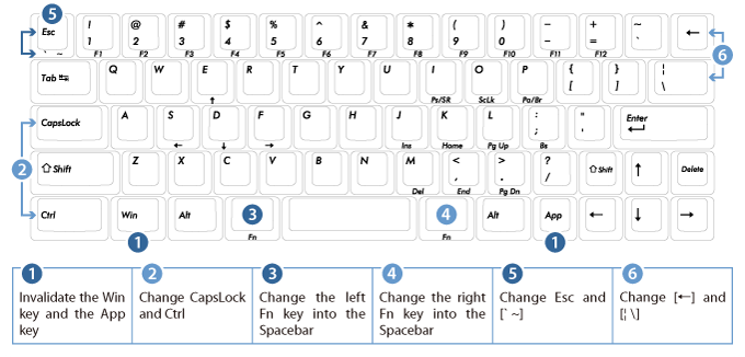
normally on a 60%, (for at least most 60%'s out there) The Function row is accessed with the function key, and then the number row, with each number corresponding to each fuction (F1 -> FN + 1, F2 -> FN + 2, etc..). If you were to remove the function row off your 70%, and use that traditional location for the new function function row, it would interfere with the function numpad, so you could do something like this....(call upon my master paint skills  )
)
move the function row to a descending pattern that wouldn't interfere with the numpad, and move the scroll lock somewhere else.
and - another side note, for the bottom row, i'd rather one fn cap, and only on the right side. i would take it off the left side, and make that spacebar a tad bigger
move the function row to a descending pattern that wouldn't interfere with the numpad, and move the scroll lock somewhere else.
and - another side note, for the bottom row, i'd rather one fn cap, and only on the right side. i would take it off the left side, and make that spacebar a tad bigger
- Attachments
-
- 60bsproposal.PNG (631.58 KiB) Viewed 5233 times
- Dubsgalore
- Location: USA
- Main keyboard: ESA-3000-HASRO
- Main mouse: Deathadder 2013
- Favorite switch: MX Blacks
- DT Pro Member: -
I thought, with the suggested function row layout, the uses who use the vintage SSK's wouldn't have to adjust, because they are not being moved at all? I'm not sure though, that's what I was going forM'er Forever wrote: Thank you for your suggestion, Dubsgalore.
Yeah, that would work but at the expense of everyone who touch types on a vintage SSK and who would have to acclimate to the new positions for the numpad keys. And then, of course there are dozens of different and conflicting layout suggestions that could pour forth. Oi vay car-r-r-r-umba! (probably misspelled, it's what Juan Goldstein says at times like this)
I did however invite suggestions and comments, as that is the purpose of this thread and forum in general, so I may draw your idea render it anyway. This may take a day or two, as I have a couple of other tasks I've got to do first, so bear with me on this...
If you are looking for more suggestions, an ideal 60% layout for me would be this:
You've done some pretty awesome work. You mentioned you are not a 60% fan really, and they happen to be my favorite size
of course, the Kishsaver is pretty similar, but not quite the same.
- Attachments
-
- 60bsproposal.PNG (636.53 KiB) Viewed 5229 times
- Dubsgalore
- Location: USA
- Main keyboard: ESA-3000-HASRO
- Main mouse: Deathadder 2013
- Favorite switch: MX Blacks
- DT Pro Member: -
I don't honestly use the numpad a lot, and including here, like the original function layer, makes it incredibly cluttered as is. It's up to other people but i'd be fine removing the numpad. Don't have a massive need for it. If it were removed, then i'd also prefer the function row (within the function layer) to be moved up along the number row, but that's my preference after using a 60% board for almost a year now.M'er Forever wrote:Now that I look again at your earlier post, I see that I misunderstood you. What you meant was that your solution would allow the numpad assignments to remain in place, but does move the F-key functions into new locations. Got it, thanks.
As far as my dislike of 60% boards and even the traditional SSK with nested-numpad is concerned, it's the crowding of so many functions into a small area without any apparent justification for doing so. I use a 101 key Model M, and never, ever use the numpad, so I wouldn't mind chopping it off. Since I never needed or used the numpad, I don't see the need for the nested-numpad either. So I would replace the affected caps with standard Model M caps and would then love using an SSK even though desk space is not an issue for me despite a fair amount of clutter. But I also realize this is my opinion, not shared among all keyboard users -- each to their own, after all.
I'll work on your ideas and present another render soon -- it'll be a real 60% board this time.
What color would you like the Lock LED indicators to be? Do you like the color scheme of keys, legends, and case? Or would you like to see another? Now's the time to let me know.
Just for the render? ehh color isn't a huge deal for me with the LEDs, maybe just a light blue? as for caps, I like the original beige colorway of traditional IBM boards. Legends and Case are fine :thumb:
- Muirium
- µ
- Location: Edinburgh, Scotland
- Main keyboard: HHKB Type-S with Bluetooth by Hasu
- Main mouse: Apple Magic Mouse
- Favorite switch: Gotta Try 'Em All
- DT Pro Member: µ
I've got to disagree with Dubs here. The way I like a 60% is with a good bit of influence from this guy:

You've seen the HHKB before on this thread. But let's break it down.
Note the physical layout:

It's a standard ANSI 60% block with a few creative differences.
First is the number row: 2u backspace is split into two separate keys. That makes a very pleasing row of 15 single unit keys. Backspace is actually down a row instead, where the awkwardly large ANSI backslash would be. I find this one change a remarkable boost, as backspace is a critically important key when writing! Less stretch equals less fatigue. Backslash is still available, but as the extra key freed up on the top row instead.
The biggest alteration, and absolutely most worthwhile stealing, is the function key the HHKB puts at the right side of right shift. Right shift is vast key, and I've no idea why ANSI and ISO alike keep it that way. Its rightmost unit makes for an inspired function key. Indeed, I took that idea along with the above and used them on my first custom keyboard:

Yes, I have a Caps Lock cap, but that is also a function key; I just couldn't source the appropriate leftover from 7bit. With two function keys, I have a second function layer for less used stuff, where I put the F1-F12 keys! Right along 1 through the equals key. Not all of us use those guys any more than the numpad.
Where I'd differ from the HHKB and my own Mk.I custom (I have another planned for 2014) is in the bottom row. The HHKB and my keyboard use a standard 6.25 unit space bar. This dominates the entire row, and I find it inefficient. Your thumbs are your most agile digits, and I plan to make more use of them, along the lines of the HHKB's brother: the HHKB JP.

Filco are also getting smart about using Japanese style space bars in the wider world. Here's the user's configuration options on this year's new model of theirs: the Minila.

The function keys around the space bar can be made into space bars, too, so westerners can have the large target that they're used to. But I'd use them for mods and layers. Keys like that are fantastic for programmability.
As for why some of us really like 60%s over everything else, look at the centreline of your screen. (If you're using more than one screen, the centreline of your primary is the one I'm talking about.) Then look at your hands on home row on your keyboard. Do they line up? Some of us love symmetry, and I stand at my desk with all myself, the screen and my keyboard lined straight up. A 60% is almost perfectly symmetrical. A TKL hangs off to the right quite a bit. And a full-size is just ridiculous that way. Even before talking about where they hell you have to put your mouse…
Also: no indicator lights, no face branding if the layout fills the entire rectangle, and white caps with light grey mods on a black case!

You've seen the HHKB before on this thread. But let's break it down.
Note the physical layout:
It's a standard ANSI 60% block with a few creative differences.
First is the number row: 2u backspace is split into two separate keys. That makes a very pleasing row of 15 single unit keys. Backspace is actually down a row instead, where the awkwardly large ANSI backslash would be. I find this one change a remarkable boost, as backspace is a critically important key when writing! Less stretch equals less fatigue. Backslash is still available, but as the extra key freed up on the top row instead.
The biggest alteration, and absolutely most worthwhile stealing, is the function key the HHKB puts at the right side of right shift. Right shift is vast key, and I've no idea why ANSI and ISO alike keep it that way. Its rightmost unit makes for an inspired function key. Indeed, I took that idea along with the above and used them on my first custom keyboard:

Yes, I have a Caps Lock cap, but that is also a function key; I just couldn't source the appropriate leftover from 7bit. With two function keys, I have a second function layer for less used stuff, where I put the F1-F12 keys! Right along 1 through the equals key. Not all of us use those guys any more than the numpad.
Where I'd differ from the HHKB and my own Mk.I custom (I have another planned for 2014) is in the bottom row. The HHKB and my keyboard use a standard 6.25 unit space bar. This dominates the entire row, and I find it inefficient. Your thumbs are your most agile digits, and I plan to make more use of them, along the lines of the HHKB's brother: the HHKB JP.

Filco are also getting smart about using Japanese style space bars in the wider world. Here's the user's configuration options on this year's new model of theirs: the Minila.

The function keys around the space bar can be made into space bars, too, so westerners can have the large target that they're used to. But I'd use them for mods and layers. Keys like that are fantastic for programmability.
As for why some of us really like 60%s over everything else, look at the centreline of your screen. (If you're using more than one screen, the centreline of your primary is the one I'm talking about.) Then look at your hands on home row on your keyboard. Do they line up? Some of us love symmetry, and I stand at my desk with all myself, the screen and my keyboard lined straight up. A 60% is almost perfectly symmetrical. A TKL hangs off to the right quite a bit. And a full-size is just ridiculous that way. Even before talking about where they hell you have to put your mouse…
Also: no indicator lights, no face branding if the layout fills the entire rectangle, and white caps with light grey mods on a black case!
-
JBert
- Location: Belgium, land of Liberty Wafles and Freedom Fries
- Main keyboard: G80-3K with Clears
- Favorite switch: Capacitative BS
- DT Pro Member: 0049
Even though the real 60% format (i.e. one with no function row) has merit for its size and portability, I really like this render.M'er Forever wrote:A couple of 60%'ers, each with a different location for Fn.
One has Win and Menu keys left and right of the spacebar for convenience.
Scroll Lock and Num Lock are assigned to S and N keys as alternate or Fn-activated functions.
If Print Screen/SysRq and Pause/Break are needed, these could similarly be added to other keys as alternate functions.
I've noticed that on a 60%, you quickly run out of buttons to program things to, and layers may become awkward to use. This type at least has the dedicated function row, meaning you have 13 keys to assign stuff to. If the keyboard was programmable, you could even use it to switch modes instead of plain media keys.
The keyword for these smaller keyboards is "programmable" though. I can only hope that the technical details will include some limited support for aftermarket controllers when the controller board gets designed. For starters, just a few empty solder-through holes just after the membrane and before the USB connector could mean that we can hook in a custom board to power his keyboard.
Only problem would be the warranty, but I guess that's hard to enforce when buying this keyboard in Europe.
- Muirium
- µ
- Location: Edinburgh, Scotland
- Main keyboard: HHKB Type-S with Bluetooth by Hasu
- Main mouse: Apple Magic Mouse
- Favorite switch: Gotta Try 'Em All
- DT Pro Member: µ
Oh, I missed that one, a fine render. The HHKB style Function exactly where I like it! Lots of bottom row mods, too. It's not a 60%, but for all the reasons you say, it's a very smart little board in either case.
Besides missing HHKB style backspace (which I love but can live without, as it's on none of my IBMs of course) that's a damn close hit to what I was talking about, just with added function row.
I'm not sure about the symmetry / asymmetry of that top row, incidentally. My mind likes balancing up the Escape key with something on the right side, but my eyes don't like the bald patch where the indicators are. Hmm.
- bhtooefr
- Location: Newark, OH, USA
- Main keyboard: TEX Shinobi
- Main mouse: TrackPoint IV
- Favorite switch: IBM Selectric (not a switch, I know)
- DT Pro Member: 0056
- Contact:
Wait, menu keys on both sides?
I'll note that Unicomp has 7, 6, and (maybe - they may not have it any more if they've retooled the keycaps) 5.25 U spacebars.
Looks like that's a 5 U spacebar?
I'll note that Unicomp has 7, 6, and (maybe - they may not have it any more if they've retooled the keycaps) 5.25 U spacebars.
Looks like that's a 5 U spacebar?
- 7bit
- Location: Berlin, DE
- Main keyboard: Tipro / IBM 3270 emulator
- Main mouse: Logitech granite for SGI
- Favorite switch: MX Lock
- DT Pro Member: 0001
I'm quite sure this is the LED-version. For sure there will be a version available where there is a button.
Now, that the right hand sinde is missing 3 columns, what about adding 2 columns to the left and one to the right, so we can have 10 function keys on the left and some cursor keys on the right?

What about this:
Now, that the right hand sinde is missing 3 columns, what about adding 2 columns to the left and one to the right, so we can have 10 function keys on the left and some cursor keys on the right?
What about this:
