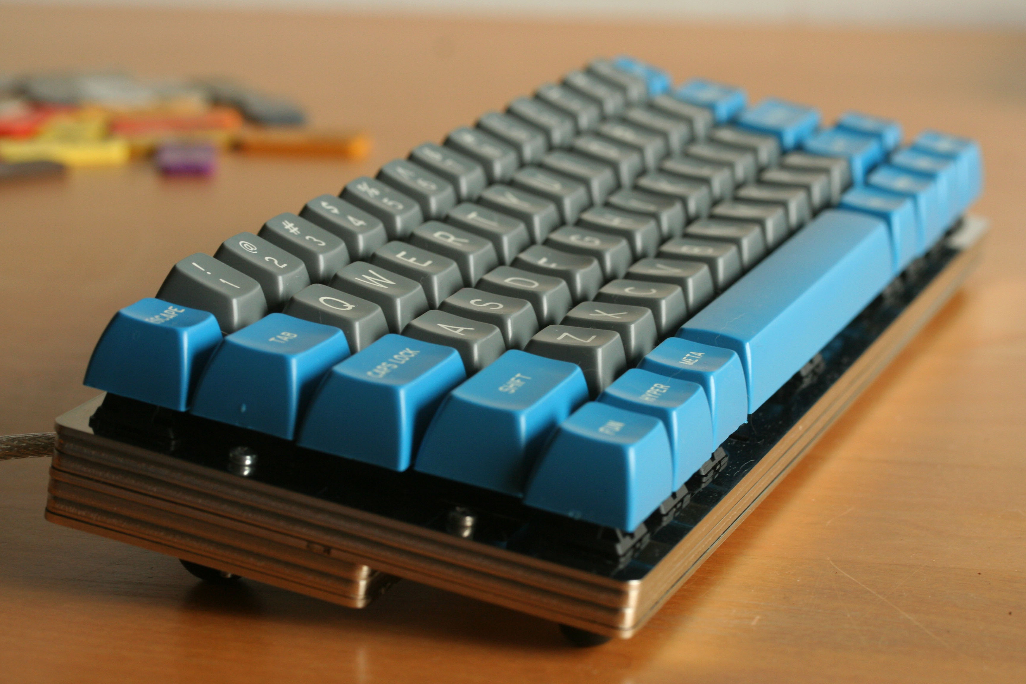
Group Build prototyping phase

User avatar
matt3o
-[°_°]-

17 Feb 2014, 15:54

We are finally close to release the WhiteFox! Read about the whole process here


What
If there's interest, we build a layered keyboard together. You can buy all the components from a GB, specifically:

- layered case
- screws
- PCB (high quality CNC'd, home built)
- teensy
- diodes
- LEDs
- USB ports/cables/etc

what it is not included:
- switches (but actually we could add them)
- keycaps (best options are: round 4, round 5, DSA Retro and the soon to come DSA PBT)

We try to cut cost by buying all components together.

How
Phase 1 is prototyping (actually this post).

We design 3 (might be 2 or 4) main designs. For these base designs you get everything ready and pre-configured. You get the teensy already programmed with the proper firmware, the right number of diodes, a CNC'd PCB and so on. All you need to do is to solder the switches. Consider it a sort of keyboard construction kit.

I might be available at assembling the keyboard for you, but the service won't be the cheapest (sorry guys).

If you don't like any of the main designs you can send me a CAD file and I'll have it laser cut with the others. You can still get the teensy and the other components if you want.

What we need to do is:
1) define the main layouts <---- we are here
2) design the case (size/screws/spacers/etc...)
2) design the PCB
3) start the GB

Why
fuck off!

When
Realistically the GB will start in a couple of months.

Cost
A hand-wired custom keyboard goes between 150 and 200 euros. We hope to cut that price a bit, but consider that this time we will try to use a PCB, so we will have that to add to the expenses. Of course you can still hand-wire your keyboard if you want.

The 3 official layouts will be cheaper than the custom ones.

Material
The material for the layered keyboard will be most likely plain stainless steel. You can have your custom layout but you cannot choose the material! The material will be the same for all. This is done to reduce expenses with the laser cut and headache to myself.

Caveat
If there's not enough interest I won't proceed with the GB and maybe I'll just have a few boards laser cut for a couple of friends.

Examples
Image

Image

-------------------------------------------------------------------------------

Layouts
Please note that they are not final! I'm looking for your feedback. Don't look at the legends, you can have whatever you want wherever you want. The candidates are:

Matt-1
Image
probably the smallest "squared" keyboard you can have

Matt-2
Image
slightly smaller than a 60% (shrunk to the right)

Matt-3
Image
a plain old 65%. note the backspace position.

A few notes:
- I'm not going to use insanely (too small, too big) sized spacebars (just because they hard to find). this is of course true for the "official layouts", if you design your own, you can do whatever you want.
- The first two layouts have some non-standard keys. I'm open to discussions on this matter
- ISO vs ANSI. Fight!
Last edited by matt3o on 27 Nov 2015, 11:31, edited 2 times in total.

User avatar
Muirium
µ

17 Feb 2014, 16:03

The Great Keyboard Build of 2014 begins…

I have a cut down µTKL design I'm working on, that I can share. Top features: No function row, HHKB Fn key and Backspace, compatible with Round 5 and Matt's DSA sets, and a strictly minimalist case. You've all seen my Shiny 60%, you know the kind of thing I'm going for.

I'm also exploring a second design using those small space bars available in Round 5. Or even a Matias switch build, if Matteo's confident enough to try.

User avatar
matt3o
-[°_°]-

17 Feb 2014, 16:06

Forgot to mention... I might be available at assembling your keyboards BUT it won't be cheap, sorry guys :P

Please share your layouts, Murium.

User avatar
ماء

17 Feb 2014, 16:09

yeah i curious layout muri ,symm sgg it seems

User avatar
Muirium
µ

17 Feb 2014, 16:14

I've some diagramming to do then! I'll do a symmetric version too, ماء, as I'd like to see if it's possible with Round 5 caps. But standard stagger is what I have in mind, really. I think symmetric stagger would be a better idea for a fully split keyboard, for me at least.

User avatar
ماء

17 Feb 2014, 16:43

Muirium wrote:I've some diagramming to do then! I'll do a symmetric version too, ماء, as I'd like to see if it's possible with Round 5 caps. But standard stagger is what I have in mind, really. I think symmetric stagger would be a better idea for a fully split keyboard, for me at least.
I think symmetric stagger good on a regular keyboard rather than split, split to columnar although I prefer for symm sgg for now.
symm sgg looks elegant on a regular 8-) I just don't like the hole in the middle you may use the trackpoint to cover :lol:
how staggering you use 1/2,1/3,1/4 i prefer like µTron
Last edited by ماء on 17 Feb 2014, 17:31, edited 1 time in total.

User avatar
rindorbrot

17 Feb 2014, 17:20

I vote for an ISO Choc Mini Layout!
Something like I already posted in the Ducky Layout competition:
Image

User avatar
Muirium
µ

17 Feb 2014, 17:27

Audacious! My steel 60% from last year weighs a kilo, naked. It's 15x5 units. Your design is 36% larger even without gaps, so it would be one impressive piece of steel.

We definitely need a way to accommodate both ISO and ANSI preferences. DT is split down the middle on those! (As is my keyboard collection…)

User avatar
rindorbrot

17 Feb 2014, 17:32

Heavy is good!

Many PCB are ISO/ANSI compatible, so I think this should be doable...
Only the plates would have to be different.

But I'd be fine with dropping the two rightmost columns, as long as the F-row is in there, I am happy!
Last edited by rindorbrot on 17 Feb 2014, 17:33, edited 1 time in total.

User avatar
snoopy

17 Feb 2014, 17:32

Matt-3 in iso with 1.5 mods (bottom-row), 7x spacebar and normal backspace would be my dream... :)

User avatar
matt3o
-[°_°]-

17 Feb 2014, 17:34

rindorbrot wrote:I vote for an ISO Choc Mini Layout!
Something like I already posted in the Ducky Layout competition:
Image
I kinda like it actually. not sure about the Function row, but one could always put them on the FN layer too.
Muirium wrote:We definitely need a way to accommodate both ISO and ANSI preferences. DT is split down the middle on those! (As is my keyboard collection…)
it would be technically feasible to support both on the same plate, but it doesn't look good on a naked board, imho.

User avatar
scottc

17 Feb 2014, 17:35

I like the layouts, but I think that the non-standard HHKB-style backspaces will make caps particularly difficult to source and I'm not sure about the compromise here. Of course there's always round 5, like you suggest, but it still rules out using most other keycap sources without going all blank.

User avatar
rindorbrot

17 Feb 2014, 17:36

matt3o wrote: I kinda like it actually. not sure about the Function row, but one could always put them on the FN layer too.
But that is exactly the point, I want the F-row and Numbers on the first layer.

User avatar
matt3o
-[°_°]-

17 Feb 2014, 17:37

snoopy wrote:Matt-3 in iso with 1.5 mods (bottom-row), 7x spacebar and normal backspace would be my dream... :)
why 7u spacebar?

with 1.5 mods and 7u you have to get rid of a key anyway
scottc wrote:I like the layouts, but I think that the non-standard HHKB-style backspaces will make caps particularly difficult to source and I'm not sure about the compromise here. Of course there's always round 5, like you suggest, but it still rules out using most other keycap sources without going all blank.
I tend to agree. We should try to keep it as standard as possible... but I don't know if it is worth doing a poker/whatever clone.

User avatar
Muirium
µ

17 Feb 2014, 17:45

Round 5 and the various DSA sets Matt's so fond of leading. Like this one:
Image
http://deskthority.net/marketplace-f11/ ... t7402.html

I have high hopes for the forthcoming dyesub PBT "beige" DSA set, as I expect it'll actually be a smart pair of monochrome greys.

But you're quite right of course: HHKB backspace and short shift aren't for everyone. I'll see what I can do with my µTKL: the minimalist's choice.

User avatar
matt3o
-[°_°]-

17 Feb 2014, 17:47

DSA is the way to go for custom keyboard, guys! NO ROWS!

now go get that Skull Squadron keyset! :D

User avatar
rindorbrot

17 Feb 2014, 17:49

But it is not available in ISO DE!

User avatar
snoopy

17 Feb 2014, 17:50

matt3o wrote:
snoopy wrote:Matt-3 in iso with 1.5 mods (bottom-row), 7x spacebar and normal backspace would be my dream... :)
why 7u spacebar?

with 1.5 mods and 7u you have to get rid of a key anyway
cause I love vintage cherry keycaps and 1.5mods. And this would give me the ability to nearly use the complete and original caps that came of a g80-3000had/sad/... except right shift. Or complete keys of 1800had/... So if I have worn out a set of them, I can hunt a new set on ebay and don't have to use any special keys.

I don't like keyboards with a lot of modifiers in bottom row (especially 1xmods), they always confuse me and I don't need them. I like it simple and classic. 1.5-1.5-7-1.5-1.5 is perfect for me. But that's a personal preference. I know other people love to have as many modifiers as possible.

User avatar
Muirium
µ

17 Feb 2014, 17:54

Indeed. I'm the opposite (I envy Japanese keyboards with their tiny space bars and extra mods) but keyset reuse is vital, and everyone's got their own preference. I have Alps / Matias ideas for some great old caps which take me out of my traditional comfort zone, but maybe not this GB!

Re: ISO DE with the Macross set. The ISO kit features blanks, which don't even look right on ISO UK. I know why (it's a small GB and you want to hit MOQ) but we expect more from the PBT beige set. Even if it means we all have Swedish legends sitting spare…

User avatar
matt3o
-[°_°]-

17 Feb 2014, 18:04

snoopy wrote:I don't like keyboards with a lot of modifiers in bottom row (especially 1xmods), they always confuse me and I don't need them. I like it simple and classic. 1.5-1.5-7-1.5-1.5 is perfect for me. But that's a personal preference. I know other people love to have as many modifiers as possible.
I agree I tend to basically never use the right hand modifiers and I like 1.5u control. I don't know about 7u spacebar. I find it a wast of space :)

User avatar
Muirium
µ

17 Feb 2014, 18:12

This is where we differ! Hasu's firmware revived my Kishsaver yesterday, which was awesome. But his keymap had right shift set to the Fn key, to access the HHKB layer. It was driving me nuts! I press right shift just as often as left. Same with the thumb mods, especially Command on either side of the space bar.

User avatar
matt3o
-[°_°]-

17 Feb 2014, 18:31

I use right shift a lot actually. I was talking about first row mods.

User avatar
ماء

17 Feb 2014, 19:05

any someone use SpaceShift dual role i went try,may alternative..

User avatar
matt3o
-[°_°]-

17 Feb 2014, 19:54

ISO test, I actually like it very much

Image

User avatar
rindorbrot

17 Feb 2014, 19:56

matt3o wrote:ISO test, I actually like it very much

Image
This +Function-row please! ;)

User avatar
matt3o
-[°_°]-

17 Feb 2014, 19:59

the problem is where to place FN. probably the best is on CAPS LOCK...

User avatar
rindorbrot

17 Feb 2014, 20:04

I'd say either capslock, right "super" or the lowest Anykey.
Plus I'd also make the second Anykey a FN with an MXLOCK (maybe).

User avatar
matt3o
-[°_°]-

17 Feb 2014, 20:14

variant for the Matt-1

Image

User avatar
snoopy

17 Feb 2014, 20:19

matt3o wrote:ISO test, I actually like it very much

Image
:shock: So close to my dreamboard.

Very nice!

User avatar
Muirium
µ

17 Feb 2014, 20:43

Seeing as we're in ISO love tonight: here's the ISO variant µTKL in progress:
µTKL.png
µTKL.png (130.65 KiB) Viewed 24942 times
I'm thinking of a solid wall of keys again. Note the navigation six-pack above the cursor keys: it's a square of 9. Because it's a numpad on the function layer, and 3 macro keys on the default.

Re: Matt's number-row-less layout; I was wondering when you'd go 4 row! I have considered it for the TKL. But then I'd lose row 1, and it's my favourite profile of Round 5 caps.

Post Reply

Return to “Workshop”