LOVE IT!7bit wrote:Looks to me like the logical evolution of the Windows logo for version 9.
What about this one:
IC/Discussion on beige set
- Muirium
- µ
- Location: Edinburgh, Scotland
- Main keyboard: HHKB Type-S with Bluetooth by Hasu
- Main mouse: Apple Magic Mouse
- Favorite switch: Gotta Try 'Em All
- DT Pro Member: µ
Nice! What was the Xerox Alto keyboard like for mods anyway?
Windows 1 clearly had quite a nice logo Microsoft's standards. It got much uglier for Windows 3.
Text only should do it, I think. Unless some of the Windows guys share my obsession with a symbolic mod set and demand equality!
Windows 1 clearly had quite a nice logo Microsoft's standards. It got much uglier for Windows 3.
Text only should do it, I think. Unless some of the Windows guys share my obsession with a symbolic mod set and demand equality!
- matt3o
- -[°_°]-
- Location: Italy
- Main keyboard: WhiteFox
- Main mouse: Anywhere MX
- Favorite switch: Anything, really
- DT Pro Member: 0030
heathen!Muirium wrote:Nice! What was the Xerox Alto keyboard like for mods anyway?
https://www.google.com/search?q=x11%20logo
- Ichigo87
- Location: Paris, France
- Main keyboard: Noxary X60 v1
- Main mouse: G502 Lightspeed
- Favorite switch: Purple Zealios
- DT Pro Member: -
I had only text version in mind, i know that we cannot use logo.matt3o wrote:do you want me to remove the command key?
edit: it is not a matter of what key does what, it's just branding. I'm not having any brand key. I have the TUX key which is hardly a brand and anyway it's open source.
edit 2: I can add text only WIN keys by the way, but no logos.
I would like win because it is prettier near menu than super and super is prettier near meta than menu...
- rindorbrot
- Location: Bavaria, Germany
- DT Pro Member: 0029
Just a stupid question, why can't we use the Windows logo?
I mean I get that it is copyrighted but SP can do and has done doubleshot versions of some Windows logos.
Is it different for Dye-Sub?
I mean I get that it is copyrighted but SP can do and has done doubleshot versions of some Windows logos.
Is it different for Dye-Sub?
- matt3o
- -[°_°]-
- Location: Italy
- Main keyboard: WhiteFox
- Main mouse: Anywhere MX
- Favorite switch: Anything, really
- DT Pro Member: 0030
I think that if you really wanted you could have the windows logo. but it's a distinction mark of all my GBs, you'll never see a windows logo. I'm not a windows hater and I'm not an Apple fanboy. It's simply that you won't see windows or apple logos in my GBs.
- Daniel
- Location: Blackforest Germany
- Main keyboard: Various
- Main mouse: Kensington Slimblade + MX518
- Favorite switch: Cherry MX Blue and Black + BS
- DT Pro Member: 0028
Or the wayland logo? http://upload.wikimedia.org/wikipedia/c ... go.svg.pngmatt3o wrote:LOVE IT!7bit wrote:Looks to me like the logical evolution of the Windows logo for version 9.
What about this one:
- Broadmonkey
- Fancy Rank
- Location: Denmark
- Main keyboard: Whitefox
- Main mouse: Zowie FK2
- Favorite switch: MX Black
- DT Pro Member: -
- Contact:
I shouldn't have posted the picture of the WYSE DSA set. I would really love if the set was a tad warmer, but I am sure it will be a great set in any way!matt3o wrote:people don't see the beauty in beige. Just cold, sad neutral gray.
maybe next time...
- matt3o
- -[°_°]-
- Location: Italy
- Main keyboard: WhiteFox
- Main mouse: Anywhere MX
- Favorite switch: Anything, really
- DT Pro Member: 0030
What do you think of the utility kit instead of the "inverted function row"?

"win" would go back to the mod kit instead of "super" and we can get rid of the windows logo.

"win" would go back to the mod kit instead of "super" and we can get rid of the windows logo.
- Broadmonkey
- Fancy Rank
- Location: Denmark
- Main keyboard: Whitefox
- Main mouse: Zowie FK2
- Favorite switch: MX Black
- DT Pro Member: -
- Contact:
oh yeah, I love the the Zoidberg! How come you changed the Amiga A to black?
- matt3o
- -[°_°]-
- Location: Italy
- Main keyboard: WhiteFox
- Main mouse: Anywhere MX
- Favorite switch: Anything, really
- DT Pro Member: 0030
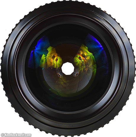
refresh your nerdom7bit wrote:The aperture has only 8 blades, but must have either 7 or 9 !!!matt3o wrote:Another test for the Nerdom
- drrtyrokka
- Location: Bavaria, Germany
- Main keyboard: Ducky Shine III, Ducky G2Pro TKL
- Main mouse: Logitech G602; Anker Optical Vertical Mouse
- Favorite switch: Ergo Clear 62g
- DT Pro Member: -
- Contact:
how about a 'help!' key for f1?
- scottc
- ☃
- Location: Remote locations in Europe
- Main keyboard: GH60-HASRO 62g Nixies, HHKB Pro1 HS, Novatouch
- Main mouse: Steelseries Rival 300
- Favorite switch: Nixdorf 'Soft Touch' MX Black
- DT Pro Member: -
This * 100000000. I wouldn't use a "WIN" mod key.jdeblese wrote:I'd rather have SUPER than WIN in the mods.matt3o wrote:"win" would go back to the mod kit instead of "super" and we can get rid of the windows logo.


