
Damn, I'm looking forward to this


the highlighted area is the keytop. the printable area is slightly smaller than that. Actually if you print the SVG template you get a 1:1 replica of the keyboardwoody wrote:So far, so good. The high-lighted (lit?) area is the allowed per SP template?

Muir, that is due to the complex 7bit system, the same happened to round 4. The prices you see here are exactly what you are going to pay. We have a less flexible system, but what you see is what you get.Muirium wrote:Hmm… heard what just happened to Round 5? 7bit submitted his final order and SP put the price up enough he had to throw it back to taking new orders, hoping to hit a better tier. He's a smart man and I bet he had a good buffer in his model, but they shot through it anyway. Concerning!
Looking good.matt3o wrote:I started working on the final templates. This is the real deal, legend text, size and position are actually the way they will be printed, so if you spot any error or have suggestions please report asap. I'll also post the SVG if you wanna play with it.
Maybe font size for the mods could be slightly smaller.
<image>
PS: I really don't like the @ sign
The problem with @ is that it is uneven, the "a" is bold, the circle is very thin. I don't like it.Kurk wrote:Looking good.
- The @ is indeed a bit fat round its belly.
- Tilde looks a bit small.
- Single and double quotation mark should not be italic.
- Further: the font size of the mods looks OK to me. Is it the same font size as the rest of the non-alpha keys? CAPS LOCK looks a bit larger but maybe that's the nature of the beast.
Muirium wrote: Meanwhile, I actually like a nice round @. Which is ironic, given the connotations…

Lëtzebuerg: 15%.squarefrog wrote:Misdirection through a nice EU country with low import tax?Muirium wrote:The key to getting anything in here without getting robbed lies in a little misdirection…

you mean "super" instead of "win"?Ichigo87 wrote:I love this kit and this group buy, i am sure that i am gonna try to buy 90% of the kits. The only thing, i don't like, is the yellow win keycap. Is there a chance to get them like others modifiers ?

Late reply here.matt3o wrote:1 black 1 outlined (like the original Amiga), no?Broadmonkey wrote:oh yeah, I love the the Zoidberg! How come you changed the Amiga A to black?
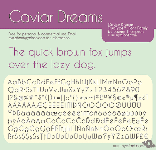
Hmm…drrtyrokka wrote:I really like this font here, what do you say? http://www.dafont.com/caviar-dreams.font
There is a nice '@' logo too
And it's free for personal and commercial use...
If you could give me the svg file, i could edit it and you wouldn't have work to do..
Of course only if anyone likes it...
There is in fact a shirt for that…imbattable wrote:Do we really want to start talking about the font again? (inb4 µ demands Helvetica again).

Yes, me too. Ready to share with us, Matt?drrtyrokka wrote:just something i wanted to share. i like it though.
Nevertheless it would be fun for me editing the .svg file, just because i want to know how it will look like.


Nooooooooooooooooo!matt3o wrote:Really?! Do we want to change font at this stage?

