Topre switch / Cherry MX compatible
-
imbattable
- Location: Germany
- Main keyboard: Some Cheap Aukey MX blue
- Main mouse: Logitech G305
- Favorite switch: Topre
- DT Pro Member: -
Cookie is complicated like Alps SKCL 
- cookie
- Location: Hamburg, Germany
- Main keyboard: HHKB Pro 2
- Main mouse: MX Master
- Favorite switch: Topre
- DT Pro Member: -
you guys know how I mean it  All this is the beaty about this place and the different preferences people have!
Almost every keyboard will get some love for it's unique design/layout/whatever... beside of g81s, rubber domes, razer switches and so on!
Almost every keyboard will get some love for it's unique design/layout/whatever... beside of g81s, rubber domes, razer switches and so on!
-
jamaicanpi
- Main keyboard: Matias quiet pro
- Main mouse: Mionix Naos 5000
- Favorite switch: quiet and tactile
- DT Pro Member: -
Maybe Bram can shed some additional light, but it sounds like the Novatouch TKL will use a switch that is some hybrid between a standard 45g topre switch and a 45g silent topre switch.
CM Carter:
I don't own a topre board, but the wiki describes that silent boards have a foam o-ring to dampen the upstroke, and can have a longer stem to account for the o-ring's reduction in travel.
http://deskthority.net/wiki/Topre_switches
CM Carter:
http://geekhack.org/index.php?topic=503 ... msg1247508The purple stem is related to CM (Our now exclusive switch color) but also has characteristics of the silenced topre version.
I don't own a topre board, but the wiki describes that silent boards have a foam o-ring to dampen the upstroke, and can have a longer stem to account for the o-ring's reduction in travel.
http://deskthority.net/wiki/Topre_switches
-
jamaicanpi
- Main keyboard: Matias quiet pro
- Main mouse: Mionix Naos 5000
- Favorite switch: quiet and tactile
- DT Pro Member: -
That's too bad. I would've preferred a dampened upstroke. I wonder if when CM Carter made that comment they were looking into the silent topre switch. Thanks for the clarification.
- Bramster
- Cooler Master Employee
- Location: Netherlands
- Main keyboard: CM NovaTouch TKL + Custom DSA Granite
- Main mouse: CM MM531
- Favorite switch: too many :D
- DT Pro Member: -
The purple is indeed like Carter mentioned on GeekHack not because of the Topre Silent Switches but our exclusive switch color to differentiate our switch from the rest of the Topre switches..
Small update, how about this font style:

Small update, how about this font style:

- 002
- Topre Enthusiast
- Location: Australia
- Main keyboard: Realforce & Libertouch
- Main mouse: Logitech G Pro Wireless
- Favorite switch: Topre
- DT Pro Member: 0002
Hmm? Are you saying that the slider on the silenced switch is shorter? Do you mean overall height of the total piece, or are you talking about the travel being shorter as a result of the base of the slider + foam ring being thicker than the base of a standard slider?matt3o wrote:...the silent topre slider (that is actually shorter)
Ref pic: http://deskthority.net/w/images/4/4d/Si ... arison.jpg
- matt3o
- -[°_°]-
- Location: Italy
- Main keyboard: WhiteFox
- Main mouse: Anywhere MX
- Favorite switch: Anything, really
- DT Pro Member: 0030
yeah sorry I wasn't clear. to compensate the buffer height, the feet are shorter (as you can clearly see from your picture)002 wrote:Hmm? Are you saying that the slider on the silenced switch is shorter? Do you mean overall height of the total piece, or are you talking about the travel being shorter as a result of the base of the slider + foam ring being thicker than the base of a standard slider?matt3o wrote:...the silent topre slider (that is actually shorter)
Ref pic: http://deskthority.net/w/images/4/4d/Si ... arison.jpg
- matt3o
- -[°_°]-
- Location: Italy
- Main keyboard: WhiteFox
- Main mouse: Anywhere MX
- Favorite switch: Anything, really
- DT Pro Member: 0030
getting closer, Bram. (fix the ALT positioning thoughCM Bram wrote:The purple is indeed like Carter mentioned on GeekHack not because of the Topre Silent Switches but our exclusive switch color to differentiate our switch from the rest of the Topre switches..
Small update, how about this font style:
- scottc
- ☃
- Location: Remote locations in Europe
- Main keyboard: GH60-HASRO 62g Nixies, HHKB Pro1 HS, Novatouch
- Main mouse: Steelseries Rival 300
- Favorite switch: Nixdorf 'Soft Touch' MX Black
- DT Pro Member: -
"CAPSLK" is a bit ugly, why not Caps Lock or CAPS LOCK? It looks like there's plenty of space for it.CM Bram wrote:The purple is indeed like Carter mentioned on GeekHack not because of the Topre Silent Switches but our exclusive switch color to differentiate our switch from the rest of the Topre switches..
Small update, how about this font style:
- Muirium
- µ
- Location: Edinburgh, Scotland
- Main keyboard: HHKB Type-S with Bluetooth by Hasu
- Main mouse: Apple Magic Mouse
- Favorite switch: Gotta Try 'Em All
- DT Pro Member: µ
That's more like it! It is Futura. The alphas are the best looking legends on a new keyboard that I've seen this year!
Scott's right about CAPS LOCK though. And ESC ought to be the same text size as the other mods too. But you guys are really getting there this time.
Scott's right about CAPS LOCK though. And ESC ought to be the same text size as the other mods too. But you guys are really getting there this time.
- combataran
- Location: Malaysia
- Main keyboard: Cherry G80-1000HAD
- Main mouse: CM Storm Spawn
- Favorite switch: MX Blacks
- DT Pro Member: -
I noticed that the Capslock LED is gone from this pic: http://imgur.com/a/FpMJz.CM Bram wrote:The purple is indeed like Carter mentioned on GeekHack not because of the Topre Silent Switches but our exclusive switch color to differentiate our switch from the rest of the Topre switches..
Small update, how about this font style:
Can't wait for this to launch!
- Broadmonkey
- Fancy Rank
- Location: Denmark
- Main keyboard: Whitefox
- Main mouse: Zowie FK2
- Favorite switch: MX Black
- DT Pro Member: -
- Contact:
It's a good font compared to anything else being used these days, but I don't know if I prefer the top centered placement of the legends seen in the picture combataran linked to.
- Kurk
- Location: Sauce Hollondaise (=The Netherlands)
- Main keyboard: Kinesis Advantage // Filco MJ2 + HID liberation
- Main mouse: ITAC Mousetrak Professional
- DT Pro Member: 0027
edit: as Muirium said.
I hope this is not the final design. Why are the legends of most part of the number row arranged in a fit-for-backlight fashion? It just looks plainly wrong, especially because other keys (tilde and grave) are arranged in the normal way, i.e. shifted character on top.
I hope this is not the final design. Why are the legends of most part of the number row arranged in a fit-for-backlight fashion? It just looks plainly wrong, especially because other keys (tilde and grave) are arranged in the normal way, i.e. shifted character on top.
- Muirium
- µ
- Location: Edinburgh, Scotland
- Main keyboard: HHKB Type-S with Bluetooth by Hasu
- Main mouse: Apple Magic Mouse
- Favorite switch: Gotta Try 'Em All
- DT Pro Member: µ
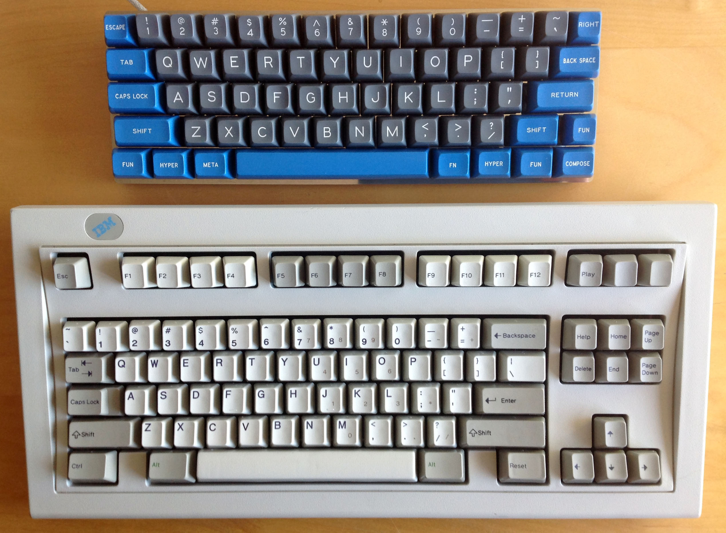
True, I like dead centre the best of all. But I like spherical caps, too. Probably a bit too retro for most tastes.
But top left legends on cylindricals is positively modern. IBM only introduced it during my lifetime!

Another example of what we like: Dolch.

But top left legends on cylindricals is positively modern. IBM only introduced it during my lifetime!

Another example of what we like: Dolch.

- Broadmonkey
- Fancy Rank
- Location: Denmark
- Main keyboard: Whitefox
- Main mouse: Zowie FK2
- Favorite switch: MX Black
- DT Pro Member: -
- Contact:
Which is to say, Cherry's font, right? 
- cookie
- Location: Hamburg, Germany
- Main keyboard: HHKB Pro 2
- Main mouse: MX Master
- Favorite switch: Topre
- DT Pro Member: -
I must admit that I like the font on the novatouch, it is modern, modest and the letters are not too big.
The letters reminds me a little bit of those on filco keyboards. The only thing I dislike is "CAPSLK" I would spell it out completely, there is enough space for it. Which material are the caps?
I envy Mu's 60% board, really nice caps, really nice color!
The letters reminds me a little bit of those on filco keyboards. The only thing I dislike is "CAPSLK" I would spell it out completely, there is enough space for it. Which material are the caps?
I envy Mu's 60% board, really nice caps, really nice color!
- Muirium
- µ
- Location: Edinburgh, Scotland
- Main keyboard: HHKB Type-S with Bluetooth by Hasu
- Main mouse: Apple Magic Mouse
- Favorite switch: Gotta Try 'Em All
- DT Pro Member: µ
ABS only again, I presume.
PBT space bars are where the action is at. Pity that Topres have a strange size, and will be late to the party in any case.
PBT space bars are where the action is at. Pity that Topres have a strange size, and will be late to the party in any case.