TL;DR: Give up and go home.
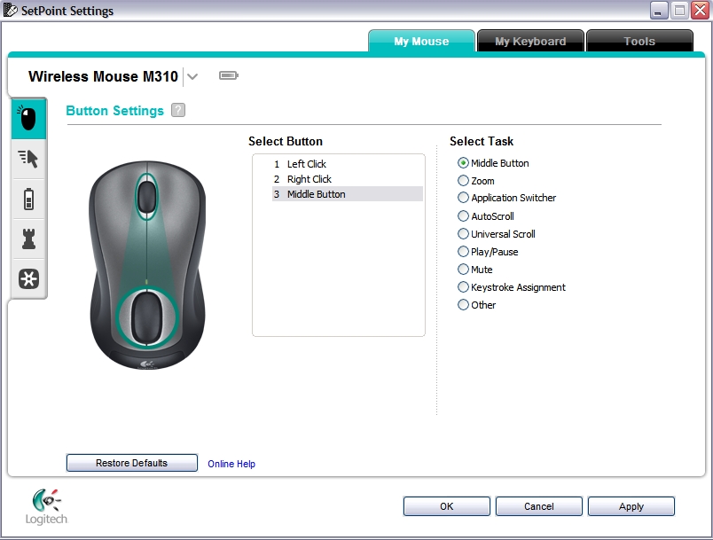
The Logitech one looks nice — it uses
some native controls, it's not cramped, and it makes tasteful use of colour. The picture of a mouse with a finger wheel, palm wheel and wheel-to-wheel spotlight/raygun is a bit odd, though.
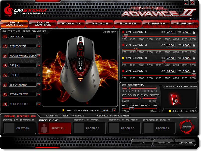
The Intel window (and that's their old design) is just fugly and confusing (it's as confusing to use as it looks), and whoever designed the Asus window should be shot. Then resurrected and shot again.
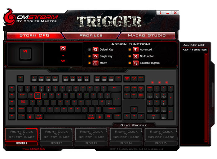
The CM programs do appear to make sense, once you get over your "the goggles!" reaction (and since the goggles do nothing, you'll still get eye cancer off that software).
Ultimately, it's a very difficult problem. The Windows stock UI is pretty drab and sterile looking. I don't object to programs having a custom look, but it causes two problems. Firstly, the idiotic managers responsible for most of these products have no taste, so they'll sign off whatever garish garbage they end up with. Custom window designs typically aren't done for the right reasons or by anyone who has the necessary aesthetic sense that such a difficult task requires.
Secondly, the Windows GUI is very primitive. There is no per-process theming, and that is the first step to a correct solution: allow a program to bundle and load its own theme. Microsoft won't allow this, because they keep the theme system completely locked out (though there's a patch-free solution now—
UxStyle—that modifies Windows at runtime but makes no permanent alterations, which lets me run a theme to have white title bar text in Windows 8, something Microsoft officially forbid me from doing).
However, it gets worse. The Windows native controls are anaemic. Something programmers frequently need is more complex controls, or more fine-grained control over how they appear and function. For example, I tried to get .NET to draw a slider without the tick marks, and so far as I can tell, that is fundamentally impossible. For 256-step sliders (RGB/HLS) the tick marks waste precious space and serve zero purpose, but I can't remove them.
This has always been an issue with the Web, since HTML was never intended to be used as a general-purpose GUI. is an issue that goes far beyond games and gaming-orientated drivers. I don't know of any GUI that has an intelligent control construction kit that permits creation of compound controls with intelligent application of visuals that can be themed easily. Custom controls on the Web (HTML+CSS+JS) are almost guaranteed to be mouse-only, and the browser has no say in the matter.
Go into Event Viewer in Windows Vista upwards, open the
Filter Current Log dialog box for any event log, and try using the keyboard to operate the
Event sources control. That's a custom control created by Microsoft that is completely messed up. It has an editable text box that is treated as read-only (anything you type in is discarded, which is extremely stupid). Pressing Escape closes the dialog instead of the dropdown. Type-to-find is single letter only: typing "eve" for "eventlog" takes you to E, then V, then back to E again. It's utterly pathetic.
And that's the other problem. Custom windows and controls frequently don't obey native behaviour rules or follow basic expectations, so they offer poor accessibility and poor ease of use. For people who prefer keyboard control over the mouse, you can often find that you're stuck: some of these custom windows don't respond to the keyboard at all. Even Microsoft don't get the basics right. In Windows 7, press the Windows key, type "Notepad" (for example), then the menu key: you get the context menu for Notepad. Now try it again, but press Shift+F10: you get the context menu for the search field. Microsoft couldn't even figure out how to make Menu and Shift+F10 do the same thing (this is fixed in Windows 8 though), so if they can't, what chance is there that Dumb Funge Co in Taiwan is going to make fake controls that actually work properly?
The Windows GUI is a minefield for absolutely everyone, as it's a rotting prehistoric mess. Windows Forms doesn't appear to be a lot better. The Web has been digging itself into huge holes for years with terrible fake UI, some in the name of arrogance, and some out of necessity from ending up in the difficult position of trying to do something with a platform never designed for those objectives.


