Unicomp SSK... for real this time?

User avatar
acfrazier
Mad Scientist

02 Apr 2014, 18:24

I just got a shockingly convincing email about ten minutes ago with the following contents:

Image

Since it is April 2, but the email was dated April 1.. is it real?


Edit: I can confirm this is real:

Image

Further proof that this has been in the works for a while: https://www.facebook.com/PCKeyboard/pos ... comments=7

And official FB post: https://www.facebook.com/PCKeyboard/pho ... eam_ref=10
Last edited by acfrazier on 02 Apr 2014, 18:41, edited 1 time in total.
Reason: Stick, because holy crap

User avatar
scottc

02 Apr 2014, 18:34

I might cry if this is an April Fools Day joke...

User avatar
Muirium
µ

02 Apr 2014, 18:45

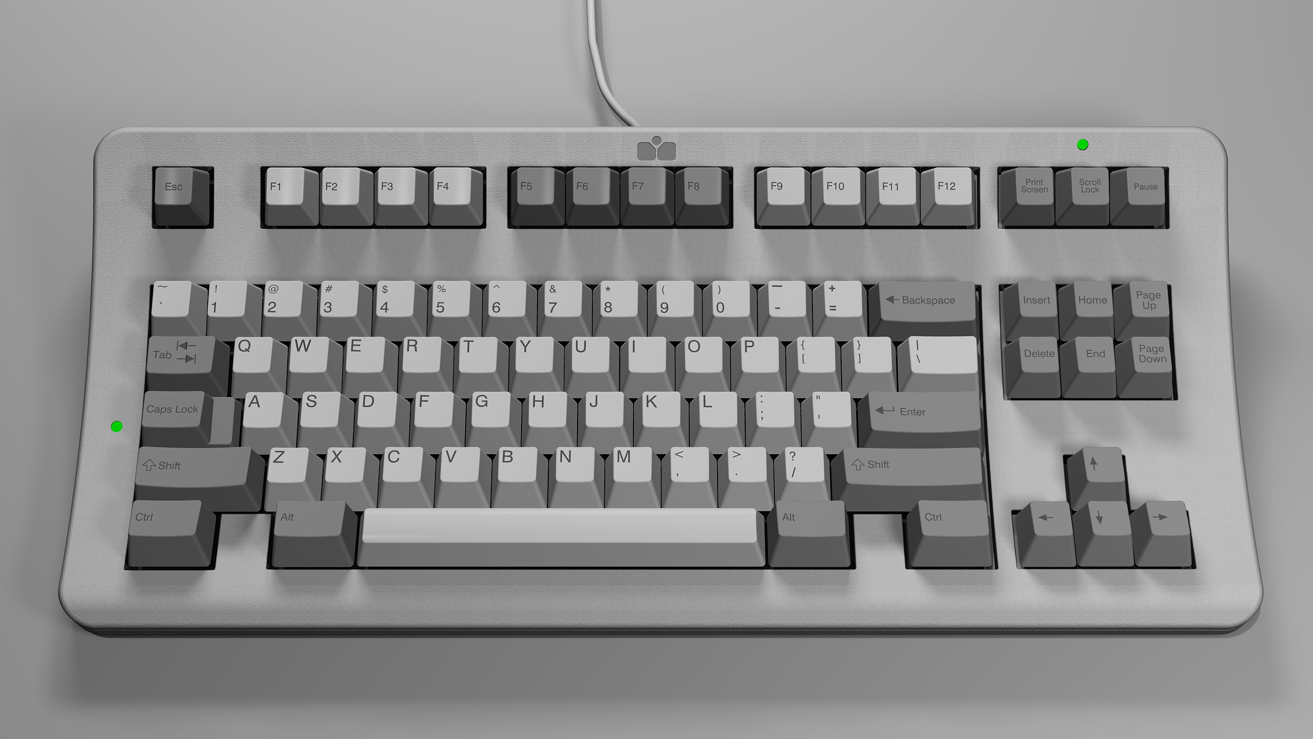
I recognise that style of render: this is what Emmer Forever was working on here at DT.

http://deskthority.net/keyboards-f2/a-p ... t6977.html

Pretty impressive to see Unicomp is taking a shot at this! We could be in for something awesome. Take a read through the thread to see what ideas a bunch of us threw around, including full programmability for layers and macros. I preferred some of the other layouts, but anything small and next gen like this from Unicomp is just the news we need to hear. Life, Jim!

User avatar
E TwentyNine

02 Apr 2014, 18:53

Yeah, that's Forever's render, no question about it. He had said he was working with them as well.

So they've announced it. Now let's see if they build it...

It's also mentioned on their Facebook page: https://www.facebook.com/PCKeyboard

User avatar
Muirium
µ

02 Apr 2014, 18:55

acfrazier: give them a link to this thread. The more public Unicomp is about how this project develops, the more interest they'll get.

User avatar
scottc

02 Apr 2014, 19:03

Aha, I just asked M'er about it in his own thread before noticing you guys mentioning it in here. I'm glad it worked out for him. Very very impressed with Unicomp here.

User avatar
Hypersphere

02 Apr 2014, 19:04

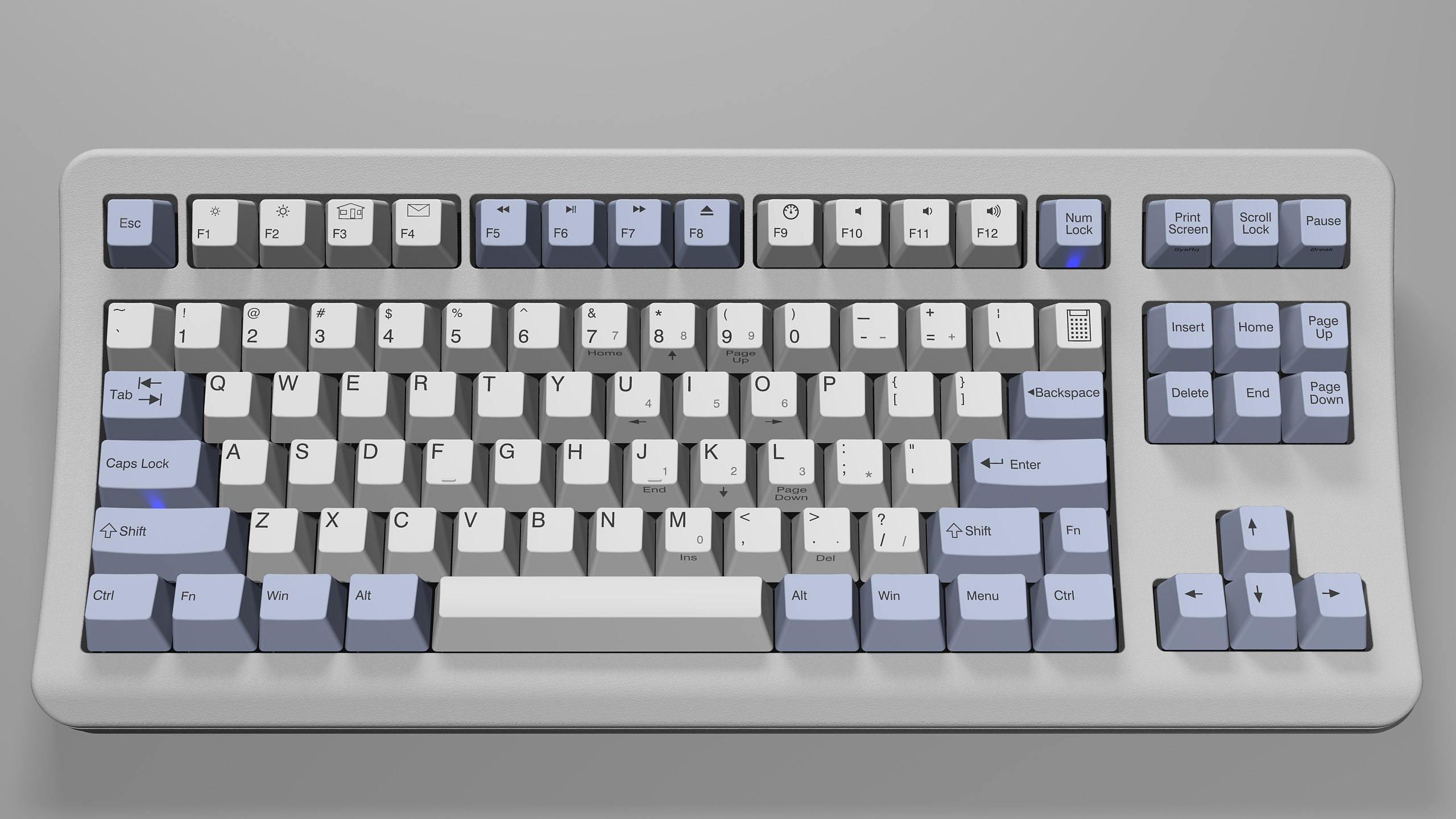
I especially like this proposed SSK design from M'er Forever:
Spoiler:
LightBlue-WhiteSSK12.jpg
LightBlue-WhiteSSK12.jpg (811.21 KiB) Viewed 12061 times
In any event, the closer they could get to a HHKB with buckling springs, the better it would be for me!

User avatar
acfrazier
Mad Scientist

02 Apr 2014, 19:06

Muirium wrote:acfrazier: give them a link to this thread. The more public Unicomp is about how this project develops, the more interest they'll get.
I've went ahead and done that. We'll see where it goes.

User avatar
matt3o
-[°_°]-

02 Apr 2014, 19:07

of all layouts they could come up with... ooh well... it's Unicomp after all.

User avatar
Muirium
µ

02 Apr 2014, 19:09

Aaaaaand… there's Matt's seal of disapproval, we're all set! I don't like that particular layout much either, but they're going in the right general direction, surely. New stuff!!
acfrazier wrote:
Muirium wrote:acfrazier: give them a link to this thread. The more public Unicomp is about how this project develops, the more interest they'll get.
I've went ahead and done that. We'll see where it goes.
Cool. There's no harm in them posting on DT. We're nice keyboard snobs, honest!

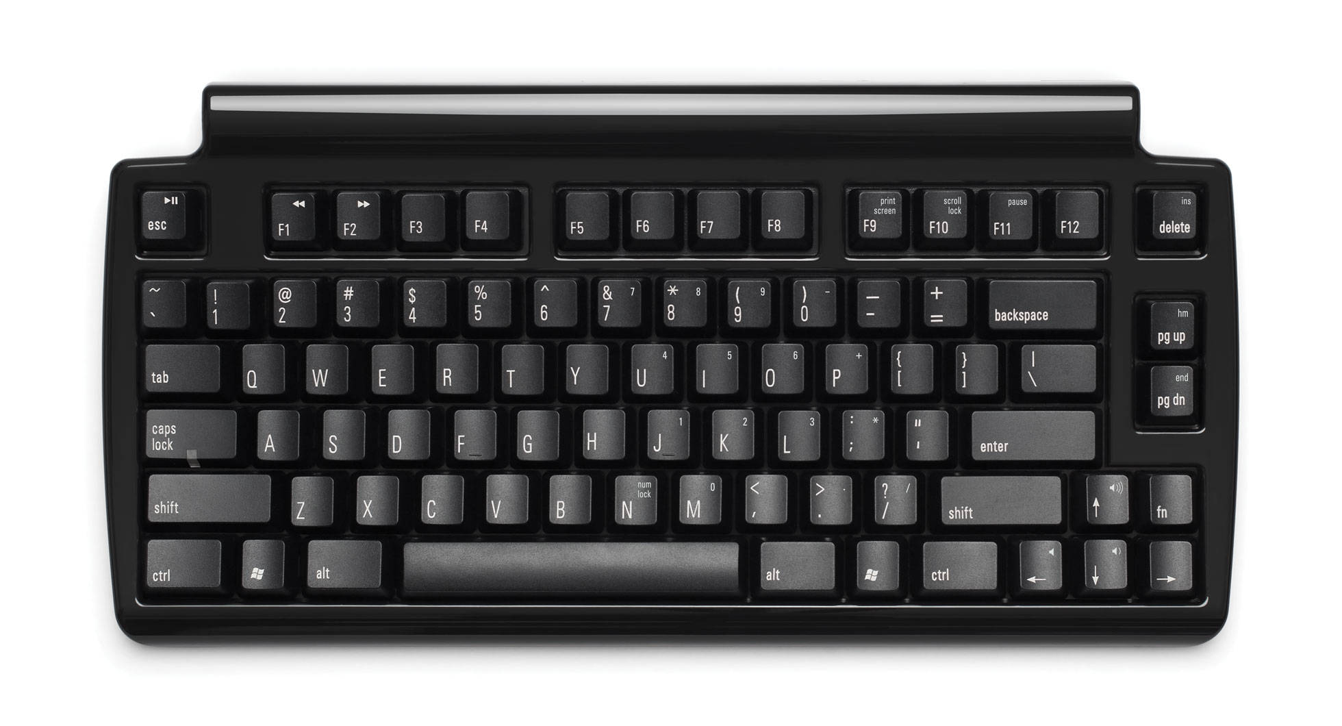
@RJ: That render right above, as I recall, was my favourite and the result of a lot of haggling with Emmer. He was skeptical of 60% layouts until I finally badgered him into giving a few a try. Somewhere in the thread you'll find a straight 60% SSK, very much informed by the HHKB; with that same bottom row I think.

5u space bars and four mods a side, oh my!

User avatar
matt3o
-[°_°]-

02 Apr 2014, 19:13

don't get me wrong Muirium, you know I'll buy it anyway whatever layout it will have. But honestly... what were they thinking?

User avatar
scottc

02 Apr 2014, 19:14

I, for one, would love to see Unicomp contributing to the forums with news, asking for opinions etc. like CM Storm and others do. It's great for them to seek advice from the community and I think that for Unicomp to do it would make us all happy!

User avatar
Muirium
µ

02 Apr 2014, 19:24

matt3o wrote:don't get me wrong Muirium, you know I'll buy it anyway whatever layout it will have. But honestly... what were they thinking?
I have an idea
Spoiler:
Image
Going TKL alone would be awesome. And 60% all the more so. They're exploring the appealing, but difficult, space between the two. Like you do with your customs. It's bold, I'll give them that.

User avatar
matt3o
-[°_°]-

02 Apr 2014, 19:31

I like 75%, totally love them. Indeed Matia's is a well thought layout. Unicomp's is just silly. Why no key to the top right? Why no gap between Function-groups? Oh well... we will have to deal with it I guess.

User avatar
Daniel Beardsmore

02 Apr 2014, 19:32

matt3o wrote:don't get me wrong Muirium, you know I'll buy it anyway whatever layout it will have. But honestly... what were they thinking?
It could be a lot worse, I'm sure. I'm just not keen on where Home and End got put, since I'm a devout Ctrl+Z/X/C/V user and therefore Insert is far less valuable to me than Home/End. So close!

The banana case, though — see, I like the Minila/WASD V2 angular style, or all-out minimalism (Majestouch/Poker). In this case I would have retained the classic shape if it turned out to be impossible to make a minimalistic case.

Still, with the membranes and barrel plate taken care of, no doubt there will be a fresh batch of aluminium cases being made to take these innards!

User avatar
scottc

02 Apr 2014, 19:34

Agreed about home/end. I think that Ins/Del make a lot more sense there (if they had to go with that layout) - at least Del would be above backspace, which makes some sense?

User avatar
Muirium
µ

02 Apr 2014, 19:53

Sitting here, trying to figure out what exactly to suggest they do different, I can see the argument behind the most striking choices. A gap to the right of the main alpha block to help people who orient themselves from the edge? A >5u space bar because… well, it's not 6.25u either? A jumbled together function row because Emmer always liked it?

Okay, maybe not. Quickly, to your layout editors gentlemen!

I'm not well versed in 75%s myself. Everything beyond the 15x5 area looks excessive to me. But I do love a good TKL, I must admit…

User avatar
Hypersphere

02 Apr 2014, 20:34

I suppose it is good that Unicomp might seriously be considering production of a compact keyboard with buckling springs. However, the design looks unbalanced, unaesthetic, and not as functional as it ought to be.

My own dream would be a board with the form factor and layout of the HHKB Pro 2, but with a steel plate and buckling springs. The HHKB Pro 2 layout was extremely well researched. I was skeptical until actually trying it; I adapted almost immediately, and now I have trouble using keyboards with conventional layouts, which is why I have remapped my IBM SSK to the HHKB Pro 2 layout.

Otherwise, Unicomp might just as well do a good re-issue of the IBM Model M SSK (TKL).

Thus, either a great 60% or a TKL. It seems more difficult to do a good design in the 60+% range. However, I think that Matias and Apple have come close.

User avatar
Grond

02 Apr 2014, 20:56

Apparently the design is not final and they're open to suggestion, so hopefully we can help them improve it.

User avatar
Muirium
µ

02 Apr 2014, 21:05

Well, in that case:

Image

Emmer's finest.

User avatar
7bit

02 Apr 2014, 21:06

They should make a model F 122 key with extra switches where the space bar is, with industrial grey case!
:-)

Seriously, that function row is quite useless. I really stopped using function keys when they moved them to the top instead of the left side of the keyboard. Without gaps between them, there is not much orientation left. On the right side is enough space for the function row. But why not getting one step further and eliminatine the function row. Many people dream of some HHKB layout in buckling springs.

The best solution would be to have single BS-switches, so we could make our own BS-keyboards.

User avatar
Yslen

02 Apr 2014, 21:07

Muirium wrote:Well, in that case:

Image

Emmer's finest.
Personally I greatly prefer his original design to that one. The layout, colours and extra legends look messy, whereas the original looks very classy indeed. Personal taste I guess.

EDIT: This one! It looks incredible.

Image

User avatar
Grond

02 Apr 2014, 21:15

I also prefere Emmer's design, however in their announcement they stressed the fact that the new keyboard will be smaller than the original SSK. What about Matteo's Brownfox layout? For me it's the best I've seen among sub-tenkeyless.

User avatar
Muirium
µ

02 Apr 2014, 21:17

Just a couple of extra mods in the spaces either side of Alt and I'm sold! We love the classics.

I agree with 7bit. (Which feels kind of odd…) Function keys add too much extra depth thanks to the curved backplate on buckling spring. So much could be gained by losing them.

User avatar
scottc

02 Apr 2014, 21:20

They seem to want to have compatibility with current cap molds (apart from right shift, WAT), so it'd be interesting to find out their motivation for the other parts.

User avatar
Grond

02 Apr 2014, 21:30

I don't think that spacebar is part of their current cap molds, is it?

User avatar
Muirium
µ

02 Apr 2014, 21:37

Their current plan looks like it has two left shifts to me.

But what size is that spacebar: 5.5u? Is there a reason for that exact size? Does something prevent them going smaller?
Last edited by Muirium on 02 Apr 2014, 21:39, edited 1 time in total.

User avatar
7bit

02 Apr 2014, 21:39

Just got that message from them.

I consider this an April joke, just a little late.
:roll:

Space is 5.5 units. Maybe they have a tool for it or maybe indeed it is a joke.

User avatar
scottc

02 Apr 2014, 21:40

@Grond No, I don't think so. But then again, neither is right shift! They can't really add to the the bottom row without changing the spacebar, anyway.

@Muirium, I'm not really sure... it does look like two left shifts, but the missing part from the right hand side doesn't look like 0.5U, more like 0.25. Confusing stuff! Also, they'd need to swap the stabiliser/stem order to use a left shift. If they're making a new barrel plate anyway, give us a 1.75U shift! Please!

User avatar
7bit

02 Apr 2014, 21:43

Gap is 0.5 units. Left and right Shift are 2.25 units. But it is an April joke, so why care?

Post Reply

Return to “Keyboards”