TKL mechanical keyboard with macro's?
- Bramster
- Cooler Master Employee
- Location: Netherlands
- Main keyboard: CM NovaTouch TKL + Custom DSA Granite
- Main mouse: CM MM531
- Favorite switch: too many :D
- DT Pro Member: -
Good morning DT community,
Time for an other question... We recently launched in the US with the Rapid i and we will follow shortly with this in EU too but I was wondering, would you miss a added macro layer on a TKL keyboard like the Rapid or the Rapid i? Or would this loose the purpose of a TKL (small formfactor keyboard)?
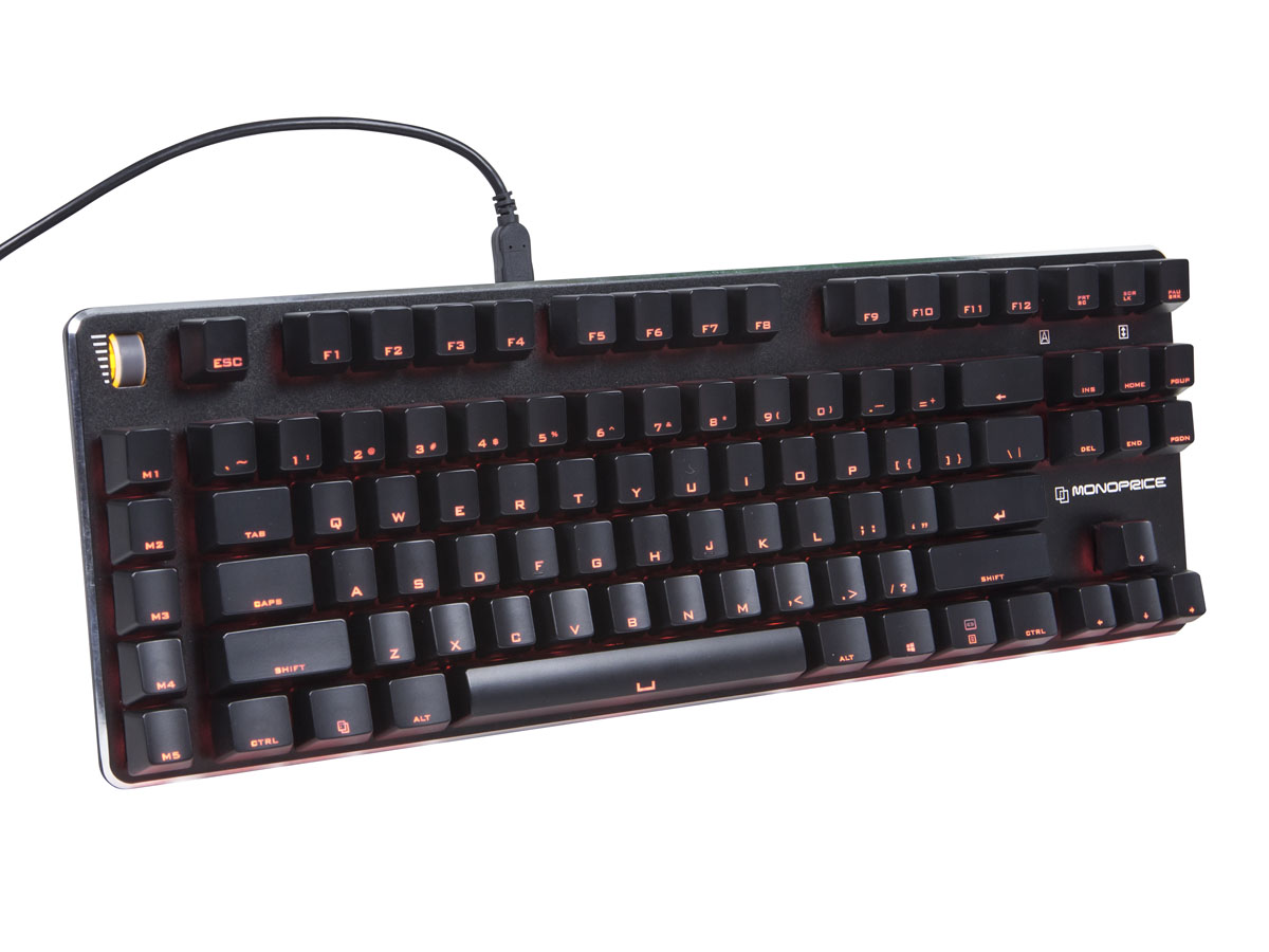
Something like this:
Thanks again for the input and feedback !
- CeeSA
- Location: Westerwald, Germany
- Main keyboard: Deck 82 modded
- Main mouse: MM711
- Favorite switch: Cherry MX Blue
- DT Pro Member: 0016
- Contact:
Imo modern keyboards should be full programmable. If so, I not need any extra macro keys.
But if you want extra keys nevertheless, add it not to the side.
- Muirium
- µ
- Location: Edinburgh, Scotland
- Main keyboard: HHKB Type-S with Bluetooth by Hasu
- Main mouse: Apple Magic Mouse
- Favorite switch: Gotta Try 'Em All
- DT Pro Member: µ
Left side function keys aren't a bad idea. IBM used to put all the function keys there for a shorter layout, and it worked quite well.
I do agree with CeeSA that programmability really means *all the keys* not just a specific group. But this could be an easier to understand introduction to it for normal people who're not us!
- whitecitadel
- Location: UK
- Main keyboard: Digital Membrane thingy...
- Main mouse: MS Lasermouse
- Favorite switch: TBC!
- DT Pro Member: -
Having had a Dell membrane at work (which I killed, S key died) with dedicated calc and other keys I have to say I found it quite useful for certain tasks (for which there was no immediately obvious hotkey solution) to have the dedicated keys.
Have my switch tester voucher on standby for rapid-i
-
- Location: Denmark
- Main keyboard: Ducky G2Pro TKL with MX clears
- Main mouse: Logitech MX518
- Favorite switch: MX clear
- DT Pro Member: -
As I see it, macrokeys is primarily for gamers, and there may be a market for the smaller size of a TKL with the addition of dedicated macrokeys, but for my part, macrokeys on a TKL adds unneccesarily to the size and/or the complexity, which I think ruins the purpose of a TKL.
I think the main benefit of a TKL design is the possibility to have the mouse closer to the keyboard by sacrificing the numpad, and the larger a TKL gets the more the main benifit diminish.
-
- Main keyboard: CM Quick Fire Rapid I
- Main mouse: Logitech 810
- Favorite switch: Brown
- DT Pro Member: -
I love the idea of macro keys on the left side as long as there is a space separating them like in the Monoprice one you are showing. I like to be able to feel where my hand is without looking down, so the spacing is nice. I use macros for non-gaming.
In my opinion, I like TKL, not for portability, but for ergonomics of bringing the mouse in closer. I spend 8+ hours on a computer per day, so TKL helps my right shoulder.
I too, feel that modern keyboards should be fully programmable. For example, I want Fn + Q to register as a unique keystroke so I can use AutoHotKey to assign it to something. Right now, Fn + letters do nothing on CM keyboards.
As for the mechanical volume knob?? Brilliant. More keyboards need it. They offer the ability to quickly change the volume to the exact level. If I'm watching a movie and a loud part comes and my child is sleeping in the next room over, I can quickly get the volume where I want, and I don't have to wait for click click click click to get it down. Same thing goes true in the car audio industry. Most die hard audio guys prefer a knob over buttons for volume.
-
- Location: USA
- Main keyboard: KBC Poker MX Red
- Main mouse: Logitech MX Revolution
- Favorite switch: MX Red
- DT Pro Member: -
I think it would be more interesting to ditch the top row function keys and use the keys on the left for this. Kind of like a modern F AT layout. That I would buy.
- Muirium
- µ
- Location: Edinburgh, Scotland
- Main keyboard: HHKB Type-S with Bluetooth by Hasu
- Main mouse: Apple Magic Mouse
- Favorite switch: Gotta Try 'Em All
- DT Pro Member: µ
- Eszett
- Location: Germany
- Main keyboard: Filco Majestouch 2 TKL DE MX blue
- Main mouse: Logitech MX Master 2S
- DT Pro Member: -
I agree to this. And, even if you need space for some extra keys, why leave those gaps I’ve marked pink? There is plenty of space to fill. Overall, there is the impression you are chewing the cud with adding some extra keys. That’s not innovation, but pseudo-innovation!Imo modern keyboards should be full programmable. If so, I not need any extra macro keys.
But if you want extra keys nevertheless, add it not to the side.
-
- Main keyboard: CM Quick Fire Rapid I
- Main mouse: Logitech 810
- Favorite switch: Brown
- DT Pro Member: -
So you can reach down and know where your keys are without looking down. Imagine a giant grid of keys all placed next to each other with no spacing. You'll have a hard time finding them without looking.Eszett wrote:.....why leave those gaps I’ve marked pink? There is plenty of space to fill.
- Hypersphere
- Location: USA
- Main keyboard: Silenced & Lubed HHKB (Black)
- Main mouse: Logitech G403
- Favorite switch: Topre 45/55g Silenced; Various Alps; IBM Model F
- DT Pro Member: 0038
As Mu pointed out, IBM had F-keys on the left side in the XT and AT keyboards, and in the giant 122-key, there were F-keys both on the left and on top.
DSI currently has a modular keyboard for the Mac with F/macro keys on the left.
However, there is a lot to be said for the standard TKL layout, and I agree with others that it would be good to have a completely programmable board rather than trying to second-guess what people might want with specialized keys.
- rindorbrot
- Location: Bavaria, Germany
- Main keyboard: Phantom, GON NerD 2.0 TKL
- Main mouse: Zowie ZA11
- Favorite switch: MX Ergo-Clear, Nixdorf Soft-Touch
- DT Pro Member: 0029
I don't like function/macro keys on the left side as I use the left edge of the keyboard for orientation while I'm gaming.
Having some additional keys there throws me off regularly and then I hit the wrong buttons...
- Daemon Raccoon
- Location: Flyover Country, United States
- Main keyboard: Model M SSK 1391472
- Main mouse: CST2545W-RC LTrac
- Favorite switch: Buckling Spring
- DT Pro Member: -
What does the macro own?
-
- Location: Belgium
- Main keyboard: Realforce 87u 45g
- Main mouse: logitech G Pro Wireless
- Favorite switch: Topre (Redux)
- DT Pro Member: 0235
You might as well provide a numpad on the left side and make it programmable. It would be more 'standard' in a way and would appeal to those who chose a TKL because of the added space for the mouse.
-
- Location: Belgium, land of Liberty Wafles and Freedom Fries
- Main keyboard: G80-3K with Clears
- Favorite switch: Capacitative BS
- DT Pro Member: 0049
Even when there's a small (think 0.25u) space between the alpha block and those function keys?rindorbrot wrote:I don't like function/macro keys on the left side as I use the left edge of the keyboard for orientation while I'm gaming.
Having some additional keys there throws me off regularly and then I hit the wrong buttons...
- whitecitadel
- Location: UK
- Main keyboard: Digital Membrane thingy...
- Main mouse: MS Lasermouse
- Favorite switch: TBC!
- DT Pro Member: -
So you want a DAS keyboard then....Ascaii wrote:I for one really like the addition of a volume wheel, though I would have preferred it to be a knob to turn.
- cookie
- Location: Hamburg, Germany
- Main keyboard: HHKB Pro 2
- Main mouse: MX Master
- Favorite switch: Topre
- DT Pro Member: -
I personaly can't stand macro keys for several reasons:
1. They are ugly
2. They consume space
3. It is pointless to develope a macro layer and not make the whole keyboard programmable
4. I barely see people using them
5. They are actually very very ugly and it goes in the wrong direction for a compact layout.
I used to like media controls a lot, but my taste changed over the years and since I discovered Volumouse for windows I barely use them anymore. I'd never sacrifice the simple look of the keyboard for media keys anymore.
Accessible media buttons via funktion layer is okay, dedicated keys is a NONO for me.
While we are talking about compact keyboard, any plans for CM to releaser a 60%?
- Muirium
- µ
- Location: Edinburgh, Scotland
- Main keyboard: HHKB Type-S with Bluetooth by Hasu
- Main mouse: Apple Magic Mouse
- Favorite switch: Gotta Try 'Em All
- DT Pro Member: µ
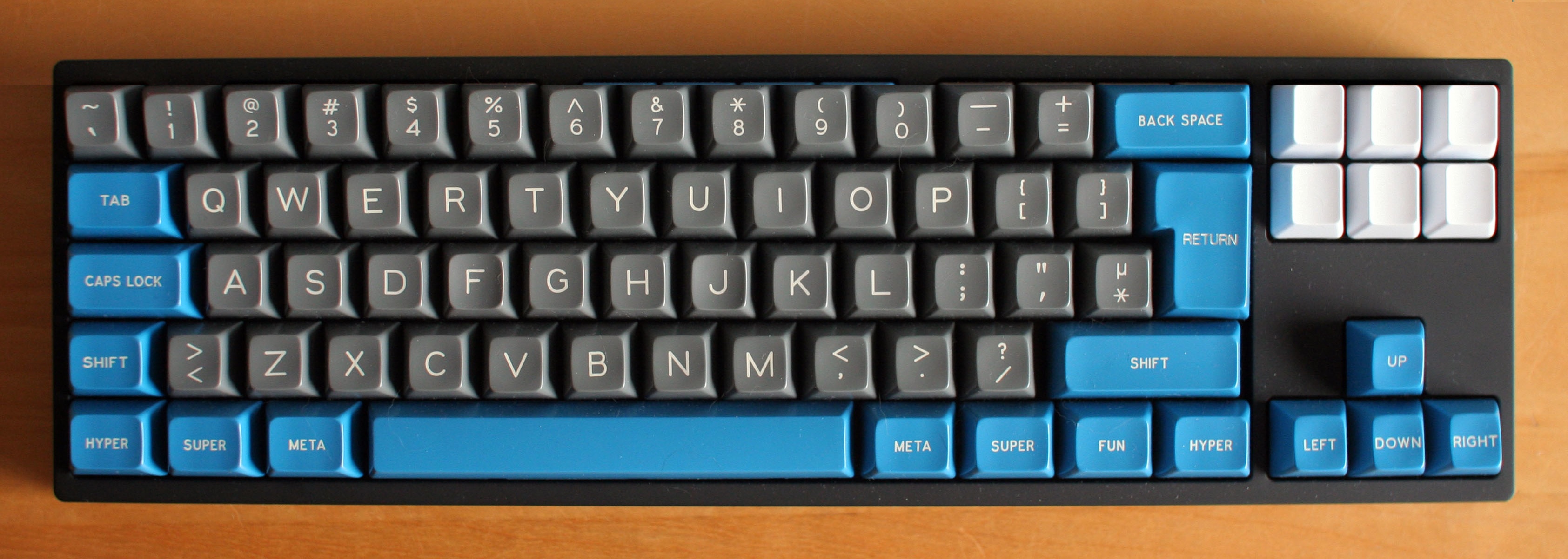
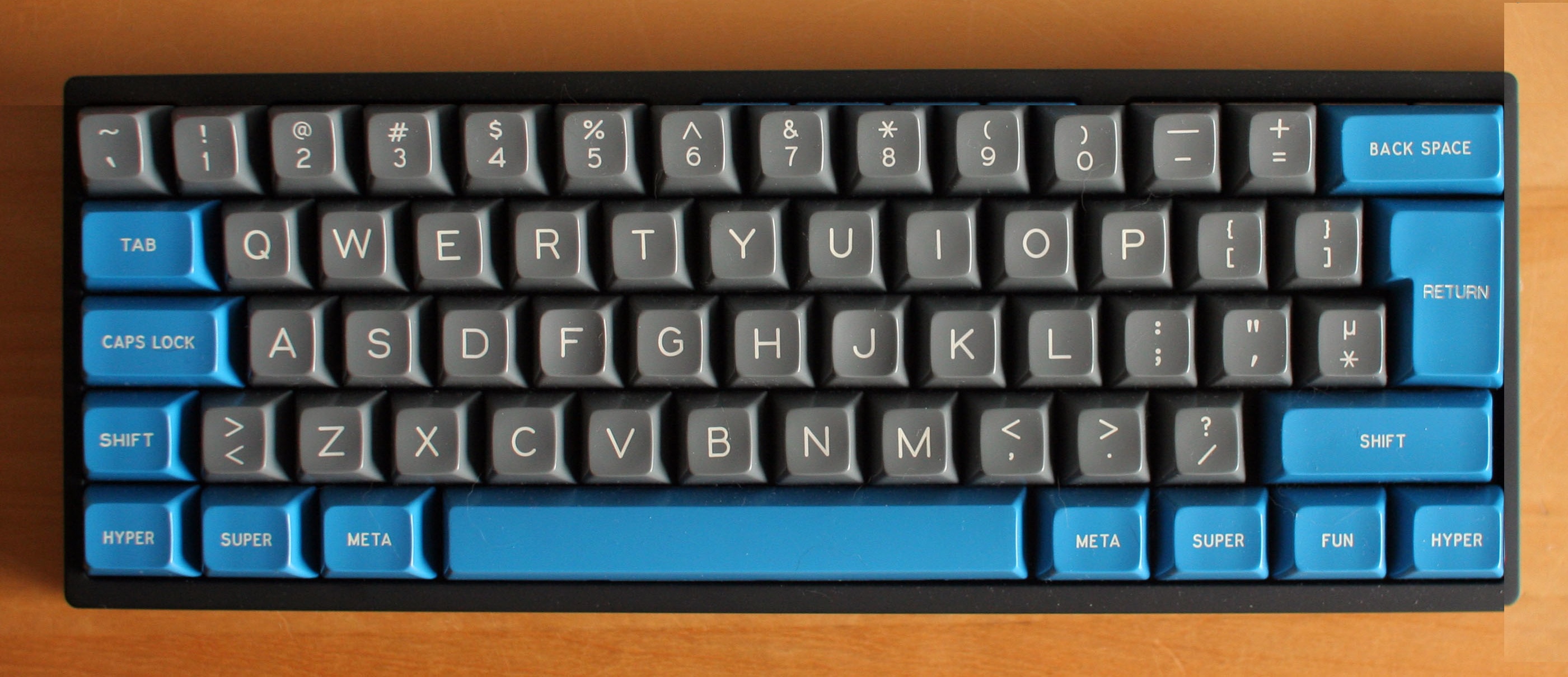
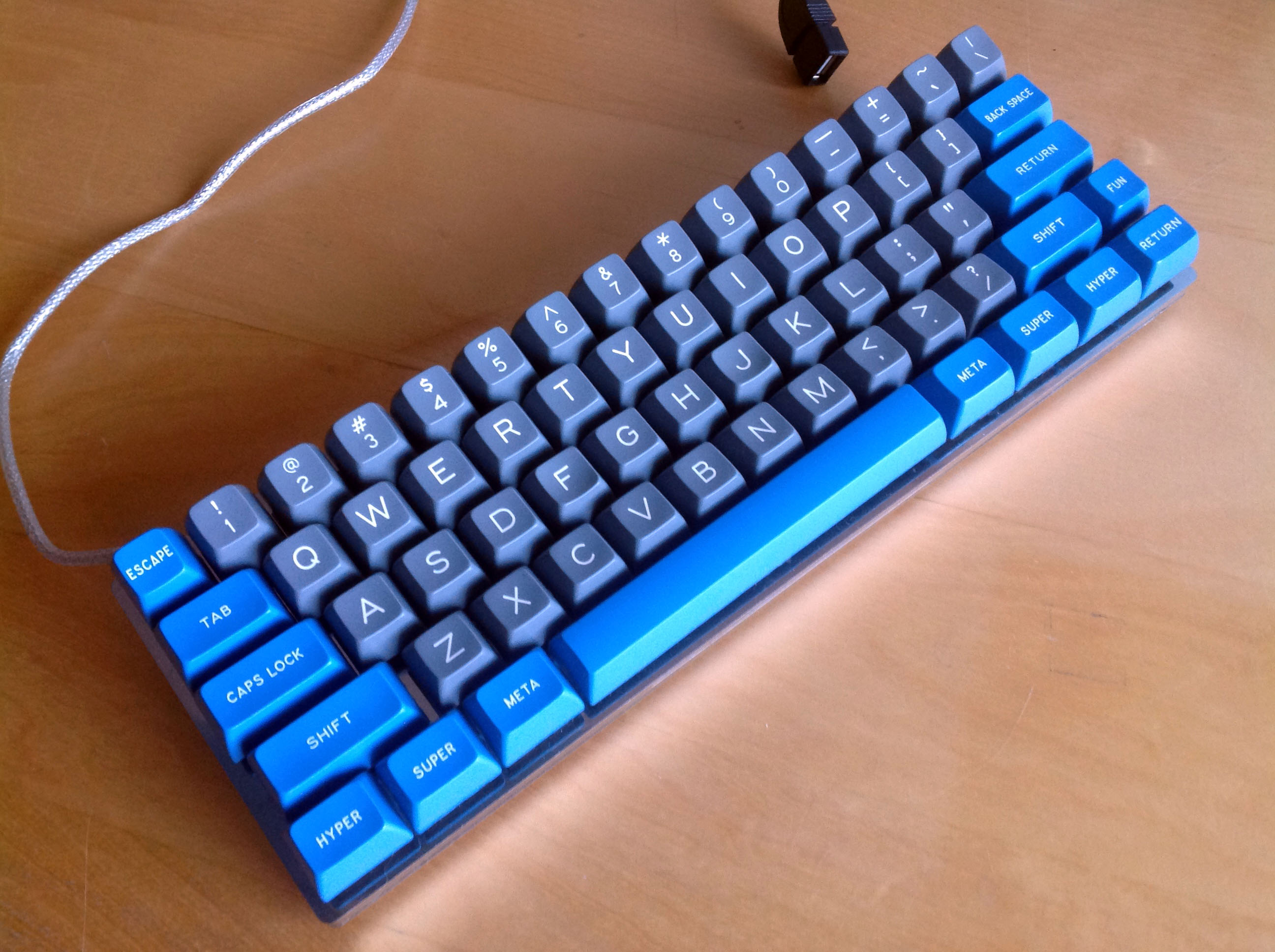
I'd like to see a CM 60%, too! I even made a fanfic…
But this layout, please!
Spoiler:
Spoiler:
A paradox! Macro keys are just nerdy and mysterious enough to be little or no use to most people. But they aren't sufficiently powerful for us keyboard aficionados. I favour full programmability instead: with a reset switch for anyone who gets confused.cookie wrote: 3. It is pointless to develope a macro layer and not make the whole keyboard programmable
4. I barely see people using them
- QWERTim
- Location: United Kingdom
- Main keyboard: Realforce 87u
- Main mouse: Razer Naga Hex
- Favorite switch: Topre
- DT Pro Member: -
If they filled those spaces on the right - it'd just become a QuickFire TK!Eszett wrote:I agree to this. And, even if you need space for some extra keys, why leave those gaps I’ve marked pink? There is plenty of space to fill. Overall, there is the impression you are chewing the cud with adding some extra keys. That’s not innovation, but pseudo-innovation!Imo modern keyboards should be full programmable. If so, I not need any extra macro keys.
But if you want extra keys nevertheless, add it not to the side.
I like the idea of having additional keys, although I would only ever use them if they were dedicated media keys. I'd also be more inclined to position them along the top edge - or even the right edge. The left side always throws you off when gaming!
- Hypersphere
- Location: USA
- Main keyboard: Silenced & Lubed HHKB (Black)
- Main mouse: Logitech G403
- Favorite switch: Topre 45/55g Silenced; Various Alps; IBM Model F
- DT Pro Member: 0038
Same here. I never use media keys. If I wanted some kind of keyboard macro, I would prefer to program it myself.
- cookie
- Location: Hamburg, Germany
- Main keyboard: HHKB Pro 2
- Main mouse: MX Master
- Favorite switch: Topre
- DT Pro Member: -
I have corrected the second picture for youMuirium wrote:I'd like to see a CM 60%, too! I even made a fanfic…But this layout, please!Spoiler:Spoiler:A paradox! Macro keys are just nerdy and mysterious enough to be little or no use to most people. But they aren't sufficiently powerful for us keyboard aficionados. I favour full programmability instead: with a reset switch for anyone who gets confused.cookie wrote: 3. It is pointless to develope a macro layer and not make the whole keyboard programmable
4. I barely see people using them
Spoiler:
- Eszett
- Location: Germany
- Main keyboard: Filco Majestouch 2 TKL DE MX blue
- Main mouse: Logitech MX Master 2S
- DT Pro Member: -
I agree to (the taste of) Cookie and Muirium. I'm afraid we have little to no influence in the product design, and the question "how would you like this ...?" is merely a kind of advertisement. CM Bram please show us that I'm wrong!
- kbdfr
- The Tiproman
- Location: Berlin, Germany
- Main keyboard: Tipro MID-QM-128A + two Tipro matrix modules
- Main mouse: Contour Rollermouse Pro
- Favorite switch: Cherry black
- DT Pro Member: 0010
Meanwhile, leaning back…
Spoiler:
Fully programmable (plus 3 additional layers!),
Last edited by kbdfr on 20 May 2014, 20:41, edited 1 time in total.
- Hypersphere
- Location: USA
- Main keyboard: Silenced & Lubed HHKB (Black)
- Main mouse: Logitech G403
- Favorite switch: Topre 45/55g Silenced; Various Alps; IBM Model F
- DT Pro Member: 0038
And I thought the KC84 looked like an impenetrable wall of keys. This thing looks like it could sub for "I'm thinking of a brick wall" in the film, "Village of the Damned".kbdfr wrote:Meanwhile, leaning back…Spoiler:Fully programmable (plus 3 additional layers!),
-
- Location: Belgium, land of Liberty Wafles and Freedom Fries
- Main keyboard: G80-3K with Clears
- Favorite switch: Capacitative BS
- DT Pro Member: 0049
Can you actually mod the bottom row to have more 1.25 mods on the right?kbdfr wrote:Meanwhile, leaning back…Spoiler:Fully programmable (plus 3 additional layers!),
- kbdfr
- The Tiproman
- Location: Berlin, Germany
- Main keyboard: Tipro MID-QM-128A + two Tipro matrix modules
- Main mouse: Contour Rollermouse Pro
- Favorite switch: Cherry black
- DT Pro Member: 0010
Plate-mounted switches, so modding really isn’t simple.JBert wrote:Can you actually mod the bottom row to have more 1.25 mods on the right?kbdfr wrote:Meanwhile, leaning back…Spoiler:Fully programmable (plus 3 additional layers!),
On the other hand, no need to because there is such a wealth of keys you can assign as you like
(e.g. those in the right column).
But I didn’t intend to hijack the thread, just thought I could show what is not only possible, but already reality.
-
- Location: Finland
- DT Pro Member: -
This.rindorbrot wrote:I don't like function/macro keys on the left side as I use the left edge of the keyboard for orientation while I'm gaming.
Having some additional keys there throws me off regularly and then I hit the wrong buttons...
Macro keys are definitely a deal-breaker for me. They are an eyesore and generally useless. On the other hand, fully programmable (think something like Ducky Mini for example) keyboard in TKL or even full size, with white keycaps as standard would cause me to scream TAKE MY MONEY in an instant.
-
- Location: Stockholm, Sweden
- DT Pro Member: 0011
BTW, that is not CM Storm's keyboard, just used for illustration I suppose.Eszett wrote:And, even if you need space for some extra keys, why leave those gaps I’ve marked pink? There is plenty of space to fill.
I think the classic layout for the function row would be best for a gaming keyboard. It is mostly when gaming that you reach the function keys by memory and feel. Therefore, having them in familiar places is important for gaming.
The space between the function row and numeric row could be reduced to 1/4 key though.
When I built my Phantom I thought of putting dedicated media keys in-between the cursor and nav key clusters, with small, lower home-made keycaps consisting only of stem. Then that idea reminded me of horrible cheap keyboards with buttons in that location, which made me shudder... I would be reminded of cheap crap whenever I saw the media keys, and I don't want that.
Yes. It is only that people are more used to knobs being absolute, and (correct me if I'm wrong, but) I think these ones can only be relative, so the user model that people are used to would have to be broken.Ascaii wrote:I for one really like the addition of a volume wheel, though I would have preferred it to be a knob to turn.
BTW. I find Pause or Mute to be more important.
... And while we are giving feedback to CM Storm:
* I am saddened to see that the usual CM Storm QuickFire Rapid is being discontinued. I had been waiting for it to appear with non-linear switches in ISO, but that never happened. Yes, there is a version with MX Brown, but it was available for such a short time over here that it hardly counts. As soon as I saw it at an e-retailer, the stock was already down to 0 and that never changed.
* Do put a proper cable channel on the underside of the keyboard or make the keyboard flatter.
The Rapid I does not have any cable channel, and the cable channels on the other keyboards (Rapid, TK, Pro) were badly designed, obviously by someone who does not understand the purpose of a cable channel.
There is no reason why a cable should go straight out from a keyboard's left or right side.
Instead, there should be outlets out the back of the keyboard near the left and right edges.
* Please do standardize on one set of Fn-key mappings. I don't see why the Rapid-I needs to have different mappings from what the Rapid, TK and Pro have.
* Please do use only 1.25 wide modifiers on the bottom row. It is hard to customize with other keycaps otherwise and the difference in feel is negligible.