Round 5 and Round 6 kits for sale!

User avatar
7bit

17 Dec 2014, 10:34

About SHIF T: I wanted them to make a new legend, where F and T touch each other, and I wanted to pay for it and see how it looks like.
:cry:

It apears they use 3 font sizes for the text legends and one size (the largest) is wrong! Those keys stick out, but they should not stick out!
:mad:

The Yen problem: I got remakes for Round 4 and they re-used the wrong legend!

Why can't they throw rejected legends into a box, labeled:
DANGER: To be used for the Odd Legends Group buy, only!!!

Mail from 2014-04-15:

Code: Select all

There are a few legends I'd like to have changed.


The SHIF T problem:

Since F and T can't get any closer, it would be great to have an FT-ligature,
ie letting F and T them touch each other. Maybe you let it done for one size of keys (preferably 1.5 units, row 4, white on gray) and show me the result.


Problem with different font sizes:

The following legends should be re-done in the smaller font:

2 units POS-keys:

CLEAR
SCREEN

STATUS

SELECT

FUNCTION

ESCAPE


1.5 units:

COMPOSE


1 unit keys:

COM-
POSE

NEXT  (looks awful next to PRIOR)

CAPS
LOCK


:roll:

User avatar
Muirium
µ

17 Dec 2014, 10:50

7bit wrote: About SHIF T: I wanted them to make a new legend, where F and T touch each other, and I wanted to pay for it and see how it looks like.
:cry:

It apears they use 3 font sizes for the text legends and one size (the largest) is wrong! Those keys stick out, but they should not stick out!
:mad:

The Yen problem: I got remakes for Round 4 and they re-used the wrong legend!

Why can't they throw rejected legends into a box, labeled:
DANGER: To be used for the Odd Legends Group buy, only!!!

Mail from 2014-04-15:

Code: Select all

There are a few legends I'd like to have changed.


The SHIF T problem:

Since F and T can't get any closer, it would be great to have an FT-ligature,
ie letting F and T them touch each other. Maybe you let it done for one size of keys (preferably 1.5 units, row 4, white on gray) and show me the result.


Problem with different font sizes:

The following legends should be re-done in the smaller font:

2 units POS-keys:

CLEAR
SCREEN

STATUS

SELECT

FUNCTION

ESCAPE


1.5 units:

COMPOSE


1 unit keys:

COM-
POSE

NEXT  (looks awful next to PRIOR)

CAPS
LOCK

:roll:

We need to send a delegation to inspect their facility.

If you know what I mean…

User avatar
Elrick

17 Dec 2014, 11:48

Yeah 7bit, you need to speak with Melissa as soon as possible because if you fail in making them recognize their faults during this test run, then this Group Buy is doomed.

Always make yourself heard FIRST by visiting Geekhack in SP's Vendor Section and leave some messages she will always return a response to your enquiries. Not meaning to force you to visit Geekhack (god forbid) but that's where their vendor section is located.

Also ask Melissa what type of font sizing are they using with their manufacturing system. Such as, do they recognize point sizing for fonts and are they able to communicate with you clearly about how it's applied or will they only deal with actual sizing such as using millimeters or inches (which would be bloody difficult) ?

User avatar
7bit

17 Dec 2014, 12:53

Aren't these issues obvious when looking at the photos?
:?

Their font sizes for text legends are small, normal and bigass. I don't like the bigass, period!

SMALL
NORMAL
B I G A S S
right-and-wrong.jpg
right-and-wrong.jpg (34.49 KiB) Viewed 6010 times
Look at the word BACK, notice the difference?
:o :shock: :cry:

User avatar
Muirium
µ

17 Dec 2014, 13:11

And then look at BS. Normal sized! So it's not simply a justification algorithm…

Actually, on closer look, the BIG ASS version of B has a wider belly than its top. In which case, BS does look like the BIG version. Which is odd, because it's still dwarfed inside the centre of the cap.

@Elrick: I gather most of the caps have been manufactured now. Don't think anything but the worst offenders can be changed this late. Nothing looks worse than it was on Round 4 SPH, far as I can see.

User avatar
7bit

17 Dec 2014, 13:22

O is more like a circle, or C like a sectio of a circle, in BIGASS, while otherwise it is more like an egg. The font is wider, less condensed. Those 2 letter-keys are OK in BIGASS, but more than that is too wide and sticks out!

The do 99.9% of the alnum, punct, whatever legends perfectly, but with text keys, they are in real trouble to know how to do them right!

User avatar
Muirium
µ

17 Dec 2014, 14:10

################## ROUND 5 RUMORS ==== SPECIAL REPORT ==== ROUND 6 NEWS!! ###################

You heard it here, folks: exasperated with SP's troublesome typesetting, 7bit CONFIRMS that Round 6 will get ICON mods. INFORMED speculation slates its premiere on Pimp My Keyboard sometime late 2015.

Image
Could this be the future of SPH?

Until now, naysayers cited the IMMENSE challenge of making custom legends for the massive range of extra keys beyond a standard mod set. But 7bit's FURY led him to seize the opportunity. An INSIDE SOURCE says the GB master has begun writing detailed FOOLPROOF descriptions of every potential legend, and constructing a recursive flowchart for SP to follow with ease.

An OUTSIDE SOURCE indicates Matt3o wants nothing to do with any of this…


############### ROUND 5 RUMORS: YOUR AUTHENTIC SOURCE FOR ALL THAT'S FIT TO TYPE ###############


Maybe I should start a separate DT Rumors account.

User avatar
7bit

17 Dec 2014, 14:47

Indeed the next time I will separate them not only by color, size and row, but also by legend size, so it will be more clear how they should look like!

However, most of those symbols look both ugly and unobvious. The NOIR and RETRO symbols looked great (in theory) but SP messed them all up and made them far too thin!
:cry:

User avatar
7bit

17 Dec 2014, 15:35

This here is a really worse example:
crossover.jpg
crossover.jpg (63.35 KiB) Viewed 5947 times
This shows how they use arbitrary sizes, just like it comes.
:roll:

1.75 units keys, steppen and full-touch, CONTROL and CAPS LOCK:
CONTROL on the full-touch wrong (too big), but correct on the stepped key.
CAPS LOCK on the full-touch correct, but wrong (too big) on the stepped key.
:roll:

User avatar
Muirium
µ

17 Dec 2014, 15:37

Your arrows say what, then? They're pointing to the good ones? Usually people annotate their images with the opposite convention. You could be giving SP bad ideas.

Uh oh…

User avatar
7bit

17 Dec 2014, 15:39

The bad ones are marked, that's how QC works: Orange dot => rejected.
The arrow is indeed a hint how they are able to do it right!
:-)

User avatar
Muirium
µ

17 Dec 2014, 15:41

Looks brown to me, like you were rubbing their faces in it!

Maybe use a different colour to highlight the good stuff.

User avatar
chzel

17 Dec 2014, 15:43

It seems to me they feel the urge to fill as much of face of the key as possible!

User avatar
Muirium
µ

17 Dec 2014, 15:45

Yup. Understandable instinct. But we don't like the big text, so there the trouble begins.

User avatar
blighty

17 Dec 2014, 18:01

On a positive note, the white-on-black keys look great! I'm sure once SP finishes producing/shipping their Pulse (was delayed 1 month) and DEEP SPACE (closing on PMK now) kits, they'll sort out these legend mishaps once and for all. :lol:

It's good to know we're halfway there! :lol:

User avatar
7bit

17 Dec 2014, 18:13

PMK is lame!
:mad:

They sold fewer kits than me!
:lol:

User avatar
Muirium
µ

17 Dec 2014, 18:22

But what about caps? Kits are an arbitrary distinction. Customers and caps are more objective.

User avatar
7bit

17 Dec 2014, 18:38

They don't list that value.
:roll:

It is your task to look through all group buys and count the sold caps!
:evilgeek:

User avatar
Halvar

17 Dec 2014, 18:42

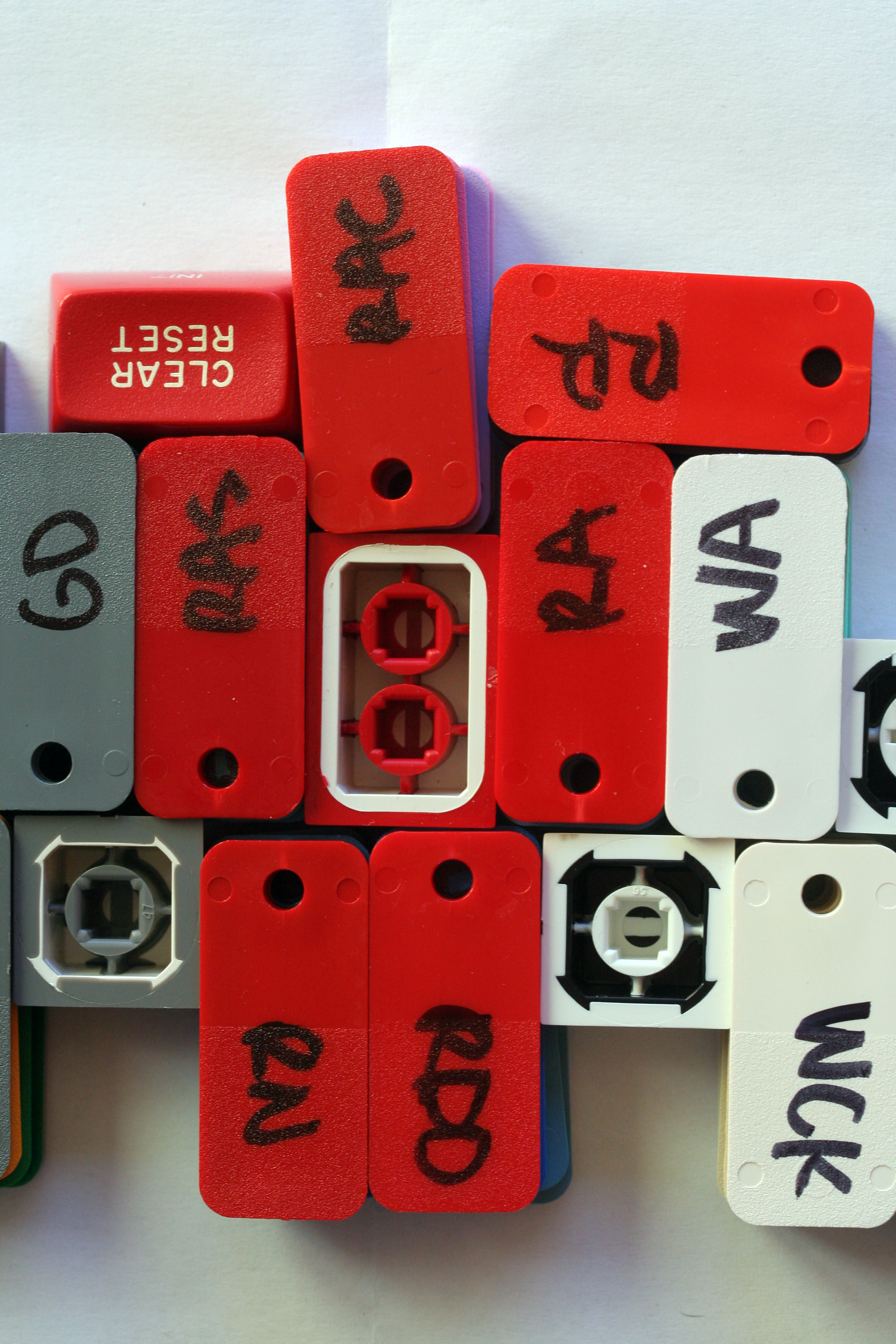
Is this really the same color (RAS)? Now I wonder how they will look on my warm-white LED lit desk ...

Image

Image

User avatar
7bit

17 Dec 2014, 18:50

Code: Select all

Manufacturer        |Apple                                                     
Model               |iPhone 5s          
:roll:

They better buy themselves a real camera!
:mad:

In reality, they look much better.

Color is more like the traditional red of the swiss flag:
Image
:cool:

User avatar
Muirium
µ

17 Dec 2014, 18:57

Yup. RAS isn't murky, it's just a little deeper than their RA pure red. Like a better shade of lipstick!

It's hard to get colour balance right by accident. When I first saw that picture they took of RAS, I thought it was something to do with DSA Retro, which looks more like red leather than the intense stuff we're getting.

(Disclaimer: I haven't actually seen DSA Retro in person. But I have seen one of those Merlin systems it was based on. Same story with Round 5!)

User avatar
Halvar

17 Dec 2014, 18:58

@7bit: Ah yes, you already have the grab bag! Thanks, that's much better.

User avatar
Muirium
µ

17 Dec 2014, 19:00

Oh yeah, I should have asked him for a cap of each colour to try against the Honeywell!

User avatar
7bit

17 Dec 2014, 19:43

:oops: <--- color is like when face is reddest.

User avatar
mashby

17 Dec 2014, 20:24

The following payments have been received for this group buy: helveticaman (twice), argcargv, swill.


Has It Shipped?
If your payment came via PayPal, your invoice has been marked as shipped to keep them from locking up the PayPal account. Keep checking this thread for the actual ship date(s).

Additionally, note that the address on your Paypal notifications/notes are not necessarily the addresses 7bit will ship your order to, he ships to the address on your invoice.

Questions?
Either ask in this thread, or PM 7bit.

User avatar
Data

17 Dec 2014, 20:25

Wow that's a lot of errors considering how much time they've had to get it right.

The SHIFT kerning problem doesn't bother me that much. At least it's a uniform separation from the other legends. I could live with it.

User avatar
7bit

17 Dec 2014, 20:36

IMPORTANT:

Because mashby will stop collecting money and SP is closing down their keyboard pimping business over Christmas, until early January, please everybody pay their bill, so he can send your money to SP before they close down!

Also: I need a new Google Wallet and PayPal money collector for 2015!

Until the end of this year, I would prefer someone who is located in the EU, because I need some funds here, too.

From 2015 on, preferably someone from the USA again, because we will have to pay for Round 5a, once Round 5 has been finished!
Image

User avatar
facetsesame
Mad Dasher

17 Dec 2014, 23:08

I don't know that we've seen any RAS keys in enthusiast hands yet. Maybe in some other grab bags!
The RAS is a richer, deeper red, a claret to the plum of the DSA Retro's RBC. And somewhat posher than RA!
Seems I've got some more pics to take!
And see, we should have tipped all the Extras colours for this exact purpose!

I concur with the comments on the letter widths, and yeah, I guess the lesson is to specify them.

Making a Gorton style legend for the interrobang was a missed opportunity, but it's taken the hindsight of doing the hashbang to think of it! From my perspective at the time, why would SP do anything other than base it on their existing design? From their perspective, why would they do anything other than replicate the render?
7bit wrote: IMPORTANT:
Sorry, I will sort out my grab box order and pay up!

User avatar
Halvar

18 Dec 2014, 00:04

facetsesame wrote: I don't know that we've seen any RAS keys in enthusiast hands yet. Maybe in some other grab bags!
The RAS is a richer, deeper red, a claret to the plum of the DSA Retro's RBC. And somewhat posher than RA!
Seems I've got some more pics to take!
You don't think the red SA caps in 7bit's grab bag are Round 5?

Image

User avatar
facetsesame
Mad Dasher

18 Dec 2014, 00:14

Halvar wrote:
facetsesame wrote: I don't know that we've seen any RAS keys in enthusiast hands yet. Maybe in some other grab bags!
The RAS is a richer, deeper red, a claret to the plum of the DSA Retro's RBC. And somewhat posher than RA!
Seems I've got some more pics to take!
You don't think the red SA caps in 7bit's grab bag are Round 5?

Image
Hmm. I was thinking of these doubleshots, it's hard to be sure but I guess these might be RA:
Image

But these blanks are described as HONEY! So do I have any reason to doubt that these are Round 5 RAS? :o
Image
I've ordered some of both (if they're still available), so will compare in the new year.

Post Reply

Return to “Group buys”