Post a picture of your ideal keyboard layout!

User avatar
Chyros

03 Jun 2015, 20:45

If you could have any keyboard layout, what would it be? Post a picture (doesn't have to be pretty, doesn't have to specify keys that are obvious if you don't want to), and give a little description.

Layout could be as simple or as complicated as you wanted it to be. 1% to 2000%, ISO, ANSI or neither, tertiary, quaternary or duodenary legends, joysticks, trackballs, whatever you want. Of course, whatever you pick has to fit on your desk!

Personally, mine would be extremely huge. Because more bigger is more better, right? xD

Image

ISO with big-ass enter key and 2u backspace, fun cluster on the left, one winkey on the right, screenshot key on the left, 12 PF keys on top of the F keys, full nav cluster and a calculator on top of and using the numpad, which includes an equals key. Bam!

What would yours be? GOGOGOGO
User avatar
Muirium
µ

03 Jun 2015, 20:48

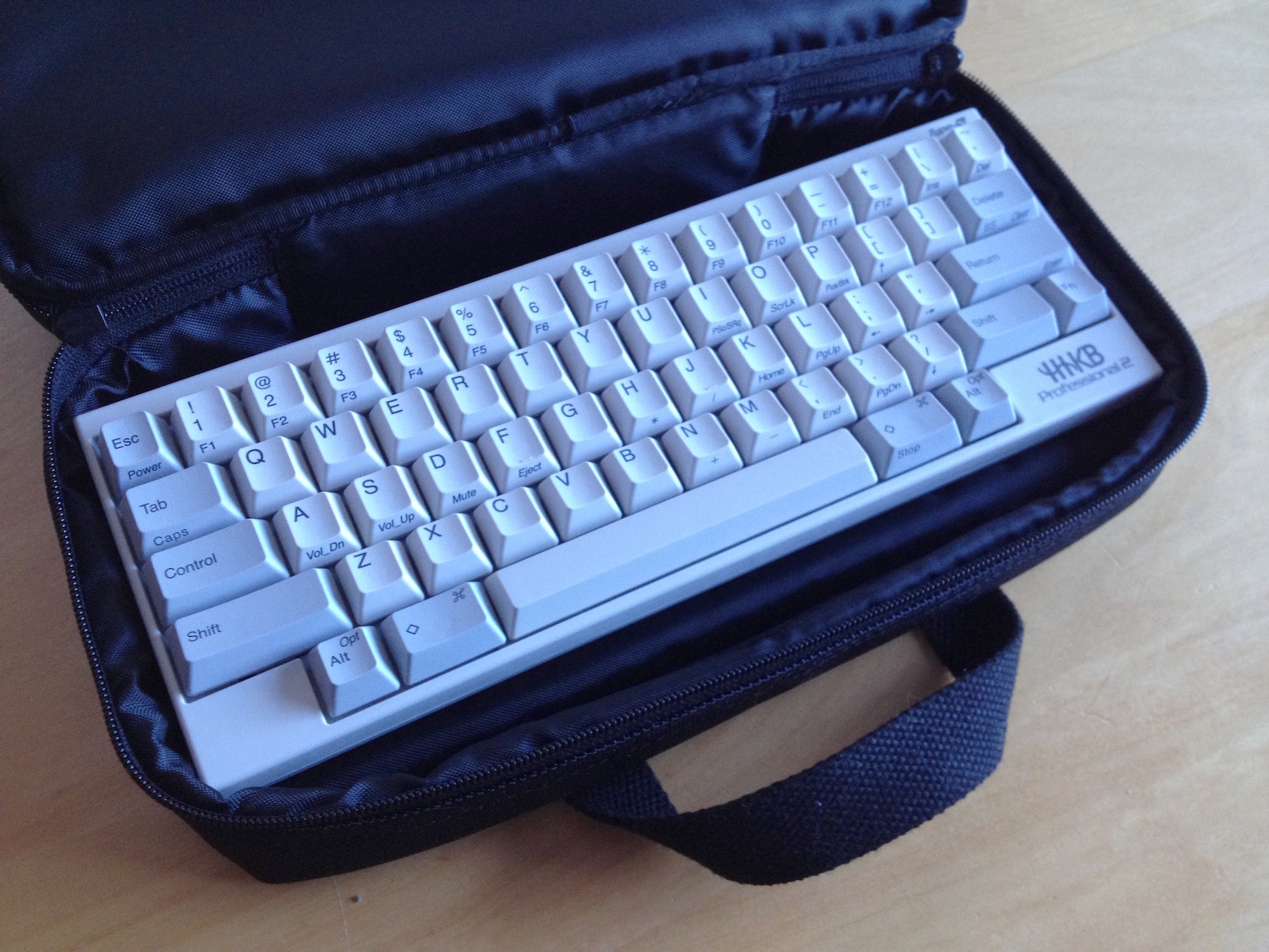
Easy:

Image

I can hardly fault the HHKB. It's absolutely superb.

Or are you talking about custom layouts you can't already buy?

User avatar
SL89

03 Jun 2015, 20:49

I like it, I also prefer battleships myself. I'll go make mine now.

User avatar
Khers

03 Jun 2015, 20:53

Muirium wrote: Easy:

Image

I can hardly fault the HHKB. It's absolutely superb.
Agreed

User avatar
SL89

03 Jun 2015, 20:55

Doesnt it bug you its not symmetrical? I really wanted a Viper but it wasn't symmetrical and was thus less interesting.

User avatar
Muirium
µ

03 Jun 2015, 21:01

It's very almost symmetrical! You'd have to ditch standard stagger to get any closer.

The "faults", if anyone's interested:
  • Fn + Backspace should be Delete.
  • What is this Eject key on Fn +nF? Is it some driver thing? The only key combo on the HHKB not to do anything for me. Even on machines old enough to have optical drives. F12 meanwhile works fine.
  • Fn + Tab is a bit funny for Caps Lock. I prefer a Shift+Shift macro. But I agree with the HHKB's strict single-layer purity, so I can live with it. I hardly use Caps Lock anyway as I'm not 12.
  • Where's the numpad layer? Again I'm not bothered about its lack really. But I do add one to my Kishsaver on the 2nd function layer the HHKB does not have.
  • Um, Bluetooth? Yeah, I've run out…

User avatar
XMIT
[ XMIT ]

03 Jun 2015, 21:04

Funny you should mention this. I was just working on my ideal F77 layout yesterday. I like 60% keyboards but can't live with a small right Shift (I only use right Shift), a proper inverted T, and the Delete cluster.

So, I give you this:

F77.jpg
F77.jpg (99.99 KiB) Viewed 20497 times
[/url]

I'm playing with something similar for my F107 conversion:

F107.jpg
F107.jpg (123.74 KiB) Viewed 20497 times
[/url]

The colors are off. Ah well.

User avatar
Muirium
µ

03 Jun 2015, 21:06

Hmm. That Fn… my Kishsaver's greatest flaw is having it down there in the corner as well. An awkward stretch for my fingers compared to the true HHKB.

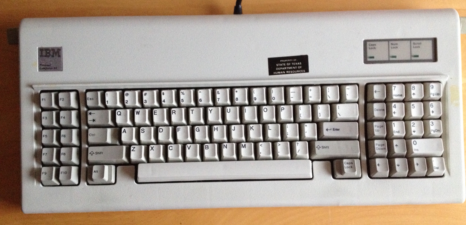
Nice ideas in the numpad block though. I do something similar on my AT.

Image

Positively roomy, this Model F!

User avatar
Khers

03 Jun 2015, 21:09

Initially I was looking for a keyboard with perfect symmetry and thought that the HHKB was the one. It was pointed out to me however, that that was not the case, something that bugged me quite a bit. Now however, I kind of like the imperfect symmetry, I find it attractive in its own right and I think that 60% boards where the user have put caps on it to make it seem more symmetric look rather uglier than those where the asymmetric nature is slightly highlighted, such as the top row on the white HHKB above.

As for MX, the Viper is probably my dream board and I certainly hope a GB will surface soon enough for me to get a board to put all of my MX caps on (not at the same time, obviously, that would look ridiculous).

User avatar
Chyros

04 Jun 2015, 01:09

Muirium wrote: Or are you talking about custom layouts you can't already buy?
Anything you want, existing or not!

User avatar
0100010

04 Jun 2015, 01:43

Muirium wrote: Hmm. That Fn… my Kishsaver's greatest flaw is having it down there in the corner as well. An awkward stretch for my fingers compared to the true HHKB.

Nice ideas in the numpad block though. I do something similar on my AT.

Image

Positively roomy, this Model F!
I moved my Function key from the bottom left, towards the top left :

Image
Image

User avatar
Mal-2

04 Jun 2015, 08:15

idealkey.png
idealkey.png (41.47 KiB) Viewed 20380 times
The 64 macro keys at the top would be tilted up at a considerable angle. The rest seems pretty self-explanatory.

Having tried navigation on the left (to get the alphas as far right as possible), I can say it's not just acceptable, it's awesome. Shift is under my left thumb for highlighting, I don't have to pull my hand off the mouse to make fine adjustments when I miss by one character in selections (which is often), and being able to navigate and use the numberpad simultaneously in Excel also rocks.

The "rabbit tooth" space bars allow the hands to be rotated in a manner like a split keyboard, reducing strain and making pinky stretches considerably easier, to the degree that the Dvorak L, ordinarily a difficult key to reach, is not a problem at all. Kicking [] to the bottom brings Backspace one key closer, which is always a good thing. (Unfortunately I am not doing this at present because I don't have those bottom row spaces to fill.)

I might note that this is not terribly different from what I actually have built, but without the compromises I have been forced to make due to the unwanted trackpad at lower right.

Image

User avatar
Chyros

04 Jun 2015, 09:46

Mal-2 wrote:
idealkey.png
The 64 macro keys at the top would be tilted up at a considerable angle. The rest seems pretty self-explanatory.

Having tried navigation on the left (to get the alphas as far right as possible), I can say it's not just acceptable, it's awesome. Shift is under my left thumb for highlighting, I don't have to pull my hand off the mouse to make fine adjustments when I miss by one character in selections (which is often), and being able to navigate and use the numberpad simultaneously in Excel also rocks.

The "rabbit tooth" space bars allow the hands to be rotated in a manner like a split keyboard, reducing strain and making pinky stretches considerably easier, to the degree that the Dvorak L, ordinarily a difficult key to reach, is not a problem at all. Kicking [] to the bottom brings Backspace one key closer, which is always a good thing. (Unfortunately I am not doing this at present because I don't have those bottom row spaces to fill.)

I might note that this is not terribly different from what I actually have built, but without the compromises I have been forced to make due to the unwanted trackpad at lower right.

Image
Woooo, that's quite a layout :D .

User avatar
Mal-2

04 Jun 2015, 11:05

Chyros wrote: Woooo, that's quite a layout :D .
You asked. ;)

Besides, I too believe bigger is better to a point. It becomes counterproductive when you can't find anything (and the exact same can be said for reducing keys and using layers), and it becomes counterproductive when it becomes unpleasant to work with. That's why all my extra keys are in the back, where they don't push the mouse out any further. This is the TKL philosophy taken to another level. Not only did I clip off the number pad (though I replaced it with an overlay, which is much more practical on a matrix than on a staggered keyboard), I also moved the navigation cluster to the left. It turns out I like it there, but I'd leave it there even if it was only passable. If it weren't for the mouse, I wouldn't have even bothered attempting it.

User avatar
kbdfr
The Tiproman

04 Jun 2015, 12:22

setup-01-50 15-06-04.jpg
setup-01-50 15-06-04.jpg (373.14 KiB) Viewed 20339 times
I especially appreciate that the numpad (which I use quite a lot) can be reached with just an upward movement.
And the old-fashioned position of the F keys, which allows intuitive use of left-hand-only combos.
And the many keys assigned to repetitive tasks.
And having, like Mal-2 but in addition rather as a replacement, arrow keys on the left - plus another Enter key there.
And other redundant keys like Escape, Delete, non-breaking space and some more.
And the specific German keys added to my French layout.
And the terrific look of the whole thing :mrgreen:

User avatar
HzFaq

04 Jun 2015, 12:58

The mothership has landed :D. I notice some novelty keys are starting to creep in as well, it's a bit more colourful than the last time I saw it :D.

I'm still fiddling around with layouts, I'm somewhere between ErgoDox and something with symetrical stagger; I'll post some pictures of some experiments when I'm back home.

User avatar
XMIT
[ XMIT ]

04 Jun 2015, 13:02

There is still some space in the upper right for an XMIT key. :ugeek:

User avatar
Mal-2

04 Jun 2015, 13:28

I also designed a modification of the standard Cherry G86 layout for the buyer of my 61410:
G86-61410-02.jpg
G86-61410-02.jpg (175.1 KiB) Viewed 20316 times
This layout moves `~ out of the bottom row where it doesn't belong, replaces it with a Fn key (which is really F24 but will be used for scripts), and by shifting the numberpad operators around a bit, manages to bring the navigation cluster (labeled in color merely for visual aid, as is "DON'T PANIC" Esc) down one row. This also results in all of the blank keys becoming a nice, contiguous 2 x 17 region. Further, the 1.5U Backspace is really easy to over-reach, so NumLock had to stay put as it is one of the most harmless keys to inadvertently press. I also put two O-rings on the stem of NumLock, such that it won't activate with a casual flick as it would receive if the user thinks they're pressing Backspace, but will activate if pressed firmly. This even further reduces the penalty of over-reaching the Backspace.

I didn't want to fire up the printer for a single key legend, so the `~ is done with paint marker on electrical tape. It's still under a lens and won't wear off. The lenses are deliberately omitted from F1-F4 and F9-F12 to make it easy to distinguish the clusters of four by touch, the same function the gutters on a normal F-key row serve.

Due to some questionable design choices on Cherry's part, the modifier row does not accept relegendables, nor do the modifier keys fit in any other row. The Fn key is a custom job (I glued a new stem onto it).

davkol

04 Jun 2015, 13:32

I don't really like straight, staggered, single-piece keyboards, but if I had to use one, I'd build something like this:
Image
It's inspired by DreymaR's Angle/Wide ergo modification and Sun/Unix layout. All keycaps are common sizes/profiles.
Last edited by davkol on 04 Jun 2015, 22:34, edited 1 time in total.

gropingmantis

04 Jun 2015, 15:23

My ideal layout is this:
isohhkb.png
isohhkb.png (16.84 KiB) Viewed 20277 times
[/url]
which thanks to Gon and (soon) Round 5 will be a reality. Though ideally a custom buckling spring would be the dream MX Green has to do for now.

Next up is a replacement for my TKL, something like this:
lh75.png
lh75.png (24.29 KiB) Viewed 20277 times
[/url]
Kind of like a lefthanded lightsaver but with no top row.

User avatar
Mal-2

05 Jun 2015, 01:27

gropingmantis wrote: Next up is a replacement for my TKL, something like this:
When I had a keypad in the left hand, I found it nice to place the +-*/ in a column on the far left for the pinky, and split the upper of the two 2U keys on the right. The one that remained became Space, the bottom of the split key became Enter, and the top became Backspace. The left index finger is much more capable of handling two keys there than the right pinky is. This also left the top row free for = ( ) , and there's no real need for an exposed (non-Fn) NumLock so that can be given over to something else as well.

gropingmantis

05 Jun 2015, 10:31

Mal-2 wrote:
gropingmantis wrote: Next up is a replacement for my TKL, something like this:
When I had a keypad in the left hand, I found it nice to place the +-*/ in a column on the far left for the pinky, and split the upper of the two 2U keys on the right. The one that remained became Space, the bottom of the split key became Enter, and the top became Backspace. The left index finger is much more capable of handling two keys there than the right pinky is. This also left the top row free for = ( ) , and there's no real need for an exposed (non-Fn) NumLock so that can be given over to something else as well.
Interesting points. TBH I had merely copied the standard keypad layout to the left but you are correct I should probably pay more attention to what my left hand is actually capable of compared to having it on the right. With your suggestions and switching "0" and "." (I feel like having the x2 keys thumb operated feels like a better choice) I get this:
lh75.png
lh75.png (24.31 KiB) Viewed 20186 times
[/url]

User avatar
gogusrl

05 Jun 2015, 13:57

I plan on building something like this :

Image

The space above the directional keys is reserved for the teensy.

User avatar
OleVoip

05 Jun 2015, 14:14

Bit-paired ISO-2530 international layout; modifiers on left edge; inverted-t cursor-block on home row; menu key with the cursor keys; delete next to backspace; stepped compose, caps lock and microphone mute (no scroll lock) keycaps with LEDs; dedicated ACPI keys and slim consumer control keys; ChangeSign instead of NumLock
OleVoip-IdealLayout.png (93.32 KiB) Viewed 20159 times

User avatar
OleVoip

05 Jun 2015, 22:06

Well, for the time being that layout is just fantasy ("ideal"), but those slim keycaps do exist:
Image

User avatar
joc

06 Jun 2015, 17:56

My ideal layout is ANSI TKL (QWERTY) because I prefer having dedicated function and navigation keys. Although, I've been testing the following 60% layout and so far it's been very intuitive and comfortable to use.
  • Pressing and holding Space, with one Shift initially held down, activates the Fn layer
  • Pressing and holding Esc sends Ctrl
  • Pressing and holding Enter sends Ctrl
  • Simultaneously pressing and releasing both Shifts sends Caps Lock
Base layout:
base_layout.png
base_layout.png (36.66 KiB) Viewed 20066 times
Fn layout:
fn_layout.png
fn_layout.png (48.84 KiB) Viewed 19989 times

User avatar
darkspider

21 Sep 2015, 08:18

I'm now considering to get a keyboard with layout like the photo I attached.
It's featured by a minimized-SSK-like layout with Fn key NOT being pressed. And when the Fn key is pressed, It has vim-like bunch of cursor keys and a set of keys simulating a numpad(colored part).
Any improvement?

I revised it somewhat again.
Attachments
keyboard-layout(3).png
keyboard-layout(3).png (52.52 KiB) Viewed 19830 times
Last edited by darkspider on 22 Sep 2015, 08:14, edited 2 times in total.

andrewjoy

21 Sep 2015, 11:37

Image

I do have this

http://coronthica.com/by-uuid/3f83a38c- ... 39950ab6c/

Closest you are going to get i think

She was a dirty girl but she cleaned up well :)

User avatar
vvp

21 Sep 2015, 13:08

I have this currently:
normal layer
normal layer
normal.png (32.73 KiB) Viewed 19096 times
keypad layer
keypad layer
keypad.png (43.9 KiB) Viewed 19096 times
Though I plan to add mouse buttons 6-9 to the keypad layer so that it is easy to scroll up/down/left/right from the keyboard.

User avatar
t8c

21 Sep 2015, 14:02

This is what I am going to do with my Zealio 62g tactile and R5/granite caps. Inspired by the wonders and faults of CM storm TK.

Image


More compact edition:
Image

Edit: Quick question: What would be the ideal controller for programming this with the TMK firmware? Is teensy 2.0 big enough or do I need the plus plus version?

Post Reply

Return to “Keyboards”