 Untitled by skurela, on Flickr
Post your keyboard/keycaps!
-
sethk

- Location: United States
- Main keyboard: G80-2100HDF
- Main mouse: Razer 2013 Naga
- Favorite switch: All of them
- DT Pro Member: -
Untitled by skurela, on Flickr
Last edited by sethk on 11 Sep 2015, 20:57, edited 1 time in total.

-
hammelgammler

- Vintage
- Location: Germany
- Main keyboard: IBM Model F Unsaver
- Main mouse: G-Wolves Skoll
- Favorite switch: Buckling Spring (Model F)
- DT Pro Member: -
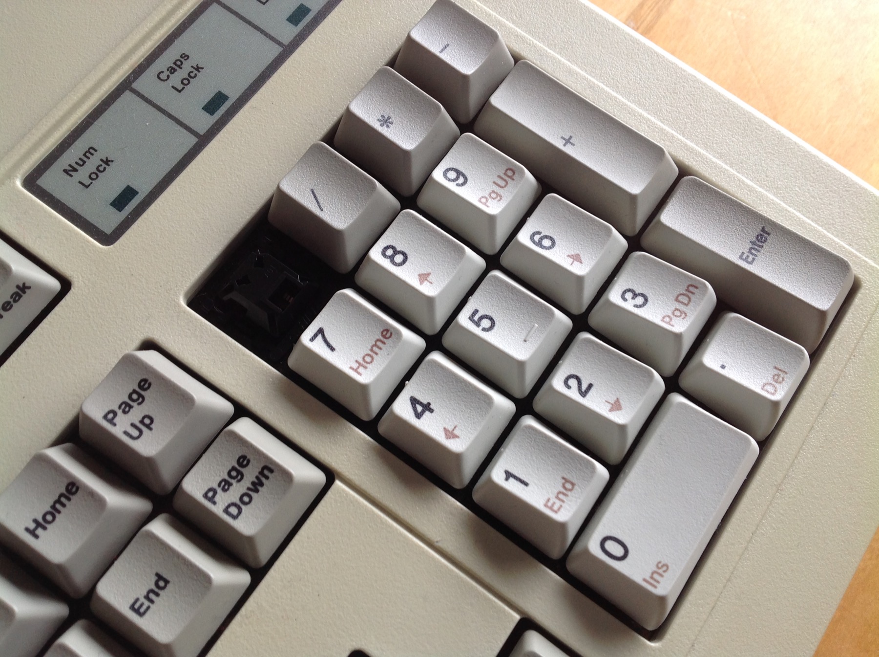
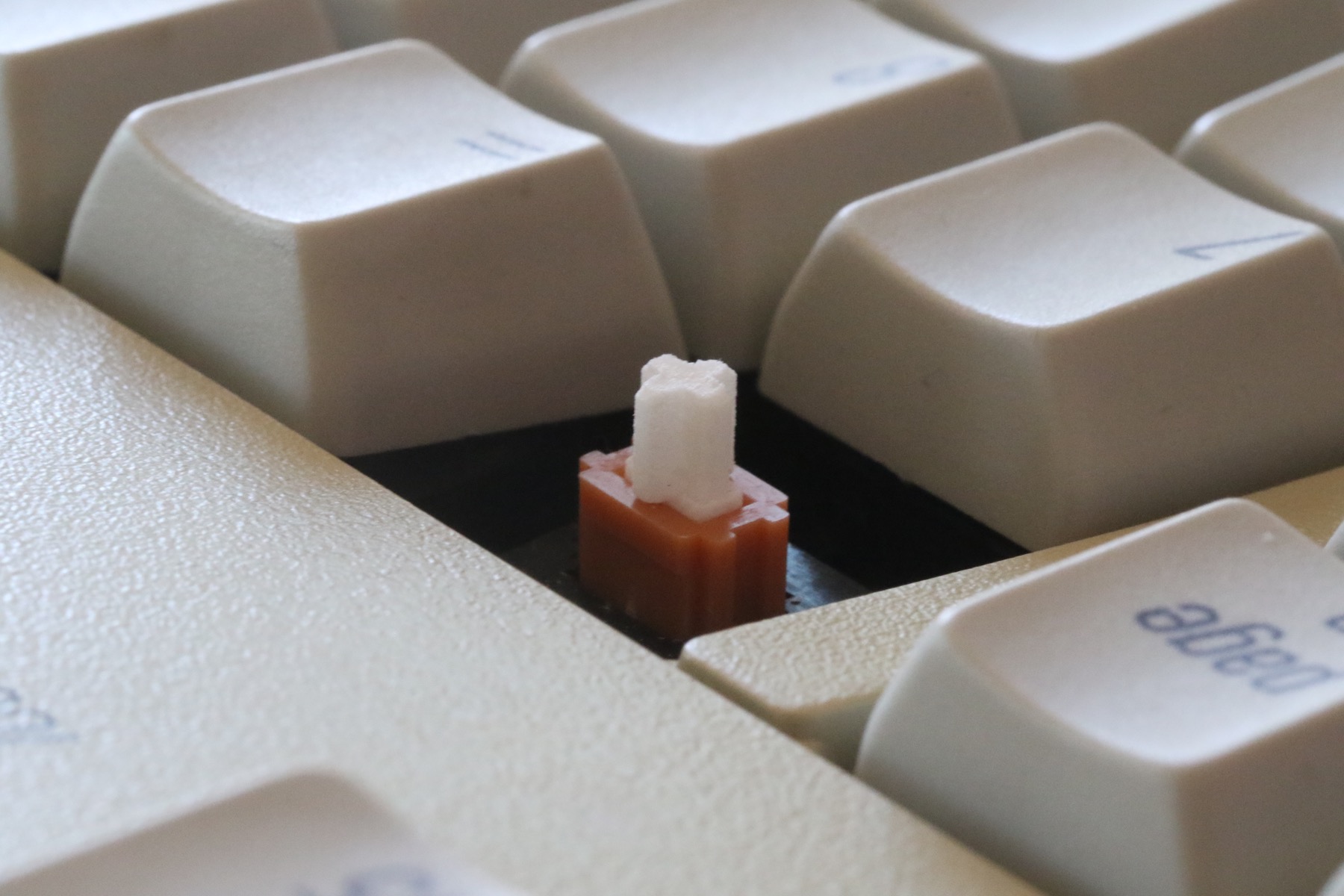
Finally, I think I'm done with the AT. I really need some nice keycaps for the right part though...
Only the xwhatsit is left.
I really nailed the spacebar stabilizer part though, it feels even better then the original one from the F122 or a SSK.
Only the xwhatsit is left.
I really nailed the spacebar stabilizer part though, it feels even better then the original one from the F122 or a SSK.
- Model F AT.jpg (973.62 KiB) Viewed 10475 times
-
Nuum

- Location: Germany
- Main keyboard: KBD8X Mk I (60g Clears), Phantom (Nixdorf Blacks)
- Main mouse: Corsair M65 PRO RGB
- Favorite switch: 60g MX Clears/Brown Alps/Buckling spring
- DT Pro Member: 0084
Nice, I've recently done this mod to my AT as well. I'm simply holding down the spacebar stab wire with some Scotch tape, works like a charm since about a month, but I fear it's not a permanent solution.
How did you do your spacebar stab?
How did you do your spacebar stab?
-
hammelgammler
- Vintage
- Location: Germany
- Main keyboard: IBM Model F Unsaver
- Main mouse: G-Wolves Skoll
- Favorite switch: Buckling Spring (Model F)
- DT Pro Member: -
Oh yeah, details. I totally forgot about that. I will do that. 
I just realized how nice the bottom row of Round 5 SA keycaps are, is that normal or just because of his keyboard?
The spacebar is at the opposite angle like on a SSK, and even the rest of the bottom is facing to you!
That's something that i really hate about the SSK. Inverting the spacebar could be an option for most Cherry Users, but that's a bit too much of an angle for me. I think that could be about right.
- cool.jpg (349.69 KiB) Viewed 10382 times
-
tigpha
- Location: United Kingdom
- Main keyboard: IBM Bigfoot + Arduino
- Main mouse: Kensington Orbit Trackball
- Favorite switch: IBM Model F buckling spring
- DT Pro Member: -
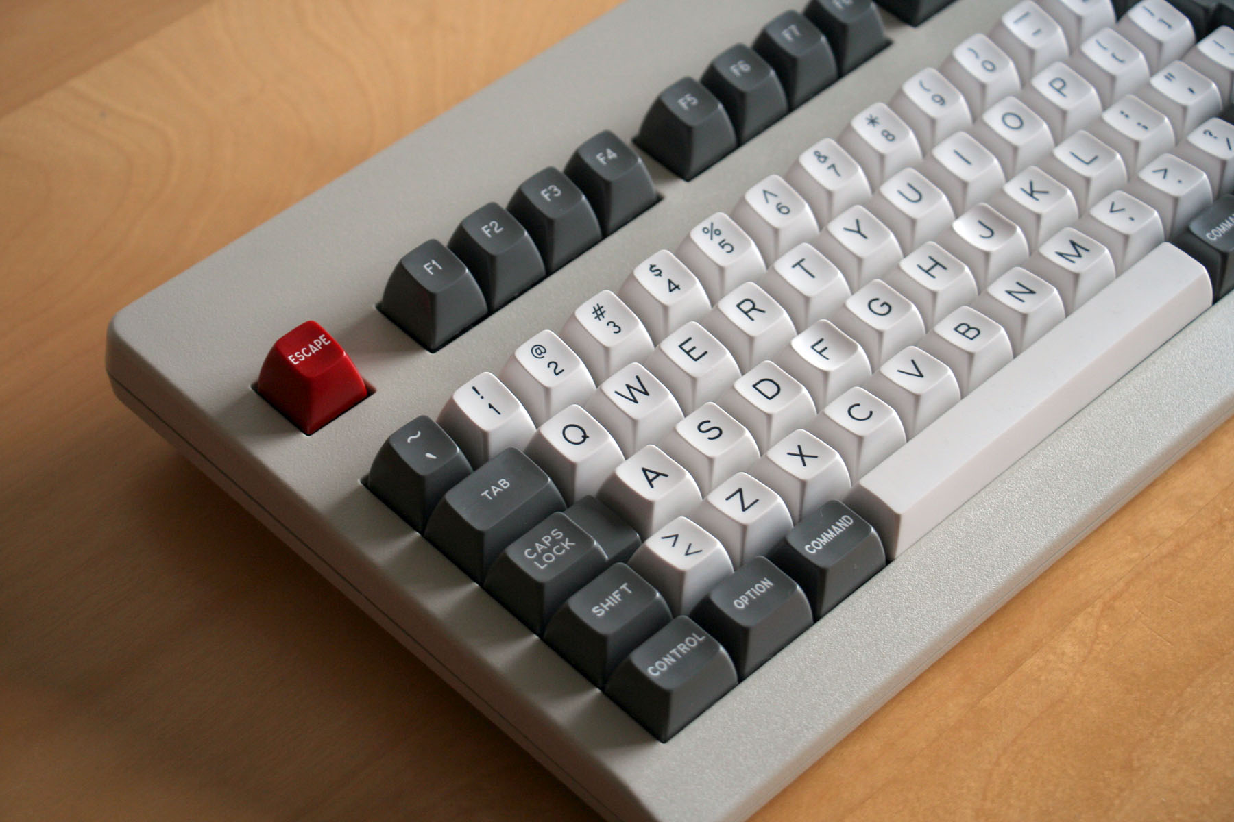
IBM Model F -- Favourite among my collection so far, in the sun of the autumn equinox.
- Equinox-IBM-Bigfoot-01.jpg (924.25 KiB) Viewed 10322 times
- Equinox-IBM-Bigfoot-02.jpg (964.23 KiB) Viewed 10322 times
- Equinox-IBM-Bigfoot-03.jpg (916.67 KiB) Viewed 10322 times
- Equinox-IBM-Bigfoot-04.jpg (956.44 KiB) Viewed 10322 times
-
Muirium

- µ
- Location: Edinburgh, Scotland
- Main keyboard: HHKB Type-S with Bluetooth by Hasu
- Main mouse: Apple Magic Mouse
- Favorite switch: Gotta Try 'Em All
- DT Pro Member: µ
Nicely captured.
IBM didn't spare on the caps, back then. Good tough PBT, full of texture. And legends as dark and thick as if they were painted on by an expert Helvetica hand.
IBM didn't spare on the caps, back then. Good tough PBT, full of texture. And legends as dark and thick as if they were painted on by an expert Helvetica hand.
-
Muirium
- µ
- Location: Edinburgh, Scotland
- Main keyboard: HHKB Type-S with Bluetooth by Hasu
- Main mouse: Apple Magic Mouse
- Favorite switch: Gotta Try 'Em All
- DT Pro Member: µ
SA's flat last row is pretty smart. We were just discussing this, actually. Jacobolus has a thread full of different profiles, conveniently displayed so you can compare them at a glance. Here's SA:hammelgammler wrote: I just realized how nice the bottom row of Round 5 SA keycaps are, is that normal or just because of his keyboard?
The spacebar is at the opposite angle like on a SSK, and even the rest of the bottom is facing to you!
That's something that i really hate about the SSK. Inverting the spacebar could be an option for most Cherry Users, but that's a bit too much of an angle for me. I think that could be about right.

When mounted on a tilted keyboard, like the one in your picture, SA's bottom row goes with the flow instead of jutting forward, towards your thumbs. I like that too. Thumbs are different from fingers, and want their own row to call home!
-
zslane

- Location: Los Angeles, California, USA
- Main keyboard: RealForce RGB
- Main mouse: Basic Microsoft USB mouse
- Favorite switch: Topre
- DT Pro Member: -
Jacobolus is a hero for taking all those profile photos. I like that 3-1-2-3-4-3 profile. I like 1-1-2-3-4-3 even better (all hail Round 5 Honey).
-
hammelgammler
- Vintage
- Location: Germany
- Main keyboard: IBM Model F Unsaver
- Main mouse: G-Wolves Skoll
- Favorite switch: Buckling Spring (Model F)
- DT Pro Member: -
Wow, when compared to the IBM profile you can clearly see the massive difference in angle!
Man, now I really want to have some SA blanks. Sad that I don't like Cherrys anymore, and together with the adapter from MX to Alps mount, I think there are a bit too high for me. And the wobble may be a problem with that.
Any news when we have SA profile for buckling spring or Alps?
Man, now I really want to have some SA blanks. Sad that I don't like Cherrys anymore, and together with the adapter from MX to Alps mount, I think there are a bit too high for me. And the wobble may be a problem with that.
Any news when we have SA profile for buckling spring or Alps?

-
tigpha
- Location: United Kingdom
- Main keyboard: IBM Bigfoot + Arduino
- Main mouse: Kensington Orbit Trackball
- Favorite switch: IBM Model F buckling spring
- DT Pro Member: -
Thank you.
Is there a name for the old-school "top hat" style of keys?
The two things I might consider changing are the cylindrical profile key tops to spherical, maybe keeping the "top hat" style, and building a compact 60% Model F for easy transport. The Bigfoot is not itinerant!
I suppose the cylindrical profile is a compromise that enables the key legend to be sublimed, since the symbol is transferred from flat foil printed with dye. At least, that is according to what I discovered from this entrepreneur in Japan. The foil would crease if it were forced into the dished tops that furnish the venerable beamsprings of the previous generation. Pity.
The Bigfoot has spoilt me. I now find the Cherry boards less appealing. The KBT Pure has fallen from favour since experiencing The Model F.
P.s. "It isn't Helvetica" apparently, Murium!
-
guk

- 1896 Vintage Reds
- Location: Hannover, Germany
- Main keyboard: SSK,Novatouch
- Main mouse: Steelseries Sensei
- Favorite switch: BS
- DT Pro Member: -
It will always remain Helvetica for µ. A shudder of pleasure runs down his spine whenever he thinks/types or speaks out that word.tigpha wrote: P.s. "It isn't Helvetica" apparently, Murium!
-
Muirium
- µ
- Location: Edinburgh, Scotland
- Main keyboard: HHKB Type-S with Bluetooth by Hasu
- Main mouse: Apple Magic Mouse
- Favorite switch: Gotta Try 'Em All
- DT Pro Member: µ
Yes, I read that a while ago, and he is quite right. Looking at the Page Down key on my Realforce here, it definitely looks more like Mr. Nakazato's Helvetica Light test cap on the left than the IBM original on the right:tigpha wrote: P.s. "It isn't Helvetica" apparently, Murium!
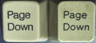
While the Page Down on my IBMs are all just like the one on the right.
Overall, it's a subtle difference that only really shows up on those text mods. The telltale capital G key is much closer to Heletica than Cherry's round G, or indeed any fools out there using Arial today! So I'm still calling IBM's legends Helvetica until we know what obscure Helvetica clone they were actually using, back in the day.
Fortunately, Topre gets it right!
-
tigpha
- Location: United Kingdom
- Main keyboard: IBM Bigfoot + Arduino
- Main mouse: Kensington Orbit Trackball
- Favorite switch: IBM Model F buckling spring
- DT Pro Member: -
I do admire the dogged persistence of monsieur Nakazato san. Gill Sans is an elegant typeface I like to see in a body of text, but each letter in isolation on the keys seem slightly out of place. The original IBM Selectric font is interesting, the square proportions and weight of each letter stand well in isolation, fitting well in the slightly oval square frame of the key tops. The limitations of double-shot molding of that time show: my opinion is that the Selectric "G" could be more elegantly drawn. As discussed elsewhere, fonts and kerning are tricky to get Just Right™.Muirium wrote:Yes, I read that a while ago, and he is quite right. Looking at the Page Down key on my Realforce here, it definitely looks more like Mr. Nakazato's Helvetica Light test cap on the left than the IBM original on the right...tigpha wrote: P.s. "It isn't Helvetica" apparently, Murium!
-
tigpha
- Location: United Kingdom
- Main keyboard: IBM Bigfoot + Arduino
- Main mouse: Kensington Orbit Trackball
- Favorite switch: IBM Model F buckling spring
- DT Pro Member: -
I used to be a technical draughtsman before CAD was widely used, and hand lettering was one of the skills learnt. The Selectric font looks very much like hand drawn gothic letters, such as those illustrated in Plate III on page 35 of "Free-Hand Lettering"
... Getting really old-school now!
- Hand-drawn-gothic.jpg (269.35 KiB) Viewed 10222 times
-
Muirium
- µ
- Location: Edinburgh, Scotland
- Main keyboard: HHKB Type-S with Bluetooth by Hasu
- Main mouse: Apple Magic Mouse
- Favorite switch: Gotta Try 'Em All
- DT Pro Member: µ
Getting right into the business of typography now, good stuff!
I like that Q. But not so much the G, and the lowercase is all kinds of… oh, all right, oldschool!
Speaking of Q, I think you're right. Here's IBM's, on a 3276 beamspring:

So much better's than SP's "Call that a Q?" in Gorton:
Q should not look like an O.
The alternate g and t glyphs are interesting. Love that geometric t (the second one). But the geometric g (the first one, oddly enough!) is too short in the bowl for my taste.
I like that Q. But not so much the G, and the lowercase is all kinds of… oh, all right, oldschool!
Speaking of Q, I think you're right. Here's IBM's, on a 3276 beamspring:
So much better's than SP's "Call that a Q?" in Gorton:
Q should not look like an O.
The alternate g and t glyphs are interesting. Love that geometric t (the second one). But the geometric g (the first one, oddly enough!) is too short in the bowl for my taste.
-
zslane
- Location: Los Angeles, California, USA
- Main keyboard: RealForce RGB
- Main mouse: Basic Microsoft USB mouse
- Favorite switch: Topre
- DT Pro Member: -
The letters on that 3276 are quite excellent, but the punctuation glyphs are all over the place in terms of perceived size. Could use a good once-over by Matt3o...
-
Muirium
- µ
- Location: Edinburgh, Scotland
- Main keyboard: HHKB Type-S with Bluetooth by Hasu
- Main mouse: Apple Magic Mouse
- Favorite switch: Gotta Try 'Em All
- DT Pro Member: µ
Yup. Beamsprings are my favourite switch of all, and the caps are magnificently shaped, but the legends are a bit hokey in their own way too. I still prefer the cool elegance of Helvetica to those quirky doubleshot fonts.
Looking around for pictures to illustrate this stuff, I think I need to take some good comparison shots of my HHKB and Realforce to put alongside the NMB, which is another non-IBM board with some fine Helvetica dyesubs:
Think I've got doubleshot Alps board with something close to Helvetica on it as well. Need to explore the collection…
-
hammelgammler
- Vintage
- Location: Germany
- Main keyboard: IBM Model F Unsaver
- Main mouse: G-Wolves Skoll
- Favorite switch: Buckling Spring (Model F)
- DT Pro Member: -
Wow, they seem like they have a bad ass texture on them! And the legends are looking very nice as well! Man I love Dyesubs.
I really need some Dyesubs for Alps...
I really need some Dyesubs for Alps...
-
OleVoip

- Location: Hamburg
- Main keyboard: Tandberg TDV-5010
- Main mouse: Wacom Pen & Touch
- Favorite switch: Siemens STB 21
- DT Pro Member: -
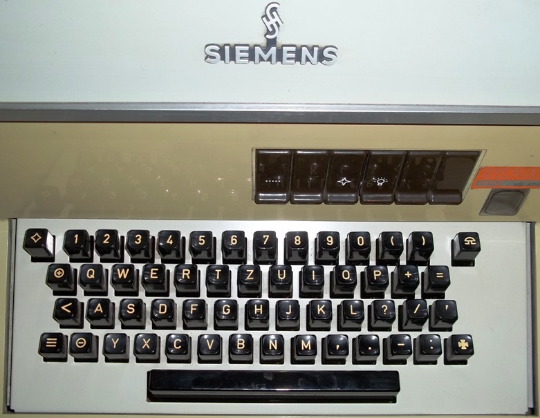
That reminds me of the keycap font SIemens used in the 1970s/80s,

edit: Sorry, I have to correct myself: For the umlauts , they did it differently such that the letters have their regular size and smaller dots are put on top. Furthermore, this only shows the construction - the end result was not as edgy as this.
Last edited by OleVoip on 24 Sep 2015, 10:20, edited 2 times in total.
-
Muirium
- µ
- Location: Edinburgh, Scotland
- Main keyboard: HHKB Type-S with Bluetooth by Hasu
- Main mouse: Apple Magic Mouse
- Favorite switch: Gotta Try 'Em All
- DT Pro Member: µ
Mmm… that 7. Those Ümlauts! Got any pics of those boards?
http://deskthority.net/review-f45/nmb-r ... t8469.html
That's a salmon AEK I.
They're awesome indeed. I love that board. Mad clicky switches, great caps.
http://deskthority.net/review-f45/nmb-r ... t8469.html
Vintage Apple boards are a good source. Very cosy shapes:
That's a salmon AEK I.
-
zuglufttier

- Location: Germany
- Main keyboard: IBM Model M SSK
- Main mouse: Razer Abyssus
- Favorite switch: Buckling Spring
- DT Pro Member: 0226
I guess, it shouldn't be extremely difficult to make a font from photos of those IBM keyboards...
I must admit that the legends have a very good readability. Not that it matters too much but it just looks better
I must admit that the legends have a very good readability. Not that it matters too much but it just looks better
-
OleVoip
- Location: Hamburg
- Main keyboard: Tandberg TDV-5010
- Main mouse: Wacom Pen & Touch
- Favorite switch: Siemens STB 21
- DT Pro Member: -
1980s http://www.dosforum.de/viewtopic.php?f=29&t=8842

1960s http://old.fernschreibamt-hausneindorf. ... t100s.html
1930s http://old.fernschreibamt-hausneindorf.de/html/t34.html
After being happy with this font for more than 50 years, they switched to Univers towards the end of 1980s - along with the change from doubleshots to lasered keycaps, followed by the replacement of mechanical switches by rubber domes. (Thus, if you find a bord with a proper Siemens "7", you can expect a switch underneath.) Those rare mechanical "Siemens" boards made nowadays are based on Cherry keys and have Cherry-Helvetica labelling.
(edit: Univers, not Universe)
Last edited by OleVoip on 29 Mar 2017, 18:20, edited 1 time in total.
-
kbdfr

- The Tiproman
- Location: Berlin, Germany
- Main keyboard: Tipro MID-QM-128A + two Tipro matrix modules
- Main mouse: Contour Rollermouse Pro
- Favorite switch: Cherry black
- DT Pro Member: 0010
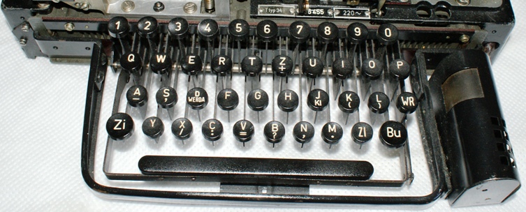
These tasty 7 and 4 caps remind me of the numpad of some Preh point of sale keyboards which,
although being rubberdomes, managed to use doubleshot caps with apparently that exact font:
although being rubberdomes, managed to use doubleshot caps with apparently that exact font:
- Preh-01.jpg (116.17 KiB) Viewed 10036 times
- Preh-07.jpg (67 KiB) Viewed 10036 times
- Preh Numpad.jpg (37.77 KiB) Viewed 10036 times
-
OleVoip
- Location: Hamburg
- Main keyboard: Tandberg TDV-5010
- Main mouse: Wacom Pen & Touch
- Favorite switch: Siemens STB 21
- DT Pro Member: -
Sorry, I meant to say that a "Siemens board with a proper Siemens '7'" has a switch underneath. The font was designed about 1930 under Siemens guidance, based on a Prussian precursor, and is known as DIN-1415. It is often seen in Germany, where it is also used for public road signs (in its modern variant).
-
Nuum
- Location: Germany
- Main keyboard: KBD8X Mk I (60g Clears), Phantom (Nixdorf Blacks)
- Main mouse: Corsair M65 PRO RGB
- Favorite switch: 60g MX Clears/Brown Alps/Buckling spring
- DT Pro Member: 0084
My Phantom with dyesubs and WoB doubleshots, with the 60% part highlighted which seems to be kinda trendy right now. Now with a new fascia from manna, thank you!
And my modded Model F AT, there are some dirt stains which simply won't go away. 
- DSCN3897 900kb.jpg (863.25 KiB) Viewed 9955 times
- DSCN3898 900kb.jpg (886.62 KiB) Viewed 9955 times
- DSCN3900 900kb.jpg (886.58 KiB) Viewed 9955 times
- DSCN3902 900kb.jpg (880.98 KiB) Viewed 9955 times