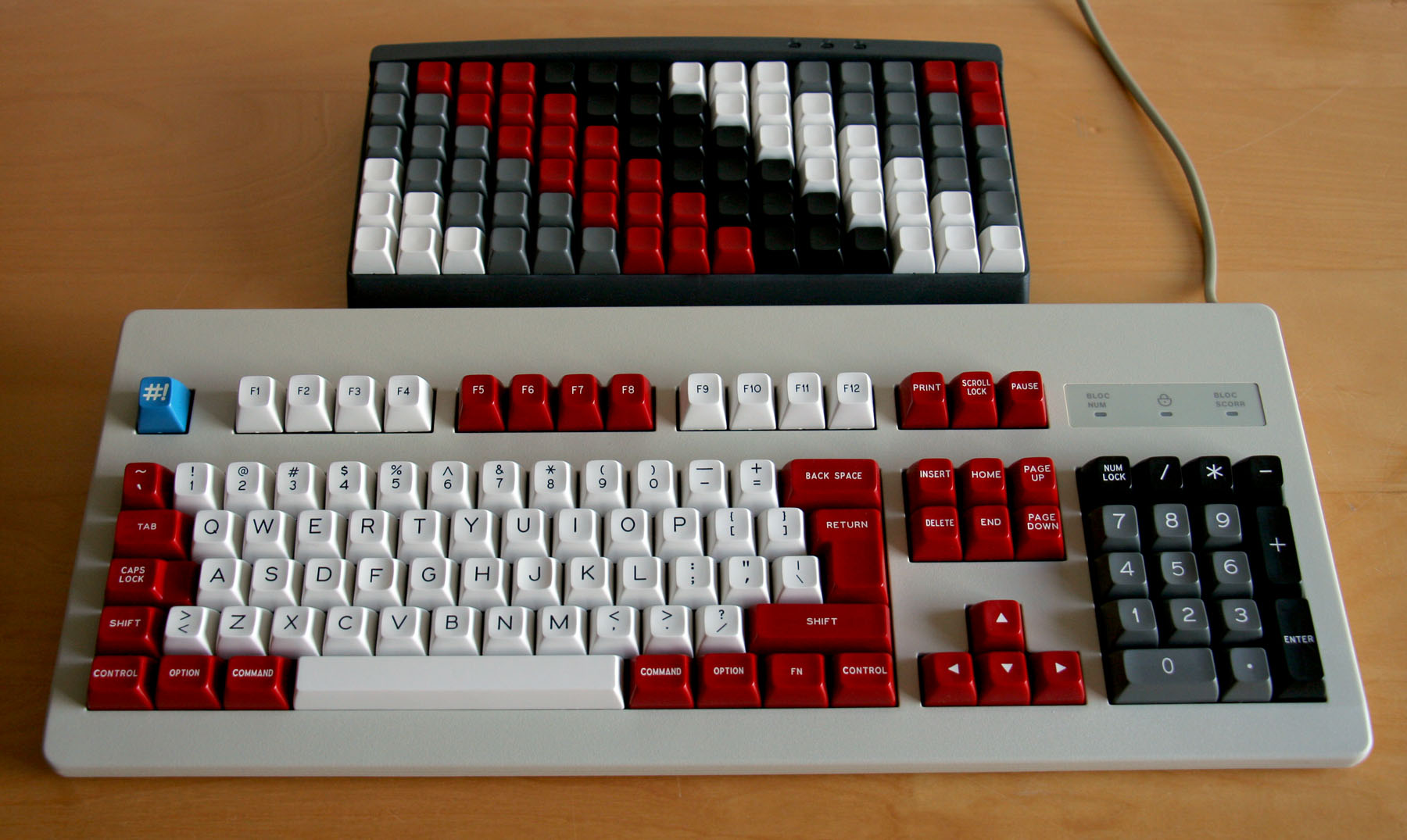
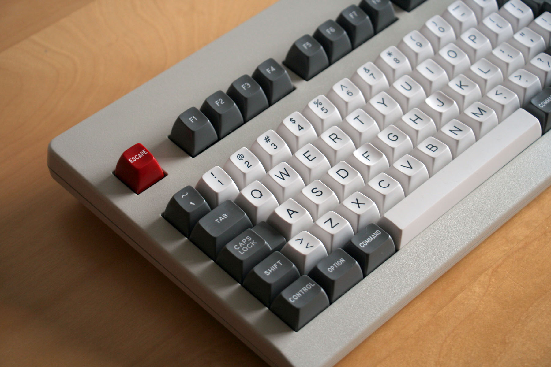
BATGIRL themed keycap set
- zslane
- Location: Los Angeles, California, USA
- Main keyboard: RealForce RGB
- Main mouse: Basic Microsoft USB mouse
- Favorite switch: Topre
- DT Pro Member: -
Recently I acquired this fine premium statuette of Batgirl and was inspired to try and come up with a keycap colorway based on the character:
I'm not sure which combination of colors works best, if any. Here are a few experiments. None of them match the statuette colors exactly, but they're never going to given that there are only two purple shades in SP's color set. Plus, I really wanted a set with dark blue alphas (not purple).
So the idea is to capture the spirit of the character, not replicate the precise colors of that particular statue. Of the four, I'm sort of leaning towards the one in the upper right as being my favorite. Yes, the two shades of blue are very close, but that might actually work. Or not. I'm just not sure.
A good eye will notice that the yellow used for the mods is different in the upper left image than the others. And that the blue alphas are different between the left and right sides. The upper left one has YCB mods, while all the others have YCF. And the dark blue alphas on the left are BBI while on the right they are BFU. The legend colors in all cases are YCB, BBI, and NN (used only with the two orange keys).
Last edited by zslane on 08 Feb 2016, 07:55, edited 1 time in total.
- Muirium
- µ
- Location: Edinburgh, Scotland
- Main keyboard: HHKB Type-S with Bluetooth by Hasu
- Main mouse: Apple Magic Mouse
- Favorite switch: Gotta Try 'Em All
- DT Pro Member: µ
Strong colours. Might be a good idea to do the occasional render on a white/beige keyboard instead of black. Everything goes with black. Lighter bodies are harder.
This also applies to your Dasher/Dancer concept. On black, Dasher looks better. But I have a feeling it might not on a white keyboard.
This also applies to your Dasher/Dancer concept. On black, Dasher looks better. But I have a feeling it might not on a white keyboard.
- seebart
- Offtopicthority Instigator
- Location: Germany
- Main keyboard: Rotation
- Main mouse: Steelseries Sensei
- Favorite switch: IBM capacitive buckling spring
- DT Pro Member: 0061
- Contact:
Intense even without the purple. Then again batgirl is intense. I only really like the original.
- Muirium
- µ
- Location: Edinburgh, Scotland
- Main keyboard: HHKB Type-S with Bluetooth by Hasu
- Main mouse: Apple Magic Mouse
- Favorite switch: Gotta Try 'Em All
- DT Pro Member: µ
Only Adam West could pull off a Batman dressed sillier than Batgirl.
Since then, they've armoured and duded up the dudes, yet Batgirl looks more or less the same! Ah, progress…
Since then, they've armoured and duded up the dudes, yet Batgirl looks more or less the same! Ah, progress…
- seebart
- Offtopicthority Instigator
- Location: Germany
- Main keyboard: Rotation
- Main mouse: Steelseries Sensei
- Favorite switch: IBM capacitive buckling spring
- DT Pro Member: 0061
- Contact:
True, Batman and Robin look like clowns by today's trends. But I prefer the 1960's Batgirl. Sexy!
- Muirium
- µ
- Location: Edinburgh, Scotland
- Main keyboard: HHKB Type-S with Bluetooth by Hasu
- Main mouse: Apple Magic Mouse
- Favorite switch: Gotta Try 'Em All
- DT Pro Member: µ
Also: bear in mind SP doesn't like to take risks with other people's property. They refuse to do Apple and Cherry logos, for instance. Sometimes things slip through — the Amiga and Evangelion stuff in Granite, and Sun logos and plenty more in other GBs — but technically you're supposed to own or have permission for the IP of everything you order. SP takes the risk of making it, which lands them in more trouble when the lawyers come.
I'm looking at that Batman symbol. It might be just iconic enough for even SP to notice! A pity, because it really makes the set.
I'm looking at that Batman symbol. It might be just iconic enough for even SP to notice! A pity, because it really makes the set.
- zslane
- Location: Los Angeles, California, USA
- Main keyboard: RealForce RGB
- Main mouse: Basic Microsoft USB mouse
- Favorite switch: Topre
- DT Pro Member: -
I'm not too concerned with how the Batgirl colors would look on a white keyboard. No real Bat fan would put such a set on a white keyboard anyway, and if they did and didn't like how it looked I doubt I'd lose any sleep over it.
I realize that the Bat logo would not get past SP's copyright policies, but then again I don't really expect to put this set into production. This exercise is just for fun.
As for the SA Dasher set on a white keyboard, I posted a couple renders of such in the Marketplace thread a while back. Judge for yourself.
- Muirium
- µ
- Location: Edinburgh, Scotland
- Main keyboard: HHKB Type-S with Bluetooth by Hasu
- Main mouse: Apple Magic Mouse
- Favorite switch: Gotta Try 'Em All
- DT Pro Member: µ
Looks a bit (conveniently) dark to me. Cherry beige is, true enough, quite a bit darker than white. But it's still damn tricky to make look good with arbitrary colour sets, compared to a black body.


Classic Round 5 works well. Red alphas, grey alphas, even straight black alphas: do not.


Classic Round 5 works well. Red alphas, grey alphas, even straight black alphas: do not.
- zslane
- Location: Los Angeles, California, USA
- Main keyboard: RealForce RGB
- Main mouse: Basic Microsoft USB mouse
- Favorite switch: Topre
- DT Pro Member: -
I am probably not as down on those color combinations (on white) as you are, but I'm sure you are not alone in your disdain. I've posted another (SA Dasher) render with a brighter board in the Marketplace thread.
- zslane
- Location: Los Angeles, California, USA
- Main keyboard: RealForce RGB
- Main mouse: Basic Microsoft USB mouse
- Favorite switch: Topre
- DT Pro Member: -
Some more color experiments:
The right-side images are the reverse of the left-side images in terms of the alphas vs. the function row and navcluster keys. The grayish-blue color used in the bottom images is BFR. BFU is the alpha color on the left and the func/nav color on the right.
The right-side images are the reverse of the left-side images in terms of the alphas vs. the function row and navcluster keys. The grayish-blue color used in the bottom images is BFR. BFU is the alpha color on the left and the func/nav color on the right.
- seebart
- Offtopicthority Instigator
- Location: Germany
- Main keyboard: Rotation
- Main mouse: Steelseries Sensei
- Favorite switch: IBM capacitive buckling spring
- DT Pro Member: 0061
- Contact:
I like these better than the earlier variation with that purple. Top right is my fave.
- Cherry1990
- Location: Italy
- Main keyboard: Filco Majestouch 2 TKL Multicam & PBT keycaps
- Main mouse: Logitech
- Favorite switch: MX Brown
- DT Pro Member: -
Nice but, for me, the contrast between dark blue and yellow is too big... Not really relaxing for your eyes...
-
mikethetiger
- Location: New Orleans, LA USA
- Main keyboard: Minivan
- Favorite switch: New BOX Whites
- DT Pro Member: -
-
Engicoder
- Location: NC, USA
- DT Pro Member: 0117
Colors seem very similar to Danger Zone. Have you thought about doing this as a smaller complimentary kit to Danger Zone? You could just do mods and novelties and it would be much cheaper. The alpha legends aren't quite the color you were working with, but I think it could work.
- zslane
- Location: Los Angeles, California, USA
- Main keyboard: RealForce RGB
- Main mouse: Basic Microsoft USB mouse
- Favorite switch: Topre
- DT Pro Member: -
Danger Zone is the set that made me think of this. Every time i saw the blue and yellow of Danger Zone my brain kept thinking it looked like a Batgirl set to me. Besides, Batgirl is my favorite DC character, so...
I'm not serious about this though; for one thing I don't think Signature Plastics would allow the bat logo to appear on a keycap, and without that it isn't worth bothering. It's just fun to imagine what it would look like.
The last step in visualizing what I see in my head is to take some of the old tv show fight fx graphics ("KerPow!", "Baff!", etc.) and make legend graphics matching them to really give them character.
-
Engicoder
- Location: NC, USA
- DT Pro Member: 0117
Here you go...a compilation
https://www.youtube.com/watch?v=6rMfpw00yoI
https://www.youtube.com/watch?v=6rMfpw00yoI
- zslane
- Location: Los Angeles, California, USA
- Main keyboard: RealForce RGB
- Main mouse: Basic Microsoft USB mouse
- Favorite switch: Topre
- DT Pro Member: -
Here's what it might look like in DSA family on a Poker. You can also see my early experiments with the "kaPOW!" novelties. They need further massaging to make them more readable and manufacturable, but you sort of get the idea. I would probably also only put them on the 1.25u bottom row mods and leave the other mods with regular Gorton Modified legends.
- Cherry1990
- Location: Italy
- Main keyboard: Filco Majestouch 2 TKL Multicam & PBT keycaps
- Main mouse: Logitech
- Favorite switch: MX Brown
- DT Pro Member: -
I really hope that this keyset can be produced! I love it!
But OEM/Cherry profile would be better, for my taste...
But OEM/Cherry profile would be better, for my taste...
-
khongthenhuvay
- Location: Vietnam
- DT Pro Member: -
You are best zslane. I don't understand why MD didn't pick your beautiful design instead of ugly Jukebox 
- Muirium
- µ
- Location: Edinburgh, Scotland
- Main keyboard: HHKB Type-S with Bluetooth by Hasu
- Main mouse: Apple Magic Mouse
- Favorite switch: Gotta Try 'Em All
- DT Pro Member: µ
As much as I'm loathe to defend Massdrop, there is the issue of the Bat logo keys for one thing. They really make this set, but SP's adamant they will not manufacture them. DC would sue them for more than the whole little keycap business is worth…
That's the problem with making these in the US instead of China. Well, one of the problems.
That's the problem with making these in the US instead of China. Well, one of the problems.
-
khongthenhuvay
- Location: Vietnam
- DT Pro Member: -
Even without that logo, it's still much better than the Jukebox.
And I believe that zslane can draw a different "bat" icon which will not cause any legal issue.
And I believe that zslane can draw a different "bat" icon which will not cause any legal issue.
- zslane
- Location: Los Angeles, California, USA
- Main keyboard: RealForce RGB
- Main mouse: Basic Microsoft USB mouse
- Favorite switch: Topre
- DT Pro Member: -
The only way to redraw the bat logo so that it doesn't draw unwanted legal attention from WB/DC is to make it look like something other than a bat. There have been so many variations of that bat logo created for Batman over the years that DC can make a reasonable legal claim to just about any logo that is even remotely bat-shaped.
Moreover, I would have to rename the set and remove Batgirl herself from all promotional images, which defeats the purpose of having a Batgirl-themed set in the first place. If I rename it Nightbird, put some bird-like logo on instead and remove the cartoon Batgirl image, then it just becomes a blue-and-yellow set with an unrecognizable theme. I'm not convinced that the "kaPOW!" legends would succeed in re-associating it with Batgirl all on their own.
Without a license from DC, this set remains firmly in the "wouldn't it be neat" category, AFAIC. Sorry!