Hi-Profile PBT Dye-sub (the time has come)
- Wodan
- ISO Advocate
- Location: ISO-DE
- Main keyboard: Intense Rotation!!!
- Main mouse: Logitech G903
- Favorite switch: ALL OF THEM
- DT Pro Member: -
So there won't be a "Row3" like we have in SA?
When putting these caps on a "high" board like a G80-1800, what profile would you recommend for the keys above the numpad?
When putting SA caps on an 1800, it feels and looks odd to have three rows of Row1 profile keycaps up there.
When putting these caps on a "high" board like a G80-1800, what profile would you recommend for the keys above the numpad?
When putting SA caps on an 1800, it feels and looks odd to have three rows of Row1 profile keycaps up there.
- matt3o
- -[°_°]-
- Location: Italy
- Main keyboard: WhiteFox
- Main mouse: Anywhere MX
- Favorite switch: Anything, really
- DT Pro Member: 0030
they look pretty good on the keyboard, they are just odd when you look at them on the same plane.
the spacebar feels pretty good as it is now, making the mods the same height/shape would kill the profile though
We have: R0, R1, R2, R3, R4, R4. So if I understand your concern, that shouldn't be a problem.
- XMIT
- [ XMIT ]
- Location: Austin, TX area
- Main keyboard: XMIT Hall Effect
- Main mouse: CST L-Trac Trackball
- Favorite switch: XMIT 60g Tactile Hall Effect
- DT Pro Member: 0093
Tough to tell from the photos, but these seem both a little deeper than SA (not saying much, it's practically flat) and more that a bit less deep than IBM. Maybe about comparable to my Alps PBT dyesubs and/or Alps spherical typewriter caps.
- zslane
- Location: Los Angeles, California, USA
- Main keyboard: RealForce RGB
- Main mouse: Basic Microsoft USB mouse
- Favorite switch: Topre
- DT Pro Member: -
- matt3o
- -[°_°]-
- Location: Italy
- Main keyboard: WhiteFox
- Main mouse: Anywhere MX
- Favorite switch: Anything, really
- DT Pro Member: 0030
- zslane
- Location: Los Angeles, California, USA
- Main keyboard: RealForce RGB
- Main mouse: Basic Microsoft USB mouse
- Favorite switch: Topre
- DT Pro Member: -
Yeah, kinda, but not precisely.
I don't think it will have any impact on typing, but it will look bad. And by bad I mean it will look like a design/manufacturing error, the way SA's Shift keys looked wrong for being row3 all those years.
I don't think it will have any impact on typing, but it will look bad. And by bad I mean it will look like a design/manufacturing error, the way SA's Shift keys looked wrong for being row3 all those years.
- Wodan
- ISO Advocate
- Location: ISO-DE
- Main keyboard: Intense Rotation!!!
- Main mouse: Logitech G903
- Favorite switch: ALL OF THEM
- DT Pro Member: -
Space bars frequently have a different row profile than the bottom row. Ever wondered why so many people fight about the right profile of the Cherry bottom row (RowA vs RowB) and no one ever bothers about the space bar? They haven't changed it even though the bottom row profile was changed.
- matt3o
- -[°_°]-
- Location: Italy
- Main keyboard: WhiteFox
- Main mouse: Anywhere MX
- Favorite switch: Anything, really
- DT Pro Member: 0030
also consider that this is a hi profile set. we need some extra care if we don't want the spacebar to destroy your thumbs. but if you guys have suggestions, this is the right time!
- Laser
- emacs -nw
- Location: Romania
- Main keyboard: Plum TKL \w Topre domes (work) / Novatouch (home)
- DT Pro Member: 0180
I have a feeling this was already discussed (in this very thread?) To my shame, I didn't read it all. Maybe just make the spacebar somewhat taller, but with the same curve? (although I'm ok with it)
@XMIT - thanks for the info Unfortunately, I still can't imagine how these caps feel, since I don't own those other caps you compare them to.
@XMIT - thanks for the info
- photekq
- Cherry Picker
- Location: United Kingdom
- Main keyboard: Various Cherry Corp keyboards
- Main mouse: Razer Deathadder (1st gen)
- Favorite switch: Nixdorf 'Soft Touch' MX Black (55g springs)
- DT Pro Member: -
- Contact:
Yep, the Cherry spacebar doesn't match A-profile or B-profile, but it looks perfectly fine with both.Wodan wrote: Space bars frequently have a different row profile than the bottom row. Ever wondered why so many people fight about the right profile of the Cherry bottom row (RowA vs RowB) and no one ever bothers about the space bar? They haven't changed it even though the bottom row profile was changed.
- Laser
- emacs -nw
- Location: Romania
- Main keyboard: Plum TKL \w Topre domes (work) / Novatouch (home)
- DT Pro Member: 0180
How about the other elements? *Thickness*, color&font for 1st theme? 
Re-spacebar: There's also the solution of making the other modifiers resemble the spacebar shape (convex instead of concave), but I don't know if that wasn't already discussed/ruled out, e.g. more or less like here:

Re-spacebar: There's also the solution of making the other modifiers resemble the spacebar shape (convex instead of concave), but I don't know if that wasn't already discussed/ruled out, e.g. more or less like here:

- derzemel
- Location: Bucharest, Romania
- Main keyboard: FC660C, SSK, TX-1800 Nixie
- Main mouse: Mionix Naos 7000
- Favorite switch: Alps SKCL/SKCM tactile
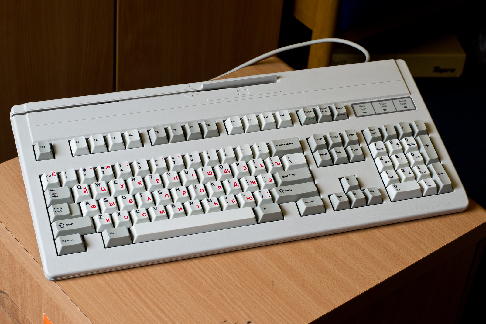
I think the Beamspring designers have had the same issue and their solution was to make the whole bottom row Convex, opposite to the rest of the rows which are concave:
As an example:
I could take a side photo of my 5251 when I get home tonight, if needed.
Anyway, I am not at all bothered by the differences between the space and the rest of the rows as I flip the spacebars.
As an example:

I could take a side photo of my 5251 when I get home tonight, if needed.
Anyway, I am not at all bothered by the differences between the space and the rest of the rows as I flip the spacebars.
- Muirium
- µ
- Location: Edinburgh, Scotland
- Main keyboard: HHKB Type-S with Bluetooth by Hasu
- Main mouse: Apple Magic Mouse
- Favorite switch: Gotta Try 'Em All
- DT Pro Member: µ
Apart from that last part where you admitted to being a monster, I agree exactly. IBM solved this. Convex bottom row is the classy answer.
Now back to what I said before the ninja.
@Matteo: The HiPro has many problems*. You took a picture of one of the most glaring ones! I don't know exactly what I'd do to that spacebar of theirs, as I like it but loathe the way it sits between the mods. The whole bottom row needs a more forgiving front edge, in my view.
*Others include: tall caps but almost no spherical indents, no separate caps on sale, incomplete compatibility with their own boards, and where's the goddamn TKL so we don't have to worry about all this?
- 002
- Topre Enthusiast
- Location: Australia
- Main keyboard: Realforce & Libertouch
- Main mouse: Logitech G Pro Wireless
- Favorite switch: Topre
- DT Pro Member: 0002
It's weird that Topre did that on the Hi-Pro because the Henkan and Muhenkan keys on their Japanese 108 Realforces are convex and they are infinitely more comfortable to press.
- snuci
- Vintage computer guy
- Location: Ontario, Canada
- DT Pro Member: 0131
- Contact:
Please don't consider what Topre did with the Hi-pro as a solution. If there's one thing I don't like about the Topre Hi-pro, it's the bottom row. The space bar row feels out of place and too low compared to the 4th row.
It looks like this:

It looks like this:
- infodroid
- Location: London
- Main keyboard: V60 Matias QC
- Favorite switch: Matias Quiet Click
- DT Pro Member: -
The height of the spacebar does not look right to me, compared to the height of keys on the same row. If Topre Hi Pro and IBM Beam Spring are the inspiration then there should be a higher or a lot more convex space bar than the keys on the same row.
Last edited by infodroid on 17 Nov 2016, 11:56, edited 1 time in total.
- matt3o
- -[°_°]-
- Location: Italy
- Main keyboard: WhiteFox
- Main mouse: Anywhere MX
- Favorite switch: Anything, really
- DT Pro Member: 0030
I posted the picture of the hi pro just to show you that other high profile sets have different spacebars.
The lower spacebar is to make it more comfortable compared to --say-- SA profile. The argument so far is just "make it taller so it is flush with the modifiers", which is aesthetics against usability. Making the last row convex introduces other issues and I wouldn't go that route (even though I admittedly like it).
The spacebar is just few mm shorter, honestly looking at it, it doesn't look out of place. I actually thought it would have been a welcomed feature... go figure.
Thickness is about 1.8mm
- infodroid
- Location: London
- Main keyboard: V60 Matias QC
- Favorite switch: Matias Quiet Click
- DT Pro Member: -
Is it really true that taller space bars are less ergonomic? It has not been my experience.matt3o wrote: The lower spacebar is to make it more comfortable compared to --say-- SA profile. The argument so far is just "make it taller so it is flush with the modifiers", which is aesthetics against usability. Making the last row convex introduces other issues and I wouldn't go that route (even though I admittedly like it).
I would be interested in a highly convex space bar option, if possible.
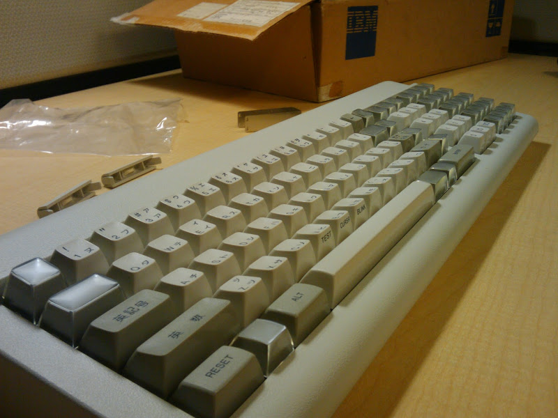
Here are high beam spring spacebars from the IBM beam springs photo thread.


- matt3o
- -[°_°]-
- Location: Italy
- Main keyboard: WhiteFox
- Main mouse: Anywhere MX
- Favorite switch: Anything, really
- DT Pro Member: 0030
compared to the other rows those spacebars are very low actually (also the mods and the spacebar are on different layout too  ).
).
we do not make keyboards today like we were in the past. often a keycap set was done exclusively for one keyboard, so maybe the spacebar on its own could be very tall, but when placed on a custom made keyboard on the right angle it is actually very low (like in the pictures above).
we do not make keyboards today like we were in the past. often a keycap set was done exclusively for one keyboard, so maybe the spacebar on its own could be very tall, but when placed on a custom made keyboard on the right angle it is actually very low (like in the pictures above).
- infodroid
- Location: London
- Main keyboard: V60 Matias QC
- Favorite switch: Matias Quiet Click
- DT Pro Member: -
I see that now. The spacebar is high relative to the adjacent modifiers. But it is somewhat lower on where it should be from the previous row. Also interesting to note those bottom row modifiers are really low!
Surely it is very hard to judge how good a set will feel until using more people are using it, especially if there is nothing else out there like it. I hope this set is not a one-off and will be open to improvements in future rounds...
- matt3o
- -[°_°]-
- Location: Italy
- Main keyboard: WhiteFox
- Main mouse: Anywhere MX
- Favorite switch: Anything, really
- DT Pro Member: 0030
it's open to improvements right now  We are still making changes. I'm not an engineer or an expert in ergonomics, we are just trying to do what we think it is best. I feel we could raise the spacebar a pinch, but it would be just for the sake of making it closer to the modifiers. Anyway we have still some days to discuss about this.
When the molds are finalized we'll talk about colors and fonts
When the molds are finalized we'll talk about colors and fonts
- snuci
- Vintage computer guy
- Location: Ontario, Canada
- DT Pro Member: 0131
- Contact:
- photekq
- Cherry Picker
- Location: United Kingdom
- Main keyboard: Various Cherry Corp keyboards
- Main mouse: Razer Deathadder (1st gen)
- Favorite switch: Nixdorf 'Soft Touch' MX Black (55g springs)
- DT Pro Member: -
- Contact:
Cherry has a mismatched R5/spacebar too, and I think it looks perfectly sexy 


