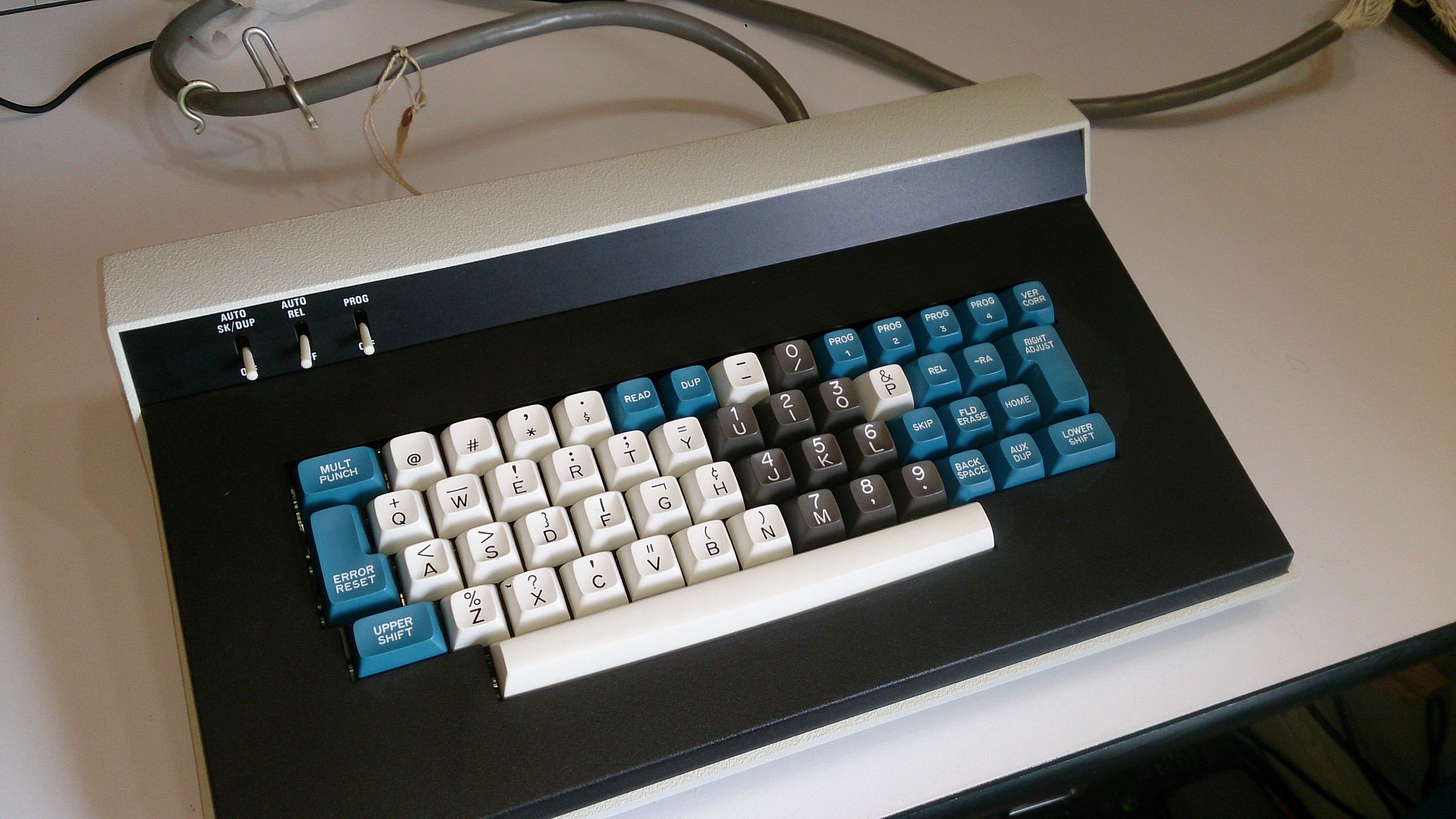
Spherical Buckling Spring Thread

User avatar
Zed

05 Jun 2017, 20:05

@wcass I have just been calling it "Beamer" but I am sure a better name could be found. I would really like to get a copy of lot_lizards' scan in high-res and make another pass to really tighten things up but I am open to discussing making it available for other projects. I have also posted in LLs MF laser engraving Marketplace thread if that is what you were alluding to. My licensing fees are quite reasonable ;)

@sgtpopwell The two colorways I presented are, of course, based on what was used on old beamspring boards. It would be up to rsbeb and the community to decide on final colorway(s) but my vote is for the traditional. If you have any ideas, lets hear them!

@ramnes What, you got a problem with the way IBM colored their spacebars? :) I can work something out shortly with alpha colored bars.

rsbeb has been in touch via PM and seems interested in using my art so we are off to a good start I think.
User avatar
Zed

06 Jun 2017, 02:32

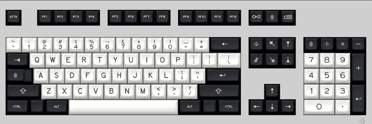
With alpha colored spacebars.
Attachments
Beamspring GB lght sp render.png
Beamspring GB lght sp render.png (111.96 KiB) Viewed 7633 times
Beamspring WB lght sp render.png
Beamspring WB lght sp render.png (116 KiB) Viewed 7633 times

User avatar
just_add_coffee

06 Jun 2017, 07:44

I'm on board for whatever the result is and these certainly look wonderful. I'm particularly liking the gray alpha-numerics.

Would it be possible to see the gray set rendered with Navy Blue instead of black?

User avatar
Zed

06 Jun 2017, 23:34

Some blue for the coffee fan and a few other possible variants. One thing to keep in mind is that I would imagine most of these sets would end up on beige cases. I am a fan of neutral tones which would go well on my black Unicomp but perhaps it is worth thinking about warmer tones that might go better on the old school cases as well.
Attachments
Navy Beamspring
Navy Beamspring
Beamspring Navy render.png (178.69 KiB) Viewed 7562 times
Gasp! Honeywell Beamspring
Beamspring Honey render.png (196.56 KiB) Viewed 7562 times
Ellipse F77 Industrial Mopar mashup
Beamspring Mopar render.png (189.82 KiB) Viewed 7562 times
Ellipse F62 Selectric
Beamspring Selectric render.png (151.8 KiB) Viewed 7562 times

User avatar
just_add_coffee

07 Jun 2017, 00:44

Zed wrote: Some blue for the coffee fan and a few other possible variants. One thing to keep in mind is that I would imagine most of these sets would end up on beige cases. I am a fan of neutral tones which would go well on my black Unicomp but perhaps it is worth thinking about warmer tones that might go better on the old school cases as well.
Thanks for doing that, Zed!

User avatar
mana

07 Jun 2017, 16:12

All beautiful, Zed! I think on a beige case any shade of grey is going to look a bit off but we can always paint the case to match our keycaps! In that sense though I think the schemes up there without grey (ie the white on black F62 and the black on white and white on black) would be most usable for our run of the mill IBM cases.

That said, I think the Honeywell render is the most beautiful colour scheme.

User avatar
just_add_coffee

07 Jun 2017, 21:47

mana wrote: All beautiful, Zed! I think on a beige case any shade of grey is going to look a bit off but we can always paint the case to match our keycaps! In that sense though I think the schemes up there without grey (ie the white on black F62 and the black on white and white on black) would be most usable for our run of the mill IBM cases.
I've got no qualms about painting cases. :evilgeek:

But don't forget about all of those black Unicomps out there. Black is the new (and old) black and so it goes with everything. Also, an attractive and high-quality alternative to the horribad Unicomp keycaps would probably be pretty popular.

duncancmt

07 Jun 2017, 23:02

I've been following this thread for a while, but I made an account to weigh in here.

That font is beautiful! I especially like the white on grey/black.

I have 2 criticisms:
  1. I'm not a fan of mixed symbol/text mods. I really like what SkullyDazed did with Modern Selectric Black's control, super/windows, alt/meta, and escape keys. Perhaps something in that vein would be possible?
  2. The secondary legends on the 1 and 6 keys should probably be ! and ^ instead of what they are currently.

User avatar
Zed

07 Jun 2017, 23:12

just_add_coffee wrote: Also, an attractive and high-quality alternative to the horribad Unicomp keycaps would probably be pretty popular.
A large part of why I started this project in the first place! I have no problem catering to the black case crowd (typing on one now) or those who would actually paint their cases to go with new caps but I would imagine we are in the minority. The old school beige contingent is like a huge horde looming in the distance and it should probably not be ignored in order to maximize the potential audience.


Are we even making too big of deal about this? Would folks with old-school cases have a problem putting white and black, or all black or even a cooler gray on beige? Heck, I am not 100% sure on the tones used on the originals. I only have pictures to go on at this point and that is a pretty poor way to gauge color.

My impression is that rsbeb was thinking about doing several different colorways that might even be available as separate alphas and mods to allow mixing and matching but we will have to wait until he returns from the wilderness next week to hear from him.

User avatar
Zed

08 Jun 2017, 00:56

duncancmt wrote: I'm not a fan of mixed symbol/text mods. I really like what SkullyDazed did with Modern Selectric Black's control, super/windows, alt/meta, and escape keys. Perhaps something in that vein would be possible?
I hear you and it is absolutely possible to work up some unicode or other symbols that would be appropriate. I have tried to stick to the original design as closely as possible and they typically had an 'Alt', 'Reset', and 'Enter' on the bottom row but I agree that it is not the most cohesive from a design standpoint. That 'Func' I have on the F62 and F77 boards looks particularly out of place. Even if it is how IBM might have done it. If you think about the 'design rules' which were used on these boards, they probably would have done the entire bottom row with text mods if they needed 'Ctrl', 'Super' etc. but it does look strange.
duncancmt wrote: The secondary legends on the 1 and 6 keys should probably be ! and ^ instead of what they are currently.
Thank you for being the first to mention one of my silly easter eggs! Like the 'PF' instead of 'F' function keys, it is one of several tips of the proverbial hat to the originals. I can imagine folks silently or otherwise cursing me every time they have to type an ! or ^ but I haven't decided how deeply I will dig my heels in on this matter. :D

duncancmt

08 Jun 2017, 01:27

Zed wrote: I hear you and it is absolutely possible to work up some unicode or other symbols that would be appropriate.
It's hard to come up with a consistent set of legends for the three bottom-row modifiers. Control and alt/meta want to be ⌃ and ⌥, but then what the heck do you use for windows/super? The legend you used for your Honeywell render is pretty cool, but it doesn't jive with those two.
Zed wrote: Thank you for being the first to mention one of my silly easter eggs! Like the 'PF' instead of 'F' function keys, it is one of several tips of the proverbial hat to the originals.
I was wondering where the 'PF' function keys came from! BTW, I'm a big fan of your delete legend. I hope it makes it into the final design.
Zed wrote: I can imagine folks silently or otherwise cursing me every time they have to type an ! or ^ but I haven't decided how deeply I will dig my heels in on this matter.
Well, if it becomes a voting matter, consider my vote cast for at least the inclusion of a normal 1/! and 6/^ key.

User avatar
Techno Trousers
100,000,000 actuations

08 Jun 2017, 03:11

I always thought the windows key could be a simple "PC" outline icon. Maybe something like this, but less modern.

Image

User avatar
ekeppel

08 Jun 2017, 04:05

Zed wrote:
duncancmt wrote: The secondary legends on the 1 and 6 keys should probably be ! and ^ instead of what they are currently.
Thank you for being the first to mention one of my silly easter eggs! Like the 'PF' instead of 'F' function keys, it is one of several tips of the proverbial hat to the originals. I can imagine folks silently or otherwise cursing me every time they have to type an ! or ^ but I haven't decided how deeply I will dig my heels in on this matter. :D
While I like the nod to the past, those two keys always get replaced with modern keys when I convert an F122, but that's just always been my personal preference.

Perhaps they could be optional? I know at some point there needs to be a limit on optional 'this' and optional 'that', or the project will never be completed, but maybe the regular 1 / 6 could be added to the list.

By the way... beautiful renders. Thanks for those! ;)

User avatar
Zed

08 Jun 2017, 04:18

duncancmt wrote: The legend you used for your Honeywell render is pretty cool, but it doesn't jive with those two.
Techno Trousers wrote: I always thought the windows key could be a simple "PC" outline icon. Maybe something like this, but less modern
That is kind of what I was going for in some of the renders but it is hard to tell what is going on. The graphic I used was an attempt to reproduce the 'Home' key on beamsprings but I only have crappy pics to work from for that one. It's located on the front of the 'Backtab' key on the originals and is supposed to be a monitor with an arrow pointing to the upper left corner. I tried a layout with this icon in the real 'Home' position and a flipped version to represent 'End' but it really didn't look too good so I went with the arrows there. It ended up on some of the Win keys for lack of anything else to put there currently. I do like the idea of an old monitor screen as a novelty/win key though. I will play around with some icons for the bottom row and see what looks good.

User avatar
Zed

08 Jun 2017, 04:38

ekeppel wrote: Perhaps they could be optional? I know at some point there needs to be a limit on optional 'this' and optional 'that', or the project will never be completed, but maybe the regular 1 / 6 could be added to the list.
I'm not really too fussed over the funky number row legends but they aren't that different from what 'should' be there. I would certainly love for there to be options but rsbeb has already undertaken a monumental task and the fact that he is already talking about stuff like convex and concave bottom rows just has me shaking my head in disbelief. It's really up to him how much he wants to expand the scope of an already daunting project.
ekeppel wrote: By the way... beautiful renders. Thanks for those!
I will once again give a shoutout to http://kle-render.herokuapp.com/ for the backgrounds on my renders. It is a wonderful new tool that takes KLE data and generates some excellent 'in between' KLE and real render pics that are perfect for banging out mockups quickly. I have been using it to generate a pic with blank keys and then I overlay the legends manually in Inkscape.

User avatar
Zed

09 Jun 2017, 04:07

Icon mods
Attachments
SBS Beamspring 'Displaywriter'
Beamspring Wheelwriter render.png (197.02 KiB) Viewed 7364 times
SBS Beamspring 'Selectric'
Beamspring Selectric render.png (148.76 KiB) Viewed 7364 times
Last edited by Zed on 09 Jun 2017, 15:55, edited 1 time in total.

duncancmt

09 Jun 2017, 05:13

Ooooooh!! I like it! Where did you get the idea for the alt/meta legend?

User avatar
Zed

09 Jun 2017, 05:51

Thanks! The Alt is based on the standard Unicode alt symbol and the Meta is from old Sun boards. Hopefully the Meta/Super and Menu icons are distinct enough from Granite that matt3o won't be too pissed. ;)

mr_a500

10 Jun 2017, 20:21

Zed wrote: Greetings Deskthorians! Long time lurker that just registered to share some ideas I have been working on for this fantastic project. @lot_lizard was kind enough to post a scan of a beamspring cap set a while ago and I used it to recreate the font and icons. I know Mr. Lizard has been working on doing the same thing and I don't want to step on any toes so, if he is agreeable and @rsbseb is interested in my work, I offer this proposal for the SBS legends.

Image
This is awesome. I'll take 10 sets please.

Maybe that's overkill.... OK, I'll take 5 sets. :mrgreen:

User avatar
Zed

10 Jun 2017, 21:13

mr_a500 wrote: OK, I'll take 5 sets.
Of each color combo? :o

mr_a500

10 Jun 2017, 21:25

No, wait a minute... I'll take 3 white with black, one Honeywell and an all black set.

How about a DEC Datasystem 150 set?

Image

And a Decision Data 8010 set?

Image

Yeah, I'll take one each of those too. :mrgreen:

User avatar
Zed

10 Jun 2017, 21:58

Nice choices! I haven't seen either of those boards before. Xerox Alto is another showstopper. We will have to see what rsbeb wants to do but there is also his SCM project where such colorways may possibly find a home.
Attachments
Xerox Alto.jpg
Xerox Alto.jpg (184.27 KiB) Viewed 7301 times

User avatar
rsbseb
-Horned Rabbit-

11 Jun 2017, 00:04

I just got back from a week of camping and all I have to say is I want to do everyone one of ZED'S proposals!

Very nice work. :D

User avatar
Ir0n

11 Jun 2017, 00:22

Oh man, I really like that black and grey set Zed.

User avatar
rsbseb
-Horned Rabbit-

11 Jun 2017, 00:37

I'm partial to white and grey myself, especially with the blue navigation accents. However a white-grey-orange in a black case would really be the ticket for me.

User avatar
Techno Trousers
100,000,000 actuations

11 Jun 2017, 01:08

rsbseb wrote: I just got back from a week of camping and all I have to say is I want to do everyone one of ZED'S proposals!

Very nice work. :D
That's great news! I think I want to combine the "industrial" blue mods (all icon) with the beam spring gray alphas. Droooool. Zed, can you mock that up?

Will you be able to do the newly proposed "all icon" modifiers rsbseb? I think that would be super cool, but I know it costs a lot for each of the double shot molds you need to make.

User avatar
Zed

11 Jun 2017, 02:15

I was kind of fearing a 'Cat in the Hat' situation here so it's great to see rsbeb has returned and is not too upset with the mess that happened during his vacation.

Renders will be coming shortly after I finish up laying out a template for lot_lizard. What should have been a straightforward job has now turned into a dozen characters getting revised!
rsbseb wrote: However a white-grey-orange in a black case would really be the ticket for me.
Were you thinking orangish like I used above or really orange? 'Esc', Nav arrows, and 'Return'?

User avatar
Zed

11 Jun 2017, 02:19

Techno Trousers wrote: I think I want to combine the "industrial" blue mods (all icon) with the beam spring gray alphas. Droooool. Zed, can you mock that up?
Cooler gray or the warmer I used in the F77? You want all blue mods, correct?

User avatar
rsbseb
-Horned Rabbit-

11 Jun 2017, 02:24

Zed wrote: I was kind of fearing a 'Cat in the Hat' situation here so it's great to see rsbeb has returned and is not too upset with the mess that happened during his vacation.

Renders will be coming shortly after I finish up laying out a template for lot_lizard. What should have been a straightforward job has now turned into a dozen characters getting revised!
rsbseb wrote: However a white-grey-orange in a black case would really be the ticket for me.
Were you thinking orangish like I used above or really orange? 'Esc', Nav arrows, and 'Return'?
I like the muted orange you have used above. It kind of has a 1970's industrial vibe I really like. The warm grey would be my personal choice

User avatar
Techno Trousers
100,000,000 actuations

11 Jun 2017, 03:12

Zed wrote:
Techno Trousers wrote: I think I want to combine the "industrial" blue mods (all icon) with the beam spring gray alphas. Droooool. Zed, can you mock that up?
Cooler gray or the warmer I used in the F77? You want all blue mods, correct?
I was thinking about the gray from the beamspring navy render. And yes, all indy blue mods. Except maybe a red attn key? Wow, so many possibilities.

Post Reply

Return to “Workshop”