Ergonomic keyboard layouts
Contents
Malt
 | |
| Creator | Maltron |
|---|---|
| Introduced | 1977 |
| Website | maltron.com |
QPYCB VMUZL | |
ANISF DTHOR | |
,.JG; /WK-X | |
Developed in conjunction with the two-handed Maltron physical keyboards.
The letter E is operated by one thumb. It is the most common letter in English, occurring in sequence with almost every other letter. There is major potential in giving E independence from the other fingers' movements. In fact, QWERTY with that one change would go a long way. In an optimized layout like this one, the change also clears another spot on the home-row where E would have been placed.
Malt puts priority the home and top rows, relegating rare keys to the bottom.
News from 1977 - somewhat sexist, says the keyboard weighs "only three pounds", and reassures you that it can be plugged into electric typewriters. It also cost $850, which in 2016 dollars is $2873.
Arensito
 | |
| Creator | Håkon Hallingstad |
|---|---|
| Introduced | 2001 |
| Website | pvv.org |
QL P FUDK | |
ARENB GSITO | |
ZW HJ VCYMX | |
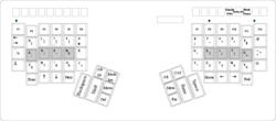
Also known as the Hallingstad layout. Arensito uses some unique punctuation arrangements, so they are not displayed above. Visit the link or check pictures for details.
Made by Håkon Hallingstad to suit the Kinesis Contoured and two-handed Maltron, though there is an adaptation for usage on standard keyboards too.
This layout is named after its home-row. The design intentions are as follows:
- Places the eight most used characters under your fingertips.
- Is the layout that minimizes the probability that you use the same finger twice (in succession).
- Is the layout that maximizes the probability for using neighbour fingers in succession (and keeps the probability of sequences like y-d or z-l diminishingly low). This lets the fingers strike diagraphs and trigraphs extremely fast.
- Keep the workload off the pinkies. Both pinkies press a button about 40% less than the other fingers.
Some punctuation and programming symbols are placed under the AltGr layer, where they are closer to the fingers' home position.
Developer's Dvorak
 | |
| Introduced | abt late 2012 [1] |
|---|---|
| Website | andong.co.uk(archive) |
| |
| |
| |
Also known as ADDvorak.
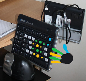
Keyboards that can be used with this layout are: any Japanese keyboard, Kinesis Contoured, Kinesis Freestyle, Maltron, Data Hand.
Created by freelance developer Andrei Stanescu, this layout is something out of the ordinary. It is only a Dvorak layout in the sense that almost all the letters are operated by the same fingers as they are in Dvorak.
At the outset, this layout relies on the concept that modifier-combinations are preferred over faraway keys.
Towards this purpose, there are six modifier states on top of the normal state. There are no utilised keys at all beyond the main home-key cluster of 3x4 for each hand. At least two thumb-keys are required for each hand.
AdNW
BuT and BuT-XCV
 | |
| Creator | Multiple |
|---|---|
| License | "Public Domain" |
| Website | adnw.de |
| |
| |
| |
 | |
| Creator | Multiple |
|---|---|
| License | "Public Domain" |
| Website | adnw.de |
| |
| |
| |
- Optimized for matrix keyboards like ErgoDox or TrulyErgonomic
- Bi- and trigram optimization, separated syllables. German-English 1:1
- More hand and finger alteration
- Shortcut buttons (X,C,V) are mirrored on the left half of the keyboard (BuT XCV)
PUQ
 | |
| Creator | Multiple |
|---|---|
| License | "Public Domain" |
| Website | adnw.de |
| |
| |
| |
- Assignment for 30 character keys
- Umlauts and special characters are generated by Diakritika / Compose key
- Optimized for matrix keyboards, trigram optimization, separated syllables. German-English 1:1
- Many hand changes, even finger strain, minimal collisions, round and fast
BEAKL
Amuseum
 | |
| Creator | Xay Voong |
|---|---|
| Introduced | Late 2008 [2] |
| Website | BEAKL Official Page |
",WHM GCU.- | |
SOENL DTAIR | |
'(YVK BPF)X | |
Note: The Q, Z and J letters are placed outside the main-30 key area, ending up in locations determined by the keyboard used – standard or Kinesis Contoured.
The parentheses () turn into brackets with Shift activated.
The quote " and apostrophe ' signs turn into colon and semicolon, respectively, when Shifted.
The goals of Amuseum layout is to :
- balance the workload between each hand ,
- put common punctuation in the main block, even if that means putting rare letters outside ,
- mirror the keys for both hands. Notice vowels are mirrored and balanced on left and right hands, same with comma and period, and parentheses.
9 Matrix
 | |
| Creator | Xay Voong |
|---|---|
| Website | BEAKL Official Page |
JHOUK GCRFZ | |
QIEAY DSTNB | |
/,'.X WMLPV | |
Workman
 | |
| Creator | OJ Bucao |
|---|---|
| License | "OJ Bucao License" |
| Introduced | 2010 |
| Website | workmanlayout.com (archive) |
QDRWB JFUP; | |
ASHTG YNEOI | |
ZXMCV KL,./ | |
Created by OJ Bucao, it's a layout particularly made for straight-column keyboards.
The design crux is that of keeping the fingers to their main 4 columns per hand and de-prioritising columns in the middle and to the sides, thus minimizing diagonal and lateral movement.
Should be very suitable for a Kinesis Contoured-type of keyboard – the author also uses this.
Ergolinear Split-case designs
Following the development of the Ergolinear form factor, the developers Ian Douglas and Xay Voong continued with their attempts to reach layout nirvana.
As is common in this field, inventors work with frequency charts of letters, bigrams, trigrams, etc. in an attempt to find a better layout.
The typical letter frequency order for English is usually a variation of this order, from Michael Dickens:
SPC etaoinsrhldcumfgpyw ENT b,.vk-"_'x)(;0j1q=2:z/*!?$35>{}49[]867\+|&<%@#^`~
But this is not the whole story. One day, Ian stumbled across a frequency chart taken from a large American corpus, which looked like this:
etaoinsrhldcumpfg.ywb-,v0k1TAIS2C'"/3ED9:MN=RP;4OB5)L(HFx8W67G_UjqzJ<?Y@*VK!|$~[]%X&+#QZ}{>`\^
Apart from some order difference, the biggest difference was the separation of uppercase and lowercase letters. It suddenly dawned on him that we type mostly lower case letters, and so we should optimise for that. This insight, together with the use of Arensito-style AltGr, led to the birth of the split-case design, where the upper case for a letter is on a different key to its lower case version.
Ideally, the optimising should work strictly according to frequency, but as a help, Ian decided to be a little less optimal, and split the keyboard into three main rows:
- Capital letters
- Lower case letters
- Punctuation and digits.
This led to the acronym C - L - P which was turned into the word Seelpy, as a name for this type of layout.
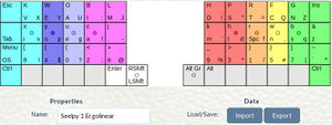
The initial version (Seelpy 1) looks like this:
Ian further refined this layout until it became unbeatable on Den1 scoring on KLA.
However Xay decided to pursue full optimisation, which entails mixing uppercase, lowercase, punctuation and digits, to achieve the best score.
This version of the Split Case came to be called Essie, from the acronym S - C. Alternative names use CLP even though this no longer implies strict separation by row.
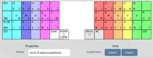
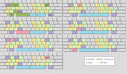
A version of such a layout looks like this:
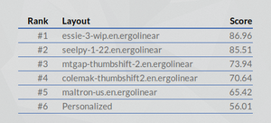
A comparison of scores, using Alice Chapter One on KLA: (higher is better)
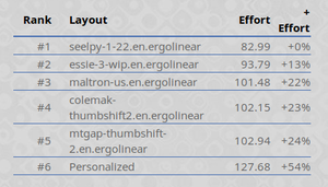
A comparison of scores, using Alice Chapter One on Den1 scoring of KLA: (lower is better)
These layouts may be too difficult to use in practice.
